14

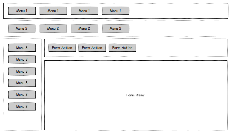
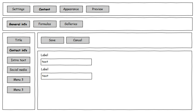
My brain seems to be pre-programmed to make administrative UI's look like the mockups below.

In the mockups I have 3 levels of navigation, with on the form another set of buttons for the form actions.

I would like to find out if what better approaches are out there. Can I make the UI a bit simpler, with some user friendly tricks, or should I rethink my app's structure?

Generic mockup Example content

2 Answers 2

23

(Since your profile indicates you're a developer, I'm going to answer this in the same way I help out programmers at my company. Let me know if you need another angle.)

I don't think hierarchical menus in administrative UIs are an anti-pattern. However, it is an example of "programmer thinking" when it comes to interface design. What you're likely doing is mapping your mental model of the application directly to the user interface. Instead, what you need to learn to do is map the user's mental model. This can be challenging without practice, but you'll notice that as you progress, your user interfaces become much more "intuitive" (in the sense that your users will learn them more easily).

But how do you get from A to B? Here are some basic UX techniques you could look into:

Mental modeling

Mental modeling is a technique that you can approach from various angles. One way is by using card sorting or the KJ method (also known as affinity diagrams). At a high level it involves grabbing a bunch of people from your target audience and working together with them to define the information architecture and prioritise activities. When you do that you'll figure out how your screens should work as a by product of the process, as well as achieving much more buy-in with your stakeholders since they'll feel like they're part of the decision-making process.

Here's a book I'd recommend about mental modeling: Mental Models by Indi Young.

Usability testing

Once you've designed some screens, do some hallway usability tests. Hallway usability tests involve grabbing someone in a hallway and asking them to do something with your app. Given that it's an admin UI you can easily ask them to do something simple, like "Imagine a new employee has joined the company. Your job is to add them to the system. What would you do?". Take notes without helping them out and you'll reveal a lot of problem areas in a short span of time. Keep repeating this throughout development and after you launch to keep up with how people use your UI.

The bible of usability testing is Rocket Surgery Made Easy. This book outlines many strategies you can use and especially focuses on ways to do testing without things getting expensive. Check it out.

Prototyping

Before actual development (in the sense that you create the real application, hooked into the back-end and all), create an interactive prototype that talks to mock services. You can pre-program them to just give you data you expect as you're not testing for errors, you're testing for how people use the UI. Prototyping allows you to iterate quickly without having to worry about executing real business logic. Combined with usability testing and mental modeling, you can get really far without investing too much time and money.

Todd Zaki Warfel's book Prototyping outlines various methods and approaches. I highly recommend it if you're planning to do some prototyping. (Plug: if you do front-end development, my profile has a link to an app I develop that's aimed at HTML prototyping. You may find it useful.)

Don't Make Me Think

Finally, read Don't Make Me Think to really change your thinking about UI design. You'll come away from this book recognising many flaws in your current designs and feeling inspired to tackle them in new ways. It takes 2 hours to read and you can refer back to it for wisdom for the next 10 years, guaranteed.
1
  • 2
    As a developer trying to get out of the developer mindset for a new app: thank you so much for this! Commented Jul 22, 2011 at 6:28
3

Rahul provides some great "high-level" points on rethinking your approach to UI design. However, there are also some "low-level" tricks that I think could help you at the 'nitty-gritty' stage of design:

If you must use parent and child tabs, make sure children are clearly 'contained' by their parent tabs

When you show users that an element contains another, they quickly grasp their hierarchy. You can do that in three ways:

  1. Making sure the tab content and tab header 'join up' (so it looks like a card tab, rather than a button on the top of the subwindow)
  2. Making sure the subtab content, and its header span are narrower than the parent tab
  3. Giving the subtab header text equal or less weight than the parent's text (perhaps by bolding the parent, or making the subtab text a weaker color).

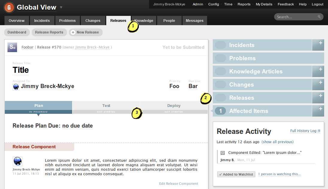
You can see each of these techniques used in Beetil, a web-based bug tracker:

enter image description here

Notice how -

  1. The "Releases" header blends into the tab's content
  2. The "Plan / Test / Deploy" tabs are narrower, and unambiguously part of something the parent tab contains
  3. The child tabs use weaker colours and smaller fonts (also, as another example of tip 1, note the downwards 'arrows', which clearly link the selected tab to the content below).

Don't mix vertical and horizontal 'child tab menus'

...Because it's not clear which one has greater precedence.

Put your form actions at the bottom

  • It makes more sense workflow wise (do something -> save or cancel it).

  • The parent / child tabs already have the potential to confuse, so don't make life harder by mixing them with controls that don't concern information hierarchy

  • Thirdly, it stops your form looking uneven.
3
  • There's quite a bit of inconsistency to this UI. For instance, the first level tabs and second level tabs use different visual clues (point 1 and 3), why? Secondly, the logic flow is from the header downwards and to the right, but the arrow between the colums points to the left. I've also got no idea how the 4 corners relate. Release Activity suggests a relation to Release Plan, but there's no horizontal alignment.
    – MSalters
    Commented Jul 26, 2011 at 13:57
  • 1
    It isn't my UI, and I'm only pointing to it as an example of three very specific parent / child tabbing patterns. Commented Jul 26, 2011 at 20:19
  • 1
    This is a great answer on how to make the UI structure in my question work as good as possible. However, I'm trying to get away from that structure; I'm wondering if there are other/better aproaches...
    – Bertvan
    Commented Aug 12, 2011 at 9:11

Your Answer

By clicking “Post Your Answer”, you agree to our terms of service and acknowledge you have read our privacy policy.

Not the answer you're looking for? Browse other questions tagged or ask your own question.