4

I'm about to develop an application that will be used by revisers to compile the errors they find while reviewing a translation. The application will consist of a simple form in which they will have to enter some informations about the error.

One of the informations that they need to enter is the type of error. The error are separated in 7 categories with 4 to 8 error types per category. Since the users will need to fill this form frequently I'd like to make it easy and fast to use. So I'm pondering how should I allow them to select an error type.

The trivial way to do this is to present to dropdown lists, one for each level. This methods as multiples drawbacks :

  • It requires 4 clicks to select an error type
  • The user can't see the options before he opens the list
  • The user need to aim and click on relatively small options

Is there any better/creative alternatives that would allow the user to choose an option rapidly/easily?

5
  • "The user can't see the options before he opens the list" If this form is used frequently, that might not be much of a problem, since users will become familiar with the types of errors available. Commented Jul 13, 2011 at 15:43
  • @Patrick : You are probably right for the most commonly used option. But there will be some errors the will be rarely used. Commented Jul 13, 2011 at 15:47
  • 2
    Are the categories meaningful to your user, or only to your system? If they're meaningful then seeing all the options shouldn't be necessary; if they're not meaningful then why pass your structure on to the user instead of giving him a flat list (which you can shuffle into your structure)? Commented Jul 13, 2011 at 16:13
  • @MathieuPagé: I recently came across a similar problem. Would you mind editing your post with how your solution turned out in the end?
    – hugomg
    Commented Nov 16, 2011 at 13:31
  • @missingno: Sure, I don't mind. ux.stackexchange.com/questions/8970/… Commented Nov 16, 2011 at 14:54

3 Answers 3

3

I would say that for repetitive tasks, one of the top priorities is to provide really quick access to the users' most recent and most common items and not to have any small target areas, and that you should design for speed, user inaccuracy and aim to reduce repetition.

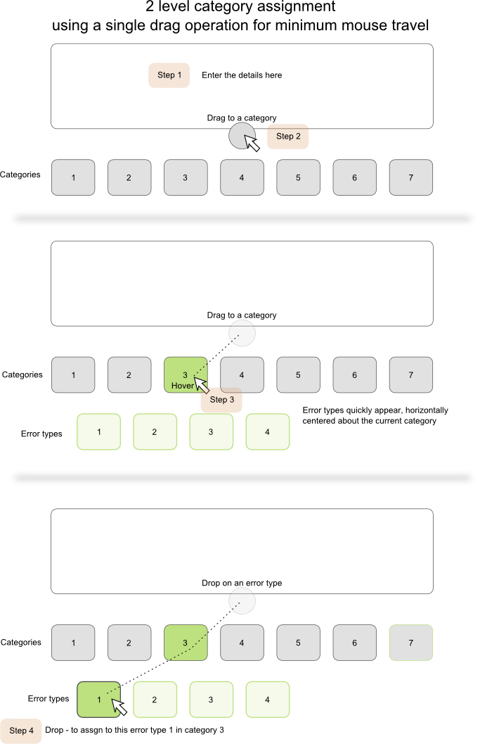
I was further pondering this problem of quickly and easily assigning a report to a 2 level category/type structure and had the following thought which could reduce the category assignment process to a single drag operation. The only thing is - I'm not sure I've seen this pattern anywhere else - but does that make it bad. I have no information to go on as to its usability for repetitive tasks in practice - but you asked for creative alternatives so here you go.

enter image description here

4
  • Having a different control for most recent and most common is a good idea, I'll certainly implement something like this. Thanks Commented Jul 13, 2011 at 15:23
  • I've rewritten my answer more usefully and added a creative idea as requested Commented Jul 13, 2011 at 19:38
  • I'm not sure how this will integrate with the remaining of this particular application's UI, but I think this is a good idea. It's exactly the kind of answer I was looking for. Thank you. Commented Jul 13, 2011 at 20:51
  • +1 for intro section and innovative (but could be hard to implement) GUI.
    – JOG
    Commented Jan 2, 2012 at 11:50
1

You have an expert system where 99% of the input is provided via keyboard, the task is very repetitive, and the number of categorization options is fairly limited (about 50, with an efficient initial breakdown of 7 categories, then up to 8 items). You should optimize it for keyboard-only usage. For example: the comment is typed - TAB - selecting category with hotkeys 1-7 - selecting subcategory with hotkeys 1-8 - move on to next comment. You complete the categorization part in 3 key presses, without having to switch to the mouse (which is a very time-consuming and frustrating step).

In case the number of categories grows and reaches a 2-digit number, you'll need to provide another TAB to move from category selection to subcategory selection.

Of course, in each step you need to clearly indicate the current stage (e.g. highlight the categories after first TAB and only show the subcategories once the category is selected), and provide prominent visual clues regarding the hotkey assignment.

This process should get very fluent within less than an hour of work. A mouse alternative should also be provided, but it will never get as efficient as the hotkeys, simply because of the need to switch back to the keyboard. What the mouse alternative will be good for is correcting errors. If the user wants to change their categorization on a previous item, they will often use the mouse to reach that item, and then they should be able to re-categorize without switching back to the keyboard (they'll need the mouse to get back to where they left off).

1

Per missingno's request, I'll answer my own questions to let future viewers know how we eventually solved this problem.

While I really liked Roger Attrill's proposal for some reason it was not a good match for our application. Mainly because such a control would have taken too much space while our application needed to be small to be used side by side with other applications such as MS Word.

What we eventually implement was a UI whit two listbox (not combobox). This way the user could select the category and sub-category in two clicks instead of four. We also pre-selected the most used category by default and when a category is choosen, the most used sub-category is also automatically selected. So most of the time only one clic is needed.

We also added a zone with 3-5 buttons (depending on their size) with the most used combinations (category/sub-category) for the current job. These buttons allow the user to select one of these category/sub-category in one clic.

It's not really a creative solution, but I think that given the constraints we had it works well.

Your Answer

By clicking “Post Your Answer”, you agree to our terms of service and acknowledge you have read our privacy policy.

Not the answer you're looking for? Browse other questions tagged or ask your own question.