16

I'm trying to find a good default width for money input in my forms. If I assume that the amount people will put in is under 1 billion Euro, the width of the value, including decimal places and punctuation, would be around 100 pixels.

But how wide should the field at least be with regard to Fitts's law? How much additional space should I add to maximise clickability and keep the design minimal?

Also the user's expectation of how much they can put into the field plays an important role.

mockup

download bmml source – Wireframes created with Balsamiq Mockups

4
  • 1
    I'm not about to edit for a single character, but it's either Fitts' or Fitts's, after Paul Fitts. Commented Nov 27, 2015 at 14:21
  • It would be "Fitts's"
    – Tim Huynh
    Commented Nov 27, 2015 at 15:29
  • 4
    @TimHuynh Actually, not necessarily. It depends on the dialect you write in and your preferences. Both are correct English. It's like the number of spaces after a period – either one or two is valid, and it doesn't matter as long as you're consistent. "Fitt's" is wrong, though.
    – anon
    Commented Nov 28, 2015 at 4:07
  • They may both be grammatically correct, but if you said /fit-ziz/ law, it would sound funny :-)
    – Kip
    Commented Dec 1, 2015 at 1:25

4 Answers 4

21

To supplement Matt's answer…

Are there other controls on the screen?

Research shows users have more confidence in a product—they believe the product is more accurate—when its visual elements are nicely aligned.

If there are multiple controls, or text boxes, sizing each one to fit its anticipated content (below, left) would be a poor choice. Look at the two options separately—so cover one side with your hand, then the other side.

Some ways to align controls

As always, different design goals will be in tension. Make an appropriate compromise.

I hope that helps you move forward.

8
  • 24
    "Research shows" Got a source to cite?
    – Aaron Hall
    Commented Nov 27, 2015 at 15:48
  • 1
    How can a product be "accurate"? What does it mean for design goals to "be in tension"? What research? Commented Nov 28, 2015 at 23:12
  • 1
    @LightnessRacesinOrbit, "to be in tension" means to have conflicting priorities. For example, aesthetics and functionality often conflict. But IDK the answers to the other questions, Commented Nov 29, 2015 at 0:18
  • 1
    Balance is the key. I would never make a money field the same length as a free-text field just because they look nicer when they're aligned. But I would always try to keep the variety in field length as low as possible and make fields with similar input the same length.
    – J_rgen
    Commented Nov 30, 2015 at 8:13
  • 1
    Man, I remember when academic papers were free. Now they're $15? Commented Nov 30, 2015 at 15:19
14

You have a few mixed concepts here. Fitts' law basically means that the wider the field is, the easier it is to hit, so option 3 would be the winner in that regard. You're rightly trying to design the field length to reflect the expected entry so option 1 would win in that case.

You say you “assume that the amount people will put in is under 1 billion Euro”. What are you basing that assumption on? If the numbers are likely to always be that large then option 2 is probably a good fit. If the numbers are likely to be smaller in most cases but occasionally reach 1 billion then option 1 is the better choice.

In summary:

  1. If numbers are generally smaller, but can reach a billion = option 1
  2. If numbers are always close to a billion = option 2
  3. Fitt's law only = option 3

For further reading Baymard have a good article on form field lengths

On another note, the alignment of your fields is not recommended. Labels above the fields or both label and field aligned left are both superior to the layout in your sketch.

2
  • Very useful answer, Matt. I have a similar problem, about long labeling that exceeds the field width. I'll appreciate if you take some minutes to check it: What's the best way to show form labels that are longer than the corresponding fields: //ux.stackexchange.com/a/87345/57201
    – redux
    Commented Nov 28, 2015 at 4:42
  • Thx for the article. The three options are merely variations, they are not options that I want to pick from. Regarding alignment: I would usually use left aligned fields, except for the case when I need to align sums (but then again, all money fields would have the same length).
    – J_rgen
    Commented Nov 30, 2015 at 8:05
1

Do you think the widest fields could lead to errors if the input is expected to be lower?

Think about the tracking of the labels and the way the users will tend to fill out this form. Will they use the keyboard tab? Or maybe they'll go for the cursor selection? Perhaps, making the fields wider isn't helping at all to make them easier to be clicked.

I have a similar problem, about long labeling that exceeds the field width: "What's the best way to show form labels that are longer than the corresponding fields (which require a short input)?"

0

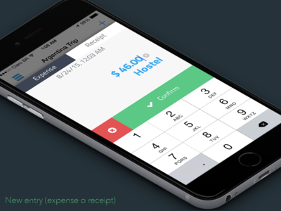
A minimalist textfield without a visual border could work, depending on your design.

enter image description here

2
  • Can you elaborate your answer? I'm not designing for mobile here and I figure that's not going to work well in desktop or web, especially with more than one field.
    – J_rgen
    Commented Dec 1, 2015 at 8:10
  • 1
    You're concerned about the size of the box around the textfield, my suggestion is to remove the box. Another example: dribbble.com/shots/2220256-Day-008-Autocomplete
    – Martyn
    Commented Dec 1, 2015 at 19:32

Your Answer

By clicking “Post Your Answer”, you agree to our terms of service and acknowledge you have read our privacy policy.

Not the answer you're looking for? Browse other questions tagged or ask your own question.