2

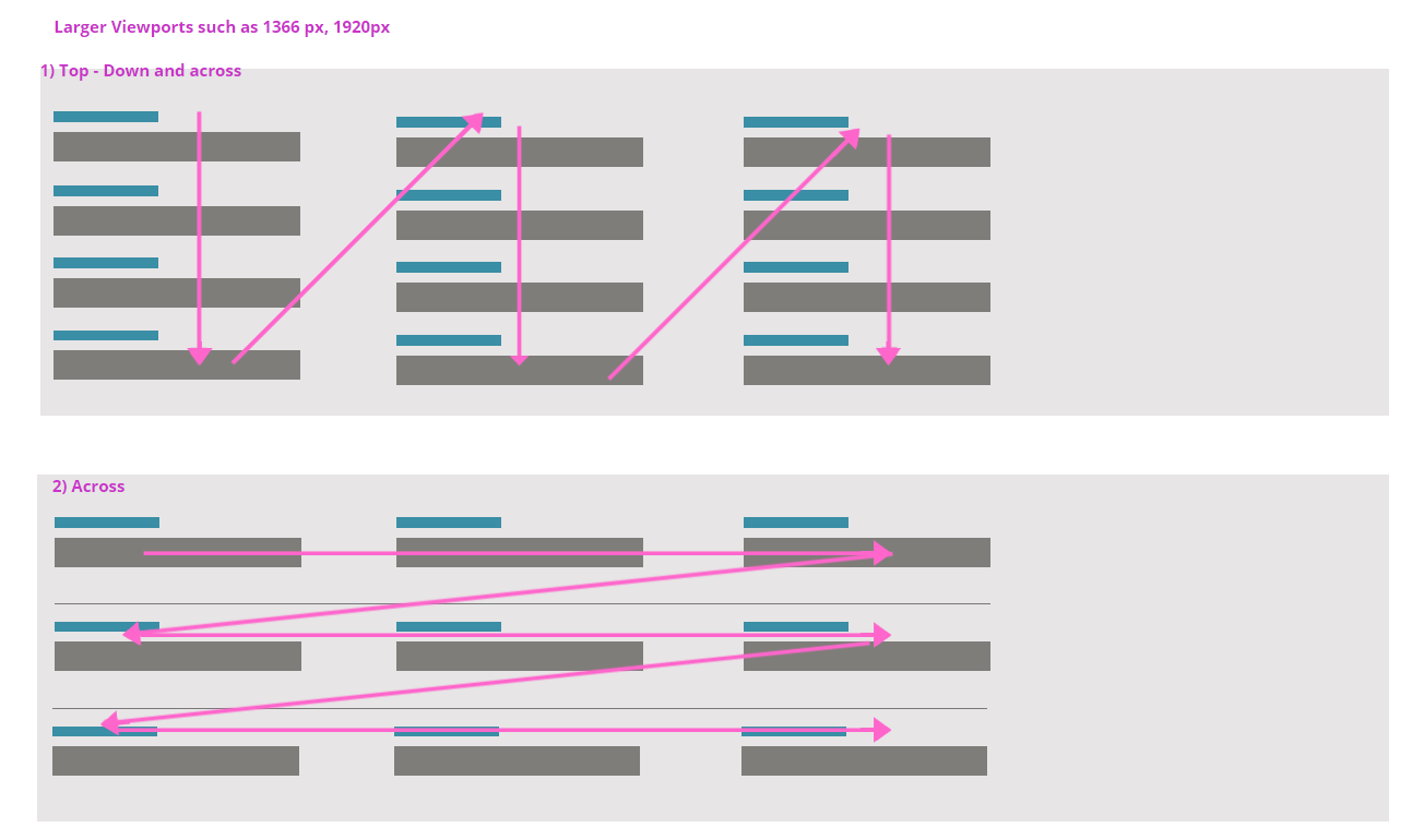
Within the context of Enterprise UX, where the focus of forms is not on conversion rates, but on quick and efficient data input process, which of the following patterns would you recommend for laying out fields/forms. I'm particularly interested in how designers deal with a huge amount of white space in larger view ports when research recommends you to go top-down (3rd option)

enter image description here

enter image description here

P.S. I mention the context of an enterprise UX software, as the user here fills out these forms like 10 times a day. The goal is to optimize it for a frequent user, rather than to entice a one-time user to fill a form.

1
  • 1
    This is good question and very actual even it is some years old. For enterprise apps with big forms on large desktop screen (HD, 4k,...) when there is no need for mobile version is more and more relevant. And there is still no satisfying solution. Commented Feb 14, 2020 at 17:25

2 Answers 2

1

You would definitely go with example #2 then. When users frequent a form of this nature on a regular basis you have to factor in how they scan the form and how they interact with it. A key part of a form like this is that users like to tab through the form to input faster. It's far more natural and efficient to use example #2 in that manner because users are expecting the form to read like a book.

Just make sure that you group your inputs in a manner that flows well - and in a manner that the targeted user anticipates. Remember that when the user is filling out the form they have a specific grouping of elements that they're thinking about as well. It's all based on the task they're currently performing. Make sure you interview them and gain insight into what those groupings are.

Summary: I've designed a lot of these forms for enterprise financial companies that perform audits, etc. Example #2 is the pattern that's worked best.

1

If you're interested in option 3 because it's the most similar to a spreadsheet's operation, and that that's the most common enterprise activity (with computers), then the design question on white space becomes interesting.

It could best be used to provide context and relevant commentary on the currently selected form field.

If the device it's targeting (PC, Mac, iPad etc) is capable of scaling windows, then it's important to leave the right side white space blank so the user can scale the window to see and do other things in that space with another app. Probably youtube ;)

Your Answer

By clicking “Post Your Answer”, you agree to our terms of service and acknowledge you have read our privacy policy.

Not the answer you're looking for? Browse other questions tagged or ask your own question.