1

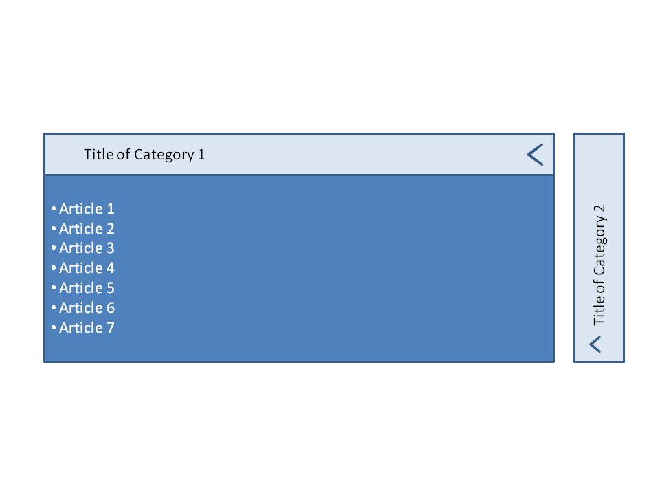
I'm designing a website and have a section which contains two categories. These two categories work like a slider (or a horizontal accordion). The default state is the two categories are represented by an image each and the title of the category. When i click on the category, it will slide out to occupy 85% of the page width and will display the articles within that category.

My question is 1. Has anyone seen anything like this before? So i can reference how they do it? Looking for design clues/ UX hints, etc. I tried looking around but didn't find anything similar. 2. Any best practices or ideas for this method of implementation that I should know?

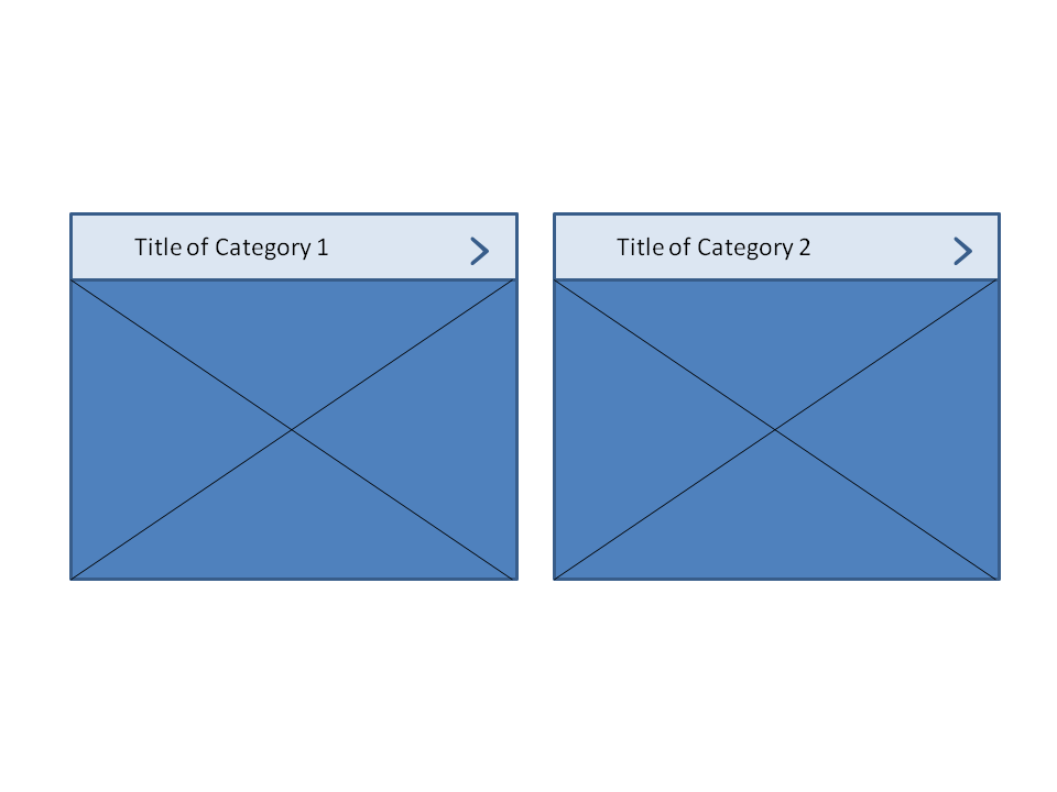
Default state

On clicking the category, it slides out

2
  • 3
    Thinking of responsive, what happens when it is viewed on a small screen? Chances are it has to fall back to a standard accordion, so is the complexity of adding this non standard control really beneficial? Also the closed panel title being vertical on and then rotating or "flashing" to horizontal makes me think way too much as a user.
    – Varedis
    Commented Aug 19, 2015 at 8:42
  • Yes, on mobile I was thinking of making it a standard accordion. On desktop, I feel that the images used in the background make it more visually appealing. The text changing from horizontal to vertical - yes, thanks for that input. My thinking was that I should display the title of the category, even when it is closed.
    – user71258
    Commented Aug 19, 2015 at 8:46

1 Answer 1

1

It is not something that I have seen. One thing to keep in mind is that if you implement an uncommon feature on your site then you're asking users to learn a new mechanic and are increasing their cognitive load (perhaps unnecessarily).

If it's only 2 categories, why not just have them both expanded from the start? If there were numerous categories I could see a need for condensing your content, but here you're asking the user to click more than they need to since your content is already limited. It has been proven that users are willing to scroll and, even though you're not sending users to another page, this article talks about how users would rather scroll than click.

Your Answer

By clicking “Post Your Answer”, you agree to our terms of service and acknowledge you have read our privacy policy.

Not the answer you're looking for? Browse other questions tagged or ask your own question.