0

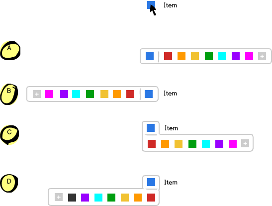
I am working on a list of item with a color picker for each and I wonder where is the best place to deploy the color list.

  • A : in line (above)
  • B : in line (behind)
  • C : Under
  • D : Under and behind

According to your experience is there a better solution than the others ?
enter image description here

1
  • It's difficult to answer this without some idea of what the design constraints are. Is this for desktop-only? Are there horizontal or vertical space constraints? Does the order of the colors matter?
    – tohster
    Commented May 4, 2015 at 13:52

2 Answers 2

4

Put it in a grid 3x3 below. It will be much easier to handle - you will shorten the distance. Take a look at photoshop swatches for order. Also consider names for colors on roll over / title="red" - 10% of males are color-blind.

1
  • Not only does it shorten the distance, it makes selecting a colour much easier. Keeping your cursor in a horizontal bar while moving is not really easy and can lead to frustration when there is no delay on the RollOut function.
    – Ruudt
    Commented May 4, 2015 at 14:24
0

I would say option A(or B).

  1. It's a good visualization of which colors is available and that it's connected to the color selected by the user.
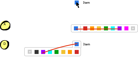
  2. The mouse movement for selecting another color is way better for this option compared to for example option C or D. Moving the mouse straight to the right(preferred by me as a right handed person) or to the left is easier and more intuitive than moving it down and right/left.
  3. The risk of moving the mouse out of the color picker is greater if the movement includes up/down movements, as shown in this picture:Mouse Movement

Your Answer

By clicking “Post Your Answer”, you agree to our terms of service and acknowledge you have read our privacy policy.

Not the answer you're looking for? Browse other questions tagged or ask your own question.