5

TL;DR:

If you don't care about the context of my question, you can jump down to the images, under "Question."


Background

I'm modifying an exeisting web application--think "social network," although it's not exactly--to work with AngularJS.

For those not aware, Angular (does a bunch of things, but most relevantly) separates the transfer of data from the transfer of HTML. For those who are aware, I'm really not using Angular to its fullest potential, because each page lives on its own, rather than writing it as a full-on single-page application. I'm aware of that.

Consequences

Because of the way Angular is working in my setup, the page load is essentially divided into three stages. I'll shadow each with an overly-simplified, hypothetical example of what it might look like.

  1. HTML is loaded, including not-so-pretty template code.

Profile's first name: {{ profile.FirstName }}

  1. Angular parses the HTML and removes those template code, and begins an HTTP request to grab data.

Profile's first name:

  1. Data is retrieved and injected into the page.

Profile's first name: Matthew

Problem

As you can see, the first and second steps might be confusing to a user. The first is obviously the most unacceptable of all, but even the second doesn't look very nice.

It's worth noting that theoretically, these steps will happen very quickly. I'm going to throw a ton of caching (server- and client-side) at it (particularly at templates), so I should realistically only be looking at the second step for a fraction of a second for most users. My concern stems primarily for users with low-bandwidth, who might experience delays when waiting for data to be pulled down.

Already Decided

The first step is not dependent on network, since it's just a matter of Angular getting situated (rather, it's dependent, but only on pulling down static JavaScript files, nothing too serious or time-consuming). A standard solution to it is to apply a display: none on the element until Angular understands it. Angular has native support for this, and I'm pretty happy with it, particularly since it's generally just a brief flash. In any event, that's way better than showing raw template code.

As such, my question is centric only on step 2.

Question

Phew, have I talked enough yet? (no, I promise that's not the question)

For step 2, is it more confusing to show users a completely blank page (less the navigation bar), or to show empty templates?

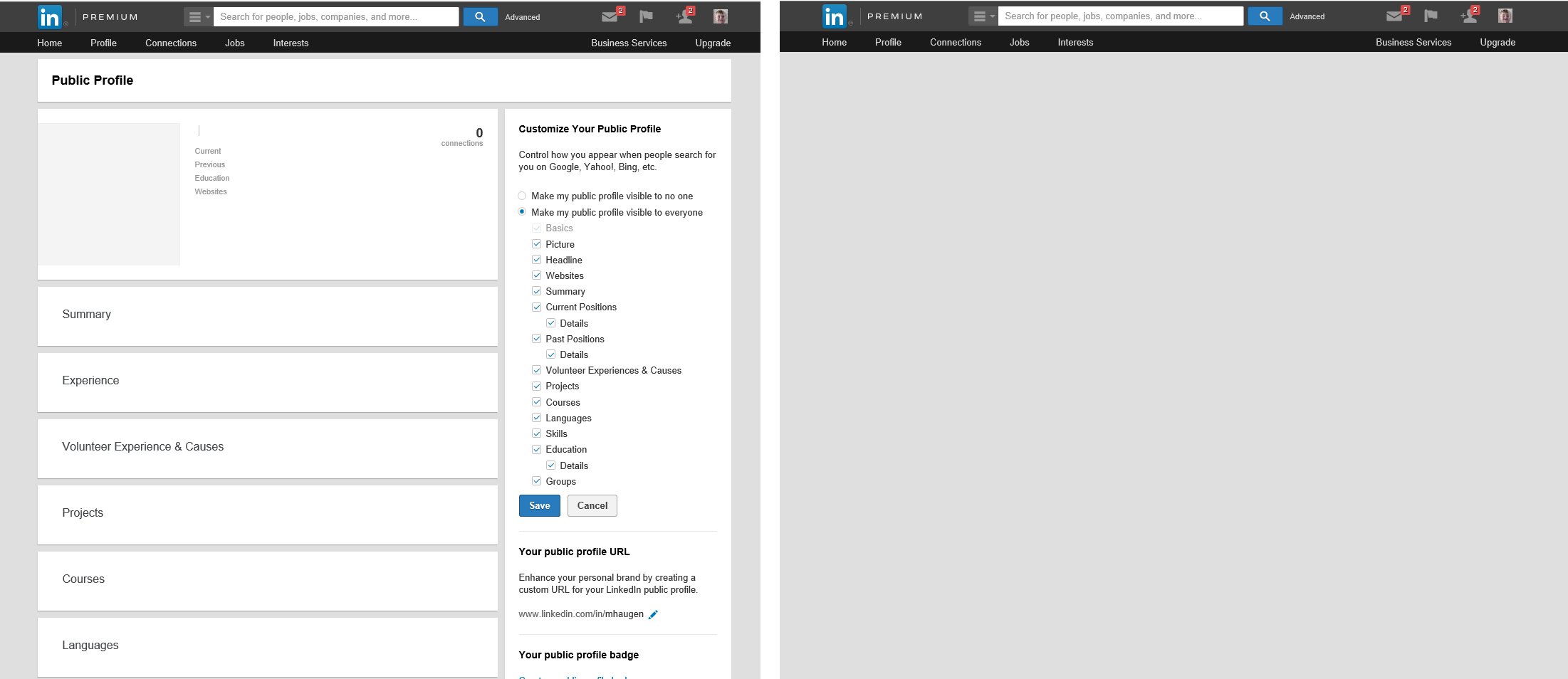
To more clearly illustrate the problem, I modified the HTML on my LinkedIn public profile page to show examples.

LinkedIn Examples

On the left, you see empty templates. This is what I explained in my example for step 2 above. The example isn't perfect, since there is some data still there, but I hope you see my point.

On the right, you see the "empty templates" CSS'd away. Only the navigation element is visible.

Concerns

I don't love either of these solutions, but I think they're the only options.

I should reiterate: this is only a problem for users with slow internet, or in cases where my backend are slower than anticipated. For most users, it will hopefully be just a flash by. It's also worth noting, although not directly relevant here, I intend to add some subtle animations as the data populates.

The way I see it, the first example:

  • could confuse a user into thinking a profile was completely empty.
  • causes the least "flashiness," because only some text is being injected, rather than changing from a blank screen to a fully populated one.

And the second example:

  • could confuse a user into thinking the page wasn't found at all.
  • more closely mimics classical behavior, since the whole page "loads" at once.

Potential Solutions

I'm leaning toward the second (right image) solution, to hide all content before the data is injected into it.

I played with showing a loading animation, but I found that such an image, even weighing only a few KB, takes nearly as long as the data to load, so it went blank, waits a moment, then loads the image and loads the data in quick succession, so the image didn't even have time to get situated.

I also thought about showing text (which transfers easily, of course) that says "loading," but I'd worry that a user on a quick connection would think they missed something if text showed up more quickly than they could read it.

I've also thought about hiding the navigation bar in addition to the unloaded content. I defaulted against it because I want the user to understand that the page is there and loading (rather than just showing a white page), but perhaps that's not the right decision.

3
  • There is an interesting debate on the merits of deliberating introducing delays that could address one concern, and also whether people do expect everything to be loaded on the page at the same time - such as when viewing pages on a mobile phone.
    – Michael Lai
    Commented Jan 7, 2015 at 2:42
  • Hi - I must admit I'm not 100% sure what's being asked. I think I understand it and the only question I have is whether these delays happen on initial load of the page or after submission of each field?
    – DLM
    Commented Jan 7, 2015 at 9:44
  • Show the 2nd screen but with a text 'loading..." while waiting for the content to be loaded.
    – Ades
    Commented Sep 26, 2017 at 7:25

4 Answers 4

7

One of the key usability heuristics is: Visibility of system status - The system should always keep users informed about what is going on, through appropriate feedback within reasonable time.

And from Luke W:

Conventional wisdom tells us that when things are going to take a while, we should let people know. In most mobile applications that translates to adding progress bars or spinners when something is happening or loading. While the intentions behind these progress indicators are good, the end result can actually turn out to be bad. It can be bad because progress indicators by definition call attention to the fact that someone needs to wait. It’s like watching the clock tick down -when you do, time seems to go slower.

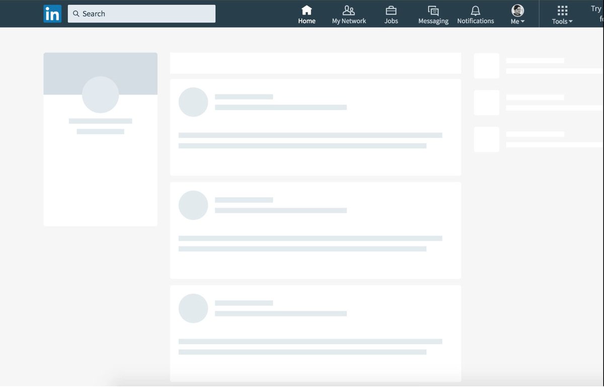
Have you read about Skeleton Screens at all? They come quite close to your left screenshot - they show the structure of the page with the content blanked out while it is loading.

Example of a skeleton screen - website mockup

With a skeleton screen, the focus is on content being loaded not the fact that its loading and that’s real progress.

These screens help the user by telling them something is happening - they don't have to guess whether the page has worked or not. Combined with a subtle animation, you can give the user good visual feedback about what's happening.

Perhaps you can utilise this technique for your site?

1
  • 1
    thanks for the image, i was just trying to put a name to the technique
    – pcnate
    Commented Feb 9, 2018 at 19:06
2

I'm also building an Angular app at the moment and have some experience with this problem. I also have someone on the team who isn't really aware of what's going on with Angular who I can show the UI to on a regular basis. Often times I change things and show him to see his reaction.

  • When I tried showing the template and allowing values to populate when the data arrived responses were something like 'I see the page but there's no values....Oh wait no I see stuff now!'
  • When I tried showing everything at once responses were like 'I don't see anything. I think it's broken. Oh wait I see stuff now!'
  • When I added a loading screen response was 'I see a loading screen....aaaannd now I see data'

Loading screens may take a second to load and they may add a little extra work but what people are thinking is very much in line with what is happening. There's no doubt or uncertainty like with the other approaches.

That being said I don't think a loading screen is the only option. What's really important here is not showing a template with no data and not showing a blank screen, both of which the user will likely interpret as 'it's broken'. I think an alternative to a loading screen might be adjusting the opacity of the empty template to indicate it's in a transitioning state.

1
  • Agreed. It's almost always best to give users feedback about system delays. If the animation takes too long ... make it lighter. Commented Feb 6, 2015 at 21:18
0

Based on my understanding of the question, I would say that as a usability professional the key to your question is how to best understanding your user base. There are a lot of questions here - how will users react to seeing an empty profile? How long will users wait? Will users understand the premise of what's going on? Will they be frustrated?

You are assuming everything at once, here. I can give you my recommendation based on experience, but ultimately you need to be testing. Get a solution that works with you, based on the fact that you clearly know what you are doing, AB test it. Get your recommended solution then go it at against another solution.

For me the key was here:

I played with showing a loading animation, but I found that such an image, even weighing only a few KB, takes nearly as long as the data to load, so it went blank, waits a moment, then loads the image and loads the data in quick succession, so the image didn't even have time to get situated.

How long are we talking the page load to be? Ultimately the loader indicates a page load is happening and therefore users, if they want to complete their objective, will wait for this page load. You can be creative (http://tympanus.net/codrops/2013/09/18/creative-loading-effects/) minimalist, or current (http://ricostacruz.com/nprogress/) but ultimately don't be scared of a progress bar. Yes it adds more weight and therefore time to a page, but surely this is being honest with the user up front explaining they may have to wait for the page to load rather than assuming one or the other scenarios above?

Then test. Test like your life depended on it. And let me know the results.

1
  • Progress indicators don't have to be images, they can be built simply with CSS which allows them to be shown very early in the loading process. Commented Jan 8, 2015 at 15:10
0

Displaying empty states The most basic empty state displays a non-interactive image and a text tagline.

Use an image that:

  • Is subtle and neutral with respect to the background
  • Conveys the purpose and potential of the app in a lively way, such as your app's icon

Include a tagline that:

  • Has a positive tone
  • Is consistent with your brand
  • Conveys the purpose of the app without appearing to be actionable

Your Answer

By clicking “Post Your Answer”, you agree to our terms of service and acknowledge you have read our privacy policy.

Not the answer you're looking for? Browse other questions tagged or ask your own question.