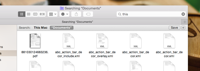
The design requires to have two search bars in one page, one for global search and one for that specific section the user currently is in. Visually, its not appealing to have two search bars but functionally we must have it. What is the best way to go about?
3 Answers
You're right, having two search bars isn't just, not visually appealing, it also can be a little confusing. You can try displaying options of where to search after the user has actually clicked on the search field/button, something like

How about one search field and two search buttons, one for the global search and the other one for the current section?
Another way to do that that could be worthwhile considering is using some sort of selector, before the search field, to explain the search being made. This is the way Amazon support searches. To be honest, Amazon has a number of sections and not only two so maybe the type of control / visuals could be different.

-
1What happens if someone types something in this search box and presses 'enter' on their keyboard though?– JonW ♦Commented Dec 29, 2014 at 15:32
-
Both these answers are correct. Essentially, what you're after is a "search within this section" functionality against a "search entire site" functionality.
Both the options above give a good design solution to this predicament however one is a web based design from an extremely reputable company that has studied and implemented hundreds of thousands of hours of user testing, the other is a software based design.
Assuming you're talking about an online solution, I would recommend the Amazon based approach where you can "search within" a category. This can be further improved dependent on your user requirements with design based solutions.
