3

Hope everyone is well and safe during recent times.

I am currently working on the UX of a searchable web directory for tiny house communities in the US. When someone searches for a community to park their tiny house, they need to be shown a range of filters ranging from culture, village acre size, lifestyle etc. There are 23+ filter categories with each having different sub-options to choose from. Based on my research of different web based directories and search sites, having around 10 filter categories on the left hand side is an ideal number though I could be wrong. I, personally, feel having 23 filter categories on the left hand side can get a bit overwhelming for users. Is there a specific way filter categories can be organized without making the design too busy?

Thanks.

2 Answers 2

3

What about creating an aggregator (or parent category) where you can split those 23 categories in some "groups".

Let's say you have 6 groups and divide those 23 categories on them. Those 6 groups become tabs and the 3 or 4 categories that are under this tab will some labels that represent the titles of their respective subcategories.

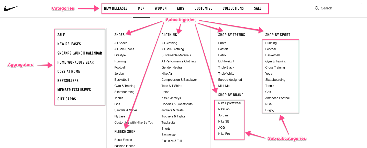
Please see an example how Nike divides their different categories:

enter image description here

In the example above there are two different aggregators, but in your case only one type is enough, and you can choose where to include it, on the left panel or as tabs in the top.

Of course, in this example the idea is to have only one click and browse the type of item desired but I think the idea is valid if we can include some checkboxes that can represent the selection of filters.

1
  • Thanks for answering. This could work but my concern would be there are some sub-filters where one might have to offer a slider (as in pricing or village acre size for instance). This idea can be tested though and see how people behave. Also, people behave probably differently on an online store vis-a-vis a directory/search engine. Commented May 10, 2020 at 3:50
2

I think the best way to do this is to have the left side of the screen just for the filters and have them in a collapsed accordion.

Try grouping the filters in 2 groups:Most & less used filters. This way you can decide which ones are opened by default and the order of your filter.

Here are some link that can help you:

Best UX approach for filtering product categories?

Search/Filter for automotive search

3
  • Hey, thanks for answering. I agree with you. I had two solutions in mind, one which you described (Nordstrom uses a similar approach). However, I was wondering if one should put 'More filters to explore' option as in Nordstrom and then displaying it right there or opening up a modal view and then showing the extra filters? I think it would increase one screen but would probably offer better freedom to users and make the experience more friendly. What's your opinion on this? Again appreciate you taking the time to answer. Commented May 8, 2020 at 6:50
  • 1
    My flow as a user usually is: 1st. Apply filter1. 2nd. Check results. 3rd. Apply filter2. 4th. Check results. And so on. Imagine doing this with a modal, not very efficient. This modal solution can work if you apply this only for less used filters and have the most used filters always showing.
    – Lonut
    Commented May 8, 2020 at 7:17
  • Exactly. That makes perfect sense! Thanks for replying. Hopefully, I will be able to convince the owner with this :) Commented May 8, 2020 at 7:24

Your Answer

By clicking “Post Your Answer”, you agree to our terms of service and acknowledge you have read our privacy policy.

Not the answer you're looking for? Browse other questions tagged or ask your own question.