25

Angle quotes (a.k.a. guillemets) are often used as arrows in pagination and such. For example, this image is from a pagination example on Bootstrap's site:

enter image description here

As a native U.S. English speaker, these symbols look to me like nifty arrows and nothing else, but in many countries they serve as quotation marks. Should they be avoided for that reason?

More specifically, I'm interested in whether native speakers of languages which use angle quotes as quotation marks will perceive their use as arrows, like in the above example, as strange or inappropriate to any degree. Therefore I'm particularly interested in responses from speakers of those languages.

7
  • 1
    Ignoring the HTML character («) for the moment; are they quotation marks that look like arrows, or arrows that look like quotation marks? Put another way, what does a directional arrow look like in other countries/languages/cultures? Commented Oct 21, 2014 at 17:01
  • To clarify, I do recognize, as Mervin Johnsingh points out in his interesting answer below, that various aspects of context will tend to lead users to read the symbols as arrows. Still interested, though, in whether they nevertheless initially register, to any degree, to a native guillemet-as-quote user as quotation marks and are therefore best avoided. Commented Oct 21, 2014 at 17:06
  • @Mark Nugent: germans usually "quote" like this.
    – user56518
    Commented Oct 21, 2014 at 18:47
  • 5
    Screenreaders might say opening quotation mark or something similar. Very confusing when there is no quote.
    – fuxia
    Commented Oct 21, 2014 at 23:23
  • 1
    With so many arrow characters available, why use a non-arrow character? htmlarrows.com/arrows Commented Nov 28, 2016 at 17:17

4 Answers 4

13

Disclaimer: I am not a native speaker of a language which does use guillemets as a way to denote quotes. But I wanted to offer a view on how context can help identify if the content being referenced is a phrase or a case of pagination


I believe there are two aspects to it

  1. I believe this is one of those cases where users can visualize whether a phrase is being referenced or if the site refers to pagination since the design structure enables users to establish the connection.

Taking your own example of bootstrap

enter image description here

The breaking or seperation of content helps establish the differential relationship of the elements within the section and helps establish that is a method of pagination. However if the design had been

<< 1 2 3 4 5 6 >>

Users could potentially get confused since they dont have any distinctive breakpoints to break the assumption that this is a quote.

It also helps that multiple pagination designs follow a similar format helping users establish the connection easily.

enter image description here

enter image description here

enter image description here

enter image description here

enter image description here

Reference : All of these images were referenced from this Smashing magazine article

  1. The positioning : The second aspect which would help users establish the connection is the positioning of the pagination design pattern. Pagination elements are generally positioned at the bottom (with some exceptions being at the top as well) and hence users, as they scan the page will be able to relate to it as a pagination element rather than a phrase since its positioned right at the bottom.

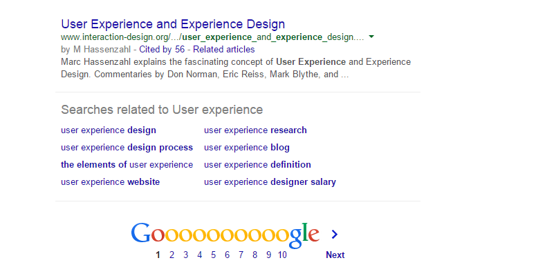
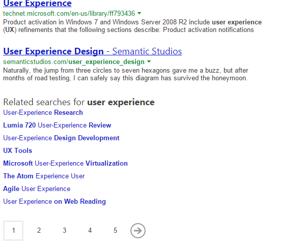
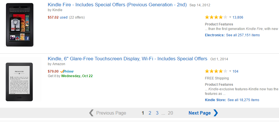
Here are examples from Google, Bing and Amazon with regards to how users would make the association

Google enter image description here

Bing

enter image description here

Amazon

enter image description here

Also taking the above examples, the content type above would also help users make the connection as pagination is generally used to show list views of content.


30 seconds research

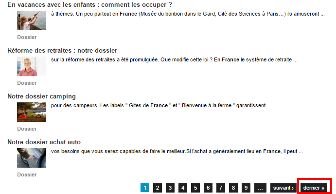
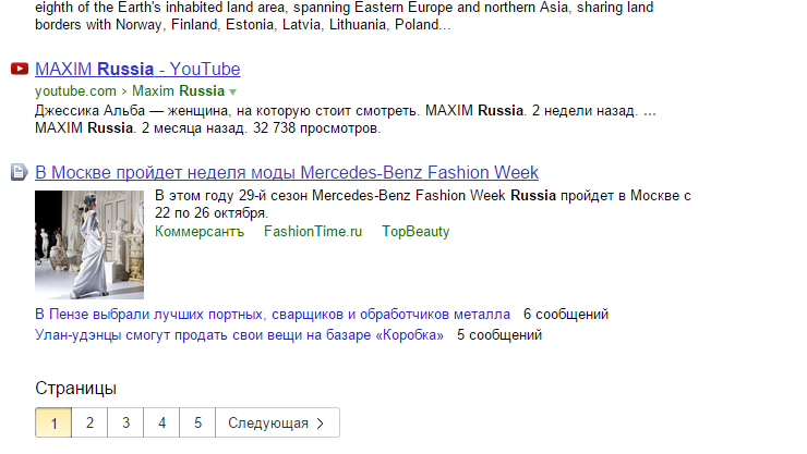
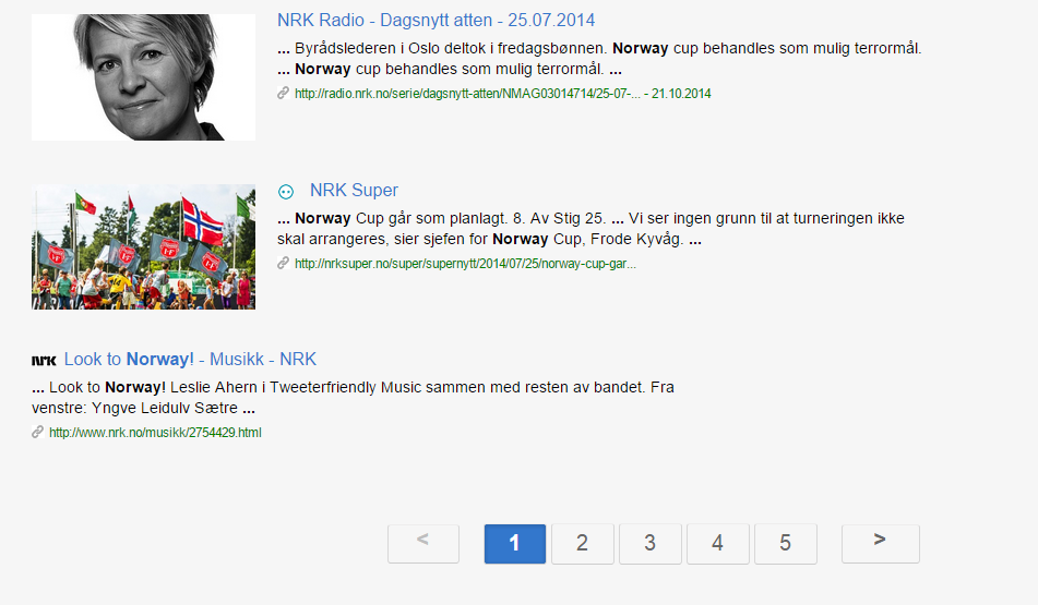
While I would really like to see someone who speaks russian or French to answer this question, I did a quick research to see how french ,Norwegian, Russian sites handle pagination since these two languages (along with numerous others use guillemets)

A french site

enter image description here

Yandex (Russian search site)

enter image description here

Norway

enter image description here

The key theme I could find in this quick research is that while guillemets are not used in the full sense, (refer to the french site example), most pagination methods seem to go to the safer route of just avoiding using chevrons or guillemets and using color and highlights to draw user focus. However this said, this is just a preliminary research and would need to be dug in deeper.

4
  • Thanks, and these are great points. I do recognize that generally, users will be able to deduce that when angle-quotes are being used as arrows in certain situations. Commented Oct 21, 2014 at 16:57
  • 1
    I also see that in one of your examples, angle quotes are used as arrows along with German-language labels ("vorherige"/"nächste"), German being an angle-quote-using language if I'm not wrong. So I guess that argues in favor of them being OK to use. Commented Oct 21, 2014 at 17:11
  • Note: my comment above re: german language convention is apparently wrong per user56518's answer. Commented Oct 21, 2014 at 18:50
  • 4
    Some nuance, because it's a little more complicated than what user56518 suggests. Usually German speakers type "English" quotes because it's what's easiest to type on a German keyboard, but published writing in Germany and Austria use quotes like „this“, ‚this‘, »this« (opposite direction from «French») or ›this‹; whereas Swiss will use the «French» style. Tools like Word corrects this for users, just like it does in “English”. Commented Oct 22, 2014 at 21:57
5

A non-blind user will usually already be familiar with that symbolic usage of « and », and also pairs /, </>, <</>>. Color, size, padding and border can improve the recognizability – your sample image shows the latter two used successfully. Localized text at the open/tall side of the symbols helps even more. If they appeared inside a text run, however, that may lead to problems.

When, several years ago, the Opera browser introduced a navigation aid that discovered “next” links in an HTML document automatically and made them available for the forward function (button and keyboard shortcut), it supported most of the symbolic patterns mentioned above and also knew keywords from several languages that it found in link texts and targets, of course HTML semantics rel=next were supported as well. Similar add-ons are available for other browsers, too. I assume screen readers have similar logic built into them.

As for textual alternatives, the ISO standard arrow symbols for page up and down keys are U+21DE ⇞ and U+21DF ⇟ respectively. Rotated variants are also available in Unicode, U+21FA ⇺ and U+21FB ⇻. Those are unfamiliar to almost everyone, though, and inappropriate since they belong on keytops. You can also find more intuitive symbols for previous and next page, U+2397 ⎗ U+2398 ⎘. These are intended for paged media, though, and not for paginated content where only n items are represented on each page. In media playback, the standard skip backward/forward symbols U+23EE ⏮ and U+23ED ⏭ are similar to horizontal tabulators U+21E4 ⇤ and U+21E5 ⇥ (but quite newly encoded and hardly supported), whereas U+23EA ⏪ and U+23E9 ⏩ (can) mean fast backward/forward. Refrain from using APL symbols like U+2347 ⍇ and U+2348 ⍈ or U+2350 ⍐ and U+2357 ⍗. There are even more Unicode characters with “right-pointing” in their names, but none seems semantically perfect for the job.

However, I always thought that it would be nice to incorporate the next-page symbol into the lower right corner of the paginated content, e.g. <article> in HTML5, as kind of a dog-ear. This is less relevant today, because more content is often dynamically auto-loaded when the view reaches the bottom.

5

In my experience in French, a language that makes common use of guillemets, you would have no confusion using « and » as previous and next page links respectively, and giving the arrows affordance (such as boxing them in the same way as the page numbers, as the examples Mark Nugent provides) would absolutely ensure it.

Your biggest challenge, as others have alluded to, is the semantic meaning of the text. This is especially important for those visually impaired users who won't see the guillemets themselves or the direction they point.

For that, I would recommend providing a rel value to identify the type of link, and a aria-label value to tell screen readers what to say.

Example:

<a href="?p=2" rel="next" aria-label="Next page">&raquo;</a>
0

I would interpret the two arrows as "Advance/Recede 5 pages.", as it is the number of pages you have in that bar.

So, no you should not.

How I see the buttons meaning:

mockup

download bmml source – Wireframes created with Balsamiq Mockups

|< ... >| First ... Last page

<< ... >> Recede ... Advance 5 pages

< ... > Previous ... Next page

Note I used two lesser/greater than symbols instead of guillemots because they are more universal.

3
  • What might be leading you to think that ">>" moves ahead five pages in your example is that there are also ">" and ">|" buttons. If ">>" (or a guillemet) was the only button, I'd assume it navigated to the next page. Commented Jan 10, 2017 at 15:41
  • @KenMohnkern: I would not. They seem a lot like Rewind / Fast Forward buttons of cassette players.
    – sergiol
    Commented Jan 10, 2017 at 16:11
  • You're right, if I was looking at a media playback UI. But this is a pagination widget, so I don't think people will have trouble understanding a symbol pointing to the right in this context. Commented Jan 10, 2017 at 16:15

Your Answer

By clicking “Post Your Answer”, you agree to our terms of service and acknowledge you have read our privacy policy.

Not the answer you're looking for? Browse other questions tagged or ask your own question.