8

I have a requirement as below:

On my page, I have a button, which when clicked will open a popup, kind of modal window ( as shown in the image below). This popup will have information in it related to alarms generated in application. Any no. of alarms can be generated ranging from 0 - 1000 or more which will be displayed in the popup.
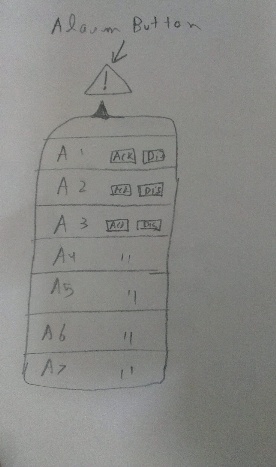
enter image description here

The interaction with each alarm is: 1) 2 buttons on each alarm - Acknowledge and Discard, as in image. User can take action on these 2.

The requirements are : 1) The alarm button will only appear on page, when there are alarms which have been generated in last 30 min.

2) The list, once opened, should also be dynamic, i.e. after opening, if there are more alarms generated, it should append/show in list automatically without user interaction

3) I can only keep 40 alarms at once in popup

4) The new alarms will keep coming on top

Summarized workflow - As soon as alarms are generated, the alarm button will appear on page. User clicks on that, the popover opens with the list of alarms. While the user has ability to take action on individual alarm - Discard or Acknowledge, the list will be getting populated dynamically, in case there are more alarms coming in. Hence the list items will keep moving down.

The problem is that if I have a list which keeps on continuously updating dynamically, how does a user take action on an particular alarm - i.e. either acknowledge it or discard it. For e.g. a user thinks of clicking Discard on an alarm in list, it is possible, that as soon as he goes to click on that button - Discard, that alarm might push down the list because of dynamic updates.

Can anyone suggest, what could be a good UX in this case, the image which I have shown, is just a start of the idea. The content/design inside popup can be totally changed.

5
  • Welcome to the site, @whyAto8. Is there a specific part of the design you're wondering about? Generic interface reviews are off-topic here. Commented Aug 28, 2014 at 16:38
  • @3nafish - yes, the problem is that if I have a list which keeps on continuously updating dynamically, how does a user take action on an particular alarm - i.e. either acknowledge it or discard it. For e.g. a user thinks of clicking Discard on an alarm in list, it is possible, that as soon as he goes to click on that button - Discard, that alarm might push down the list because of dynamic updates.
    – whyAto8
    Commented Aug 28, 2014 at 16:42
  • Ah. You may want to edit your post to contain that information. At the moment, it appears to be more of a request for generic suggestions. Can anyone suggest, what could be a good UX in this case You may also want to clarify {1} is there some reason you can't just add the new alarms to the bottom of the list? (It seems like the longer an alarm has been going off, the more urgent it might become, suggesting that it may make sense to list older ones at the top.) {2} Why do new alarms have to appear in the list while it is open? Commented Aug 28, 2014 at 16:52
  • 1
    I just added more info, as you asked, I hope this would serve better
    – whyAto8
    Commented Aug 28, 2014 at 17:04
  • Do you have a priority of alarms like somethings have to be resolved faster?
    – Mervin
    Commented May 11, 2015 at 16:51

3 Answers 3

2

Never ever update when user is deciding. It is just to frustrate your user while using your app

There is no status when the alarms are generated, how do the user know what alarm was generated at what time

Don't steal control of the selection from user

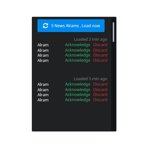
Here is my visual solution

visual solution for alarm problem

1
  • 1
    Though I like @ecc answer, but your visual solution just stole it, this message at top is what i would really want. Thanks for that.
    – whyAto8
    Commented May 12, 2015 at 5:52
4

As a user, I would often find it unnerving if the UI behaved in unexpected ways. Instead of having the new alarms pushed on top, you could consider one of the following:

  1. Show the items beyond the current scroll (I'm assuming the modal window has a scroll?) out of the view of the user; he can then scroll up to see the new alarms. The top border could light up to indicate there is something hiding above.

  2. Show a refresh button or another symbol, warning that new content is available to be shown. Clicking on it would show the new content. An alternative is to have this icon nudge and light up 1 or 2 seconds before the new alarm is shown. This would give the user enough time to be ready.

  3. You could check if the user mouse is hovering that window, and temporarily postpone the update. I have some issues with this one. First, some people are very fast aim and clickers and could click the new alarm. Second, in mobile devices where there is no mouse, you can't guess where the users fingers are.

I hope these are any good ;)

0

It seems like you have a lot going on here. One way to slim down the cognitive overload is to ditch the modal path. If alarms are an important part of the interface, make them persistent. An option to collapse this persistent view is better than forcing everyone to click the button.

With a persistent view, the nature of the dynamic loading (whether top or bottom) will be easier to understand and follow. Dynamic population of modal content can be a little much to process.

Your Answer

By clicking “Post Your Answer”, you agree to our terms of service and acknowledge you have read our privacy policy.

Not the answer you're looking for? Browse other questions tagged or ask your own question.