2

I have been having arguments at work which divided the team on whether or not a data usage graph should start at 100% and decline to 0% showing whats available (option A). Or conversely, start at 0% used and increase showing what has been used (option B).

I was wondering if anyone had any research or opinions on this, as I haven't been able to find anything online... and the opinions are quite strong and polar within the team as to what 'feels' correct has caused and is still causing arguments.

e.g
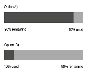
percentage usage graph

EDIT: The context for this is for a user portal on an internet service provider website. So our company sells prepaid (and postpaid) data packages to users, and this graph would be used in the portal (or mobile app) for users to check there remaining data balance.

5 Answers 5

2

"Evidence" of B being right is that both Windows and OS X uses that design:

enter image description here

enter image description here

Note that they both write the amount of empty space because that's what the majority of users are interested in knowing...

Common progress bars works in the same way - I guess the idea is to show "What has been done/What's left to do" or "what's filled/what's empty" ratio

1
  • Thanks, I'll mark this one as the correct answer as it has supplied evidence as opposed to just opinion.
    – Mandrid
    Commented Aug 22, 2014 at 1:44
5

Option B is more appropriate.

Since the usage is about a "storage tank" that is "getting full", and with the Western convention of progress moving from left to right, the experience of option B is consistent with the emotional context.

I'm happy to see that I have only used 10% and have much more space (i.e., progress) on the right before my storage tank needs servicing.

2
  • Thanks. That was my exact reaction as well, I was surprised that people interpreted exactly opposite, although I will admit several of them are close to the internal workings of the system which may be altering there view of whats going on.
    – Mandrid
    Commented Aug 20, 2014 at 0:07
  • I agree with @Evan. However, if forced to use option A, it would make more since if it were vertical with the percent remaining on the bottom thus draining the amount left. Think of the battery display on many phones.
    – FodderZone
    Commented Aug 20, 2014 at 0:48
0

I agree with Evan, but where in the question does it reference a storage tank? He's correct, but it depends on your usage.

If you're talking about battery life, then option A is correct. However, if you're in fact talking about a storage tank, or hard drive space, then option B is correct.

1
  • What the context is (I'll edit the original post) is for a prepaid internet package like you might get at a motel. Theres a few different packages types but a common one would be 1gb of data to consume, and obviously people like to know what they have left.
    – Mandrid
    Commented Aug 20, 2014 at 1:48
0

I agree with both answer's, Also showing "10% or 90% remaining" is useless, we should keep the design as simple as we could and only provide information needed.

Human brains are fast enough to process remaining % then our eyes to take an input from screen process it @brain.

0

I agree that the most important information must be on the left.

I also agree with @Customized, that you do not need both remaining and used, one is enough.

My answer is based on the goal of the users, and according to @Mandrid :

"...people like to know what they have left."

The information the users need is the remaining, so option A is the best option.

Your Answer

By clicking “Post Your Answer”, you agree to our terms of service and acknowledge you have read our privacy policy.

Not the answer you're looking for? Browse other questions tagged or ask your own question.