2

I offer web services such as hosting.

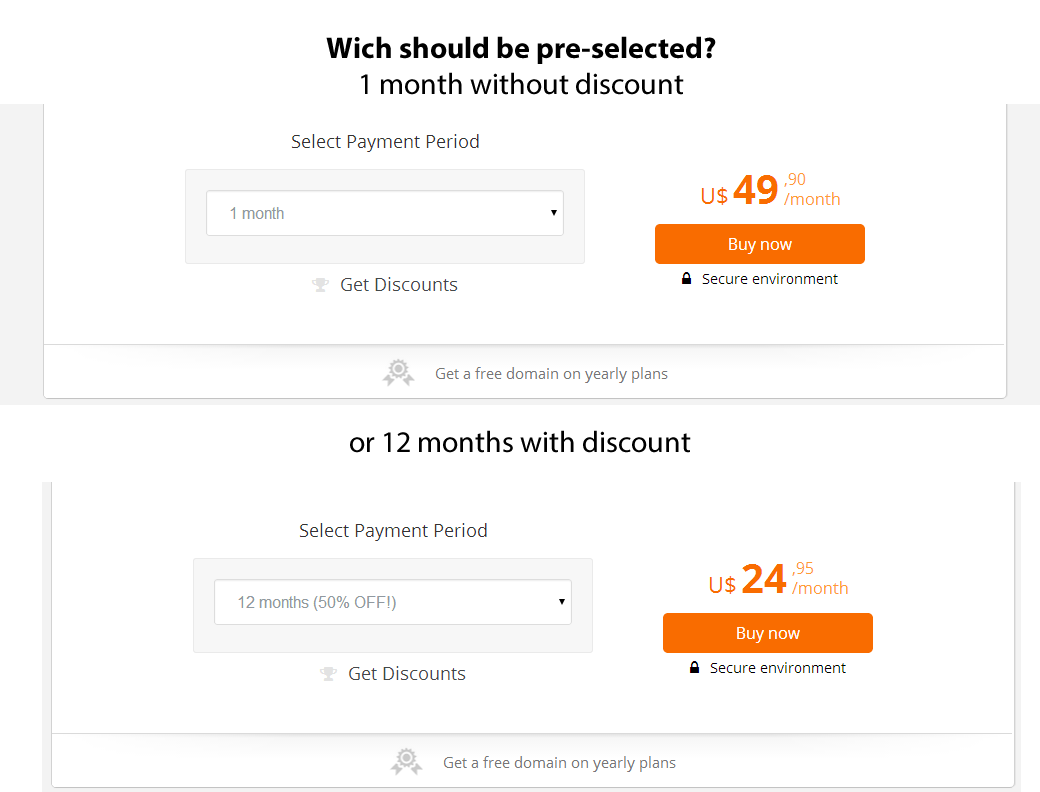
In a <select> field, wich option should be pre-selected? 1 month (without discount), or 12 months (50% off)?

enter image description here

The question might seem kinda obvious, the 12 months should be better - but what if the buyer don't want a whole year with the product, and feel bad for paying it's full price, knowing it could be cheaper, and end up giving up on the purchase?

What do you guys think?

4
  • 5
    I would display both with radio buttons if it can be done cleanly...
    – Andy Boura
    Commented Aug 9, 2014 at 20:39
  • While I agree with @Marvin's answer in general, your specific goals (e.g. more profit margin, greater revenue stability) and the context (is their a free trial option? who is your target customer? - Mom & Pop / SME / Fortune 500 CIO's ) should be included in determining the optimal designs to be A/B tested.
    – Jason A.
    Commented Aug 10, 2014 at 15:42
  • Please do not preselect any of the paying methods. Let the user decide which to take. Chances are that regardless of which default you would come up with, you will have some cancellations especially because of the wrong plan selected. An A/B/C-Test (C being the no-default variant) would get you the most insight if you can afford the possible cancellation costs and reputation drops. Commented Aug 11, 2014 at 13:31
  • A/B test to see which one leads to a higher average visitor value
    – orokusaki
    Commented Nov 4, 2015 at 22:58

3 Answers 3

8

The select field on your screenshot might not be the best solution for selecting the payment period. As a user I don't get a good experience in comparing the alternatives and probably I won't notice that there's an alternative to the very prominent designed orange 49.90/month offer. The problem here is that 50$ per month is a lot if the user wants to use your web service for a year (he can get it for half of the price) and there's no hint that the price/month will decrease when he selects a longer period.

Whenever you already preselect an option the user doesn't have to think about what to choose and he simply won't get informed that there's an alternative to select when clicking on the "Buy now" button.

Let's have a look at the Dropbox plan selection. This solution gives the user the chance to easily notice and compare every payment option and the user himself has to choose one. I think this user interface will fit your scenario, too.
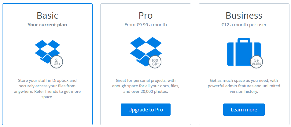
Dropbox plan - www.dropbox.com/plans

I've found an example where radio buttons are used strato.de/linux-root-server. There's a different design used for the english website so I have to show the german one. It's about choosing between no period and 12 months.
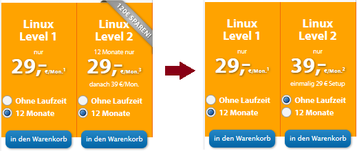
Stratro server selection

1

As it's difficult to recommend one of your suggestions without knowing your users/field etc. I'd say that

it calls out for an A/B Test.

Split your visitors into two groups, show each group one version and track your conversions. That'll almost certainly answer your question which version to take.

1

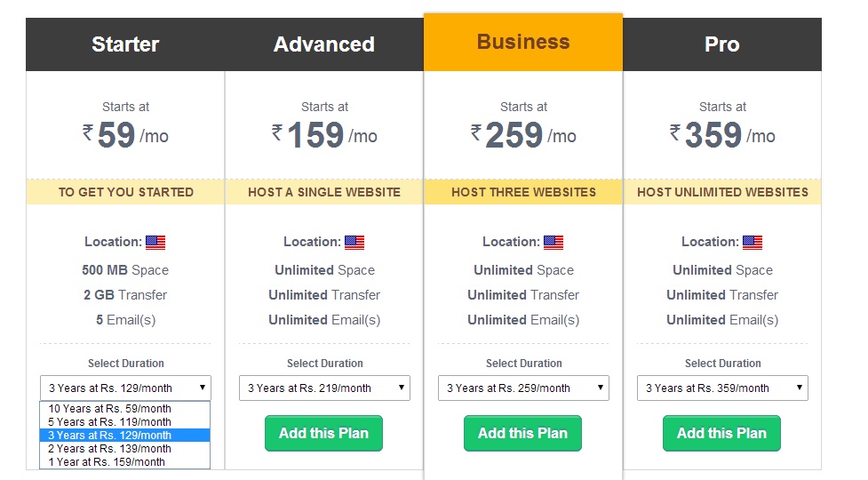
A grid comparing all the options available with the prices is the best solution. enter image description here

Image Source: http://www.bigrock.in/web-hosting/ecommerce-hosting.php

Your select option can hold the different plan prices, making it easier to compare.

Other alternative would be, using the existing layout and having the monthly option selected along with a link (In a prime area. Just below the "Buy Now" possibly.) saying, "Cheaper alternative plans available".

Not the answer you're looking for? Browse other questions tagged or ask your own question.