25

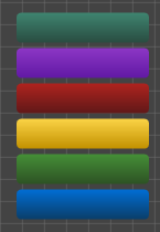
I'm not a graphic designer, and I can't afford one for my open source project, so I thought I'd crowdsource this one. I'm trying to work out a set of 6-8 easily-differentiable colors for categories in my app. Here's what I have so far (and yeah, it sucks -- it's why I'm asking):
alt text

Choosing the obvious primary colors #FF0000, #00FF00, #0000FF, #FFFF00, #FF00FF, and #00FFFF looks jarring -- yes, they are easily differentiable, but at the price of being absolutely horrid.

Are there any resources on choosing a set of colors? There are many, many resources for choosing a color scheme, but these are at most 3 colors, some more "primary" than others.

1

5 Answers 5

7

If you are looking for strong colors to differentiate categories I would suggest looking at other apps with the same functionality.

I don't think there is any IP issues with color palettes.

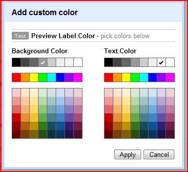
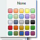
So for example here are the category colors from Outlook 2007

Outlook 2007 Category Colors

and here are the label colors from Gmail

Google Label Colors

3
  • Thanks; this is what I'll probably end up doing ;-P. Might steal the MS office app colors; each one has strong branding (word=blue, excel=green, infopath=purple) and there's a whole gradient for each rather than just one color Commented Aug 19, 2010 at 19:56
  • There can be IP issues with something as simple as a colour palette. The colour palette used by the seePOWER data visualization engine for heat-maps was patented. While Compudigm, the vendor I worked for, is now defunct, that patent is still around - it was one of Compudigms key pieces of IP.
    – Bevan
    Commented Nov 1, 2010 at 18:15
  • You could also look at the gmail labels color palette or the google calendars color palette. Most of their default colors work well.
    – Tauren
    Commented Nov 4, 2010 at 11:37
51

Beyond just suggesting places like Adobe Kuler, ColourLovers, Color Scheme Designer, ColorMatch5K ColorJack, and ColorStream (iPhone app), you may benefit from learning about color theory and why and how colors should be combined and chosen. Here are some useful resources:

Also relevant is the psychology and meanings behind choosing colors:

One other consideration is making sure that the colors work for colorblind users. See the following for more:

To avoid information overload, for your project, I'd recommend something like the following workflow:

  1. Write down a list of words and concepts that you want to describe your project, i.e. how you want it to be perceived. Examples would be: professional, edgy, soft, comforting, reliable, etc.
  2. Look up 1-3 colors that represent some of the most important concepts you wish to convey.
  3. Pay special attention to cross-cultural differences for color meanings when selecting your color or colors.
  4. Use one of the classic color scheme types outlined in the resources above to choose your full color palette.
  5. Stick to your color palette. If you add more colors, it can make your project seem just a little "off" or cluttered.
  6. Test your color scheme by asking 3-5 users in your target market to use your project or to look at screenshots and then write down how it makes them feel and what perceptions they gain about it, just by looking at it. Then compare the findings to your original word-list. Rework if necessary. Note that factors other than color like layout, copy, etc. may influence their list. To isolate the test users' feelings about the colors, present the color palette only.
5
  • 2
    Excellent answer. I used a color theory cheat sheet that I have hung near my desk to come up with my answer....so why not teach a man to fish? And props for providing a sample workflow also. Commented Aug 18, 2010 at 19:38
  • I've been looking for an answer like this for 2 years now! Thanks ;) Commented Aug 19, 2010 at 8:48
  • This is an excellent & complete answer. However, I'm not looking for a particular color palette for the app -- I'm trying to determine a set of 6-8 colors fro categories, each of equal importance. Commented Aug 19, 2010 at 19:54
  • What a ridiculously great answer. It makes my answer below quiver and shake in embarrassment at how inadequate it is.
    – Rahul
    Commented Aug 24, 2010 at 11:11
  • +1 , brilliant answer and a wealth of good links .. thanks. Commented Oct 14, 2010 at 21:07
7

Adobe's Kuler app is great for this.

1

Hey, I know what you need! You don't need to read theories and lots of articles!!!! you have a program, you want to choose colors for it! simple and easy. here you can do that.

1

colourlovers palettes is a great resource for color palettes. Many if not most of them have ~5 colors. Since you are choosing 6 colors, you could go for the tertiary colors, which are made by mixing a primary color with a secondary color. Yellow-orange, red-purple, red-orange, blue-green, blue-purple and yellow-green are tertiary colors. Check out this site: Color Chart RGB to see a list of some of the different hues available along with their hex values. If you take a look at the column headings, you can see which columns are the tertiary colors.

Not the answer you're looking for? Browse other questions tagged or ask your own question.