1

I am trying to improve the interface of a tool.

Currently, we have 4 popup dialogs which all look the same and have the same functionality. They consist of a list and add/remove buttons and in each popup the users add/remove from the list different kind of items.

Ex: in the first popup they add fruits, in the second beverages etc...

These dialogs are frequently used so I am trying to minimize the time users spend opening and closing the dialogs. Also do you have any suggestions to refactor the current interface; having 4 dialogs which look the same doesn't look like a good thing to me but I don't have much experience in UI design so I came here looking for any suggestions.

The tool is a windows application, and uses standard windows controls.

1 Answer 1

3

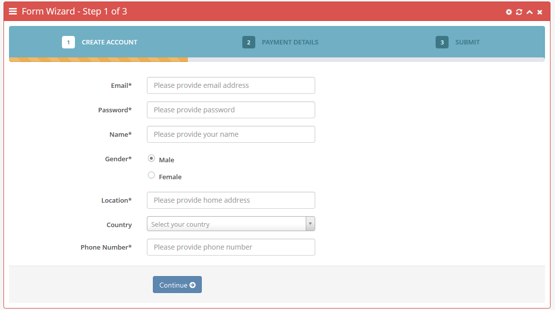
The best way to approach this is usually to do this with a "step / wizard" approach. This would at least let the user know how much more they have left to do. If you have the ability to allow them to go back on some of the steps that would be even better when it comes to user experience.

Here is an example of one I am using. enter image description here

The alternative to having what I posted is to have the options laid out to the left so that if they aren't necessarily steps, they are sections / options. By clicking on the sections on the left, the main content area updates to the content for that section. And if you want to step them through those sections, you can still do so by placing a "Next" button on your modal to step through it.

Your Answer

By clicking “Post Your Answer”, you agree to our terms of service and acknowledge you have read our privacy policy.

Not the answer you're looking for? Browse other questions tagged or ask your own question.