0

I am designing a properties panel for a dashboard with widgets on it. The app is supposed to work as follows:

  1. Users have a dashboard displayed. On the dashboard there are a number of widgets. Each of the widgets has its individual porperties: e.g. round / square corners, shadows, font size etc... They can be adjusted at the moment for each widget by using its own pop up dialogs.
  2. Now - users want to be able to edit the widegts' properties (abt. 15) from the dashboard level. So e.g. if they want to mass change corner style, shadows, color, and a whole bunch of other properties for all the widgets, they do not need to do it widget by widget, but can open a properties panel for "all widgets" and do it from there.

So I designed that dashboard can be used in two modes "normal" and "config". On the dashboard I placed a button called "Settings" which when clicked, displays a panel which contains the "common" properties for all the widgets on the dasboard. The panel expands from the top of the app, pushing the dashboard down a little (see the mockup).

But here I run into a problem - how to present graphically when widghets on the dashboard have "mixed" values, e.g. some are green, some are blue, some have the shadows on and some have them off? My initial thinking was that if that happens I show the controls as "unchecked". And I only check the controls if all the widgets have a given property set to the same value.

enter image description here

But upon further reflection I think that this is going to be quite confusing, so opted for a different approach - showing the options as drop downs and displaying "mixed" in case several options are selected. And if all have the same value, then that value is displayed (e.g. Blue):

enter image description here

TBH I am not terribly happy about it, as it forces me to present even short lists of two elements, or "on/off" controls as drop downs - which requires more clicks to reset.

So my questions are: 1. Do you know of any good practices to show different properties for muiltiple objects graphically?

  1. Do you think the approach w/ drop downs is OK? Is there a better word to use instead of "Mixed"? I am not a native English speaker, so nothing else comes to my mind ...

  2. or maybe I should do some custom logic behind each field and displkay e.g. "On or Off", "Round or Square" instead of "Mixed"?

BTW. If he concept for "all widgets" change will work, I am considering migrating the individual widgets' setup from current pop up dialogs to a similar panel (so there will be a classic multi selection / deselection model).

Thanks

2 Answers 2

1

How many widgets are there? I'm assuming 5 given what you provided.

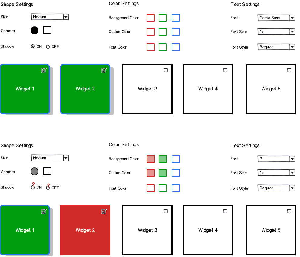
Don't feel obligated to display the data in one format across the board. The display of the data should be relevant to its type. Group editing choices by their "meta" type (ie. form, color, font, behavior, etc.).

Additionally, when multiple widgets are selected, use a scheme that may be familiar to users for indicating differences. I'm using a scheme similar to Photoshop and a few other image editors.

Here's an idea that might get you started.

mockup

download bmml source – Wireframes created with Balsamiq Mockups

Rather than having transparency (Balsamiq doesn't have right triangles), try something like this for multiple widgets with different settings. It should work for both corners and color.

multiple fills

0

Thanks for the examples, they reinforce my thinking that I should put the config options directly on the settings pane as much as I can.

To answer your question - the number of the widgets on dashboard can vary. There can be as few as 2 or three, but there can be e.g. 10 as well. So there may be cases where users will never be able to see all the widgets on screen (regardless if in "use" or "config" modes).

As for the "question marks" / "triangles" - well I have never seen such approach in any application which I have been using... But it might come in handy :)

BTW. I have looked at how Microsoft solves this issue in Excel as well as in Windows 8, and in case of several objects having different property value, they do not mark any of the options. So referring to your example, Microsoft would rather show empty squares / circles. Since the app I am designing will be used primarily on Windows devices, I guess I will go with a similar solution as they have - even though it is far from perfect. But OTOH changing the widgets' properties may be considered an advanced functionality, so we may be able to pull it off without confusing the users too much.

1
  • Microsoft has a lot of inconsistent design patterns. I'd advise against leaving the attributes blank. If they're blank, then how will users know that they've selected items (especially if they're below the fold) when looking the the panel? Anyway, good luck! Would love to see the final product.
    – SwankyLegg
    Commented Mar 6, 2014 at 19:10

Your Answer

By clicking “Post Your Answer”, you agree to our terms of service and acknowledge you have read our privacy policy.

Not the answer you're looking for? Browse other questions tagged or ask your own question.