0

I'm building a CRM, and users have given us feedback to set prospects as being important. The temporary solution we're using is the following:

Image of a prospect being not imported

When you hover over the red icon, it becomes like this (the tooltip says: "set as important")

Hovering

After clicking on it, the button stays red, meaning that the prospect is important

Prospect being important

However, this is not very clear to all users.

What would you consider best practice for setting the importance of something?

Github uses verbs to do this: enter image description here and we like that idea, but there's no word for this (especially in french)

3
  • (/!\ comment in french) Marquer comme important ne convient pas?
    – A.L
    Commented Feb 21, 2014 at 17:49
  • 1
    It's a bit long
    – edi9999
    Commented Feb 22, 2014 at 10:35
  • Worth noting that Gmail also uses Star/Unstar for this purpose. The other similar iconography I can think of is flag/unflag in most email clients.
    – Kit Grose
    Commented Mar 23, 2014 at 22:27

3 Answers 3

1

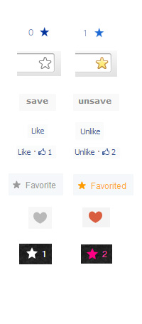
Below is a photo with some examples of favorite icons from major sites across the web. You'll notice that all of them have some common approaches.

  • Incremental counters are present. This serves two purposes. 1) It gives the user a quick reference as to how popular this item is. 2) It gives the user feedback upon complete favorite or un-favorite actions by indicating a change.

  • Icons change states visually to indicate change

  • There can be a mix of icons and language. But icon only approach is, in general, clean and clear.

enter image description here

In your particular case it seems like you are looking for something that you can localize, and icons are a good approach. The STAR icon is pretty universal (as you can see by the examples provided). You also have a good bit of advice from Chairman Meow to move the "high importance" icon closer to actual information.

The use of the "!" is typically reserved for alerts and I would NOT use that to indicate importance in this UI unless your users are expecting this icon as an indication of importance like possibly programmers.

Your CRM may also benefit from an additional Use Case. You could adjust "important" to be "This prospect requires follow-up" making the indicator actionable. Then you can build in another state for your indicator once the prospect has been follow-up with. Something to indicate that this prospect has been follow-up with depending on the overall structure and use of your CRM.

0

First thing I would do is move the "High Importance" icon closer to the actual feedback like to the left of it so user can relate "High Importance" to the feedback.

As to the visual representation of "High Importance", I would keep the exclamation mark as it is used in many programs to indicate importance. For example, Outlook is used widely and they use the exclamation mark to denote important email. But this is a graphic design issue not UX anymore.

1
  • 1
    When I see this icon, especially in red, I think that an error occurred. Very negative. Commented Feb 23, 2014 at 15:15
0

As stated in the post above I would also move the icon closer to the actual feedback. You could also change the system up a bit by putting "Importance Level:" and then color coding for the user to understand exactly what is going on. For example you could have "Set Importance: Green, Yellow, or Red" as an example this could allow you not only to set as important but also what level of priority. Hope this helps.

Your Answer

By clicking “Post Your Answer”, you agree to our terms of service and acknowledge you have read our privacy policy.

Not the answer you're looking for? Browse other questions tagged or ask your own question.