1

After a sudden realization my mobile banking app that I had been using for 2 weeks had a side menu I started to think about how the sandwich icon is used to indicate a side menus existence.

Comm bank app

At first I thought it was due to the offset that it had gone by unnoticed so easily but then I noticed the new stack exchange app has the same offset but I noticed it straight away after installing it and using it for a day

Stack Exchange app

So my question is: Has the shading on the sandwich icon made it draw attention easier or is it the use of the Icon that draws ones eye to the vicinity of the sandwich icon that makes it so easily noticed?

2 Answers 2

4

It might not be the shading that made the difference but the adherence to design guidelines.

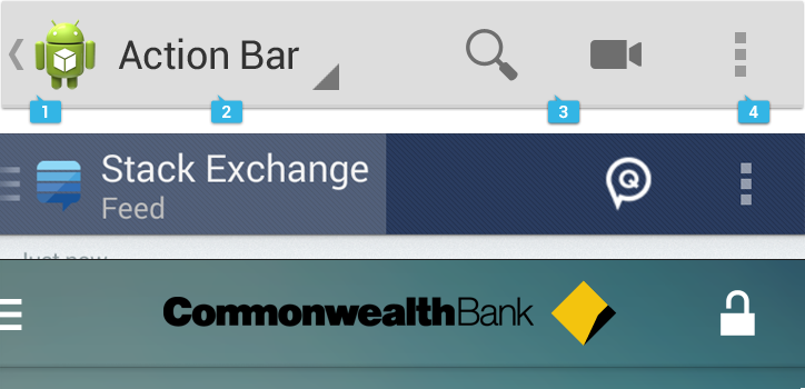
Android's guidelines for the action bar specify the text and branding to be left aligned. This makes for a larger clickable area that is more likely to be noticed and interacted with.

Action bar examples. Guidelines, SE and Commonwealth

As seen in the image, left aligning increases clickable area. So your bank's app could do better by left aligning and thus making the nav drawer more discoverable.

1

This menu is part of the standard elements in the Android design language.

The relevant section in the Android documentation can be found here: http://developer.android.com/design/patterns/navigation-drawer.html

Why they have done this, I am not too sure. Personally I find it very pleasing to the eye. Plus it leaves extra space for text.

Your Answer

By clicking “Post Your Answer”, you agree to our terms of service and acknowledge you have read our privacy policy.

Not the answer you're looking for? Browse other questions tagged or ask your own question.