0

It seems that placing a tab bar within a navigation controller is a bit unkosher and maybe a bad idea in most cases. But I am still considering doing it my app might be a special case.

I am putting together a real estate investment app and it will do two things:

  1. Evaluate a potential buy fix and sell property by calculating potential profit.
  2. Provide a utility to manage the rehab project once the property is bought.

It's sort of two apps in one. The opening screen would be a UINavController that asks the user if they want to evaluate a property or manage a property. If they tap manage a property it would take them to a tab controller with tabs for budget, repairs, to-do list and notes. The user would be able to navigate away from the tab controller if they go back to the main screen.

Does that sound like a reasonable ueser experience?

2 Answers 2

1

Tabs are common in iOS. It's just that they are on the bottom.

I think you can achieve your goals using the common approach. The navigation is normally found within the tab, though, not the other way around.

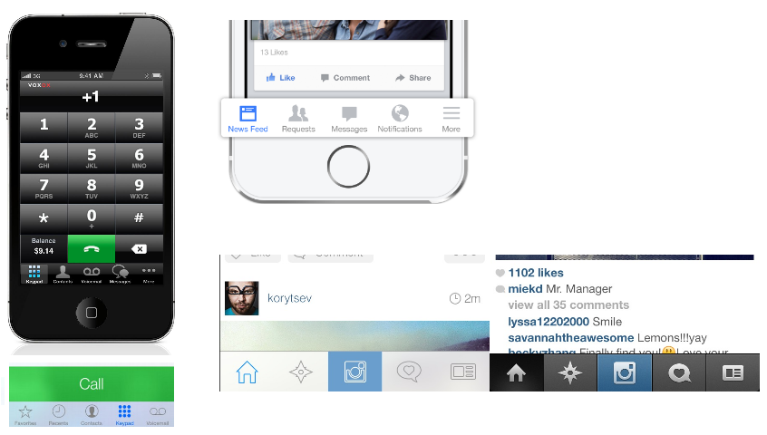
Here are some examples: Phone, Facebook and Instagram, with tabs often featuring what could be considered "two apps in one". Just look at the Num Pad and the Contacts, which in fact is an app of its own. Or Facebook's News Feed vs its Messages. enter image description here

0

Indeed is true that in iOS the most common navigation component is the Tab Bar (at the bottom of the screen). Also is true that it does his job properly. But personally I got really tired of this navigation.

If I understood well, you have a screen with a UINavController (I guess is a header on the top) and 2 buttons to go to evaluate a property or manage a property. And inside of manage a property you will get the Tab Bar to navigate between the four elements can be managed.

If it's like this, the Tab Bar can be a good approach even with the fact of suddenly a new navigation appears when enter in a screen. I don't know how many items are inside of this sections, but if there are just a couple of them you can always group them if it's a "settings" screen (also standard practice in iOS). Or maybe implement a custom "menu" on the side.

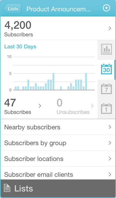
Another menu I really love is the one from MailChimp (you will need to download the app to see it): enter image description here

Your Answer

By clicking “Post Your Answer”, you agree to our terms of service and acknowledge you have read our privacy policy.

Not the answer you're looking for? Browse other questions tagged or ask your own question.