There are serious usability flaws in the placement of your buttons that none of these answers address.
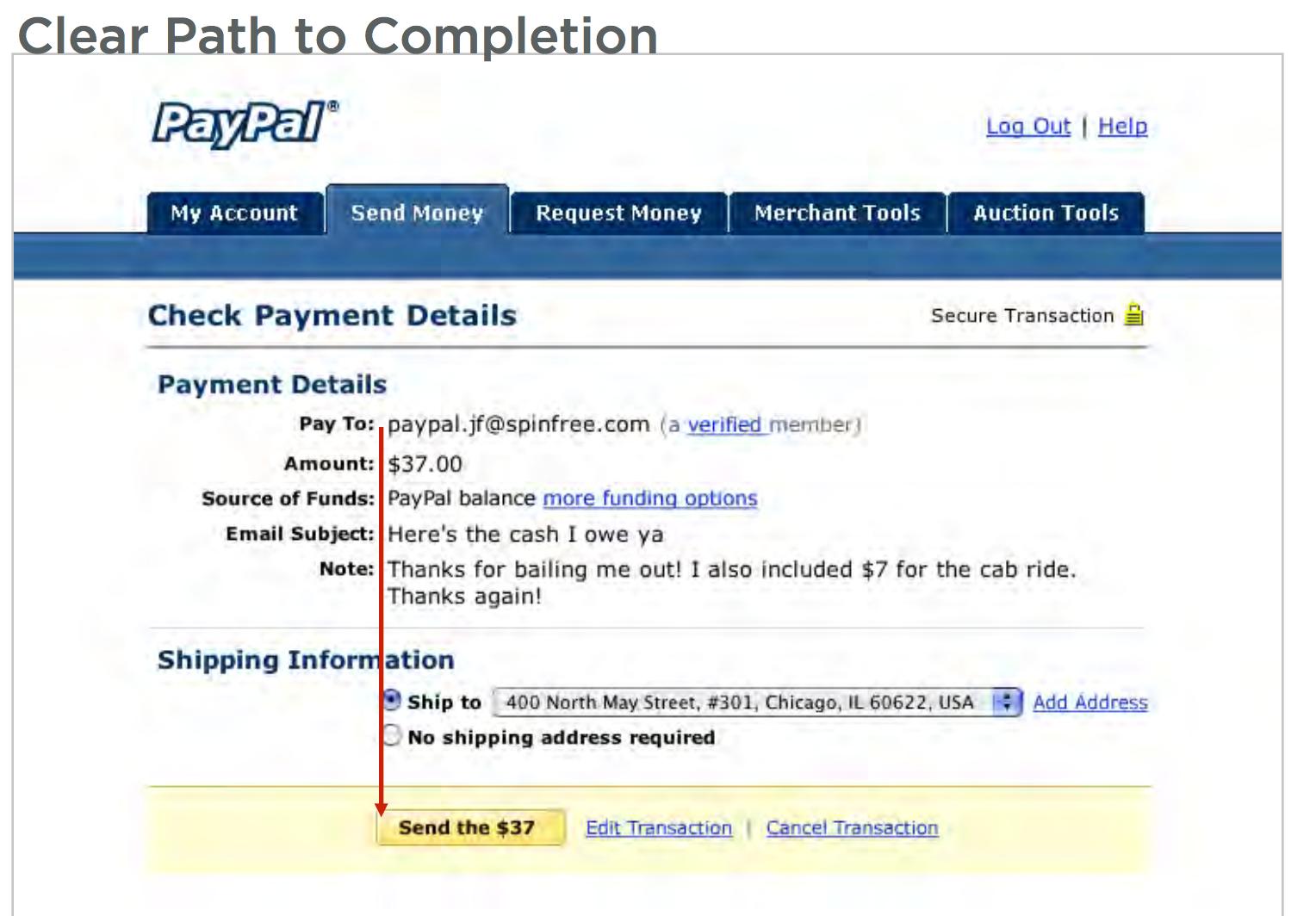
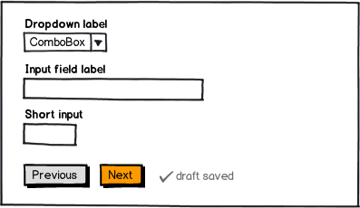
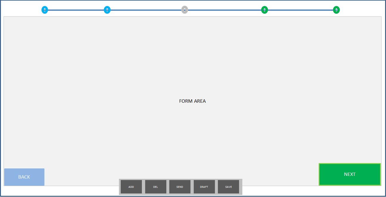
Your Next and Previous buttons are too close together. Users can click one when they mean the other on accident. You should use directional mapping and place the next button to the right. This is what users expect and are used to when they paginate and it helps prevent clicking mistakes.
Your previous button looks disabled. Not sure if it's disabled in the image, but a non-disabled previous button should have more color contrast so that it looks active.
Your Save Draft link sticks out like a sore thumb. It looks like you ran out of ideas where to put it so you haphazardly slapped it on at the end.
Clicking the Next button should take users to the next page, but also automatically save the user's progress without forcing the user to manually click Save Draft. You can let the user know this occurs by displaying a "Your information has been saved" notification whenever the user presses Next.
It's not necessary to offer a Save Draft button if you have the above in place. You could motivate users to get to the next page before they leave the form.
But if each of your form pages have many fields, a user might need to leave in the middle of the form before clicking Next. In this case, you can offer a Save Draft button. It should be a neutral button placed next to the Next button.
Here's an article on buttons that every designer should read:
http://uxmovement.com/buttons/how-button-color-contrast-guides-users-to-action/


