Commonmark migration
Source Link

Button alignment

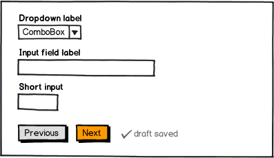
#Button alignment LeftLeft aligned buttons do have several advantages:

  • fits forms structured with left or top aligned labels
  • no guessing where to position the button on a wide screen
  • works well on mobile

#Button prioritization

Button prioritization

  • assuming most users complete the entire process in one session Next is the primary action and should be highlighted as such
  • Previous is secondary, i.e. should be grey (or even a link)

#Save draft

Save draft

  • Can be a nice and convenient feature if the form is very long or there's a reason why users would want to save
  • Save also requires some thought: how do users save, what is displayed during saving the input and what is shown as a confirmation? Can they save again? How do they access a saved form afterwards?
  • If you can afford it I'd suggest to consider auto-saving the form (see composing emails in Gmail as an example)
mockup

download bmml source – Wireframes created with Balsamiq Mockups

#Button alignment Left aligned buttons do have several advantages:

  • fits forms structured with left or top aligned labels
  • no guessing where to position the button on a wide screen
  • works well on mobile

#Button prioritization

  • assuming most users complete the entire process in one session Next is the primary action and should be highlighted as such
  • Previous is secondary, i.e. should be grey (or even a link)

#Save draft

  • Can be a nice and convenient feature if the form is very long or there's a reason why users would want to save
  • Save also requires some thought: how do users save, what is displayed during saving the input and what is shown as a confirmation? Can they save again? How do they access a saved form afterwards?
  • If you can afford it I'd suggest to consider auto-saving the form (see composing emails in Gmail as an example)

mockup

download bmml source – Wireframes created with Balsamiq Mockups

Button alignment

Left aligned buttons do have several advantages:

  • fits forms structured with left or top aligned labels
  • no guessing where to position the button on a wide screen
  • works well on mobile

Button prioritization

  • assuming most users complete the entire process in one session Next is the primary action and should be highlighted as such
  • Previous is secondary, i.e. should be grey (or even a link)

Save draft

  • Can be a nice and convenient feature if the form is very long or there's a reason why users would want to save
  • Save also requires some thought: how do users save, what is displayed during saving the input and what is shown as a confirmation? Can they save again? How do they access a saved form afterwards?
  • If you can afford it I'd suggest to consider auto-saving the form (see composing emails in Gmail as an example)

mockup

download bmml source – Wireframes created with Balsamiq Mockups

Source Link
greenforest
  • 8.8k
  • 5
  • 39
  • 56

#Button alignment Left aligned buttons do have several advantages:

  • fits forms structured with left or top aligned labels
  • no guessing where to position the button on a wide screen
  • works well on mobile

#Button prioritization

  • assuming most users complete the entire process in one session Next is the primary action and should be highlighted as such
  • Previous is secondary, i.e. should be grey (or even a link)

#Save draft

  • Can be a nice and convenient feature if the form is very long or there's a reason why users would want to save
  • Save also requires some thought: how do users save, what is displayed during saving the input and what is shown as a confirmation? Can they save again? How do they access a saved form afterwards?
  • If you can afford it I'd suggest to consider auto-saving the form (see composing emails in Gmail as an example)

mockup

download bmml source – Wireframes created with Balsamiq Mockups