18

I am working with a big table with 20 columns and a lot of information.

I know that the most common way to indicate that a column is sortable is by adding a little arrow at the right or left of the column header.

My problem is that I don't have enough space to add an arrow per column (I really don't) and that's why I am wondering how I can show this feature to the users.

3
  • 3
    As an aside, have you considered whether you can simplify the table or tweak its presentation to reclaim some space? This question about How To Display Too Much Data might be useful.
    – Matt Obee
    Commented Jun 11, 2013 at 14:15
  • Yes. I have done it already some months ago. I can not simplify it anymore (I'm talking about problems trying to make it work on 800px resolutions)
    – Steve
    Commented Jun 11, 2013 at 14:46
  • 2
    Don't add an arrow per column, only show an arrow on the currently sorted column. And then make it obvious the headers are clickable/sortable.
    – Jesse Webb
    Commented Jun 11, 2013 at 20:10

7 Answers 7

21

You could try a contextual arrow when mouseover.

arrow

It would be less self explanatory than if you had space, but it might be helpful in this context.

edit : Google drive's spreadsheet uses that

20

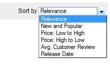
Most users with basic web app experience will most likely still try to sort your table by clicking the individual headers. But for the more novice users I would suggest adding an adjacent control similar to that of sites showing sortable content which isn't ordered in a table, eg. similar to that of amazon.com.

enter image description here

enter image description here

13

If you cannot use arrows or a separate drop-down menu for sorting, the simplest thing you can do is, make the labels clickable. Make the labels look like hyperlinks. And when the user clicks the label, they can 'discover' that it does sorting. It is bad usability in terms of understanding the functionality, but, you can atleast give them the visual cue to click the label.

mockup

download bmml source – Wireframes created with Balsamiq Mockups

Edit: You can make it a bit clearer by either changing the text of the label on-hover, to something understandable like 'Sort' OR you can use Gildas's idea and overlay the sorting icon there.

In conclusion, draw in the user by the hyperlink visual cue and signal the action when in context.

4
  • +1 But I would argue that it is not bad usability for understanding the functionality; most people understand that clickable headers on a table = sort
    – Jesse Webb
    Commented Jun 11, 2013 at 20:05
  • 1
    We use this exact solution on a large table. The headers are links and the users (who are not techy) understand that they are used to sort. We always show a single sort arrow indicating which column is currently being used to sort the data.
    – Jesse Webb
    Commented Jun 11, 2013 at 20:08
  • The standard solution is kind of a variant of this, but the column headers usually look like buttons rather than hyperlinks. Commented Jun 12, 2013 at 12:30
  • @ChrisBurt-Brown Buttons will also get you the same visual cue reaction 'This can be clicked'. The action after, can be the same too.
    – rk.
    Commented Jun 12, 2013 at 12:42
10

Is your problem mainly about saving horizontal space due to the large number of columns? If so, putting the arrows above/below the header may help:

enter image description here

Additional Node: A further way to reduce space is to only include arrows above the header of each sortable column. When you click the header of an unsorted column, it sorts it in the default direction. When you click the header of a sorted column, it toggles the direction of the sort.

2
  • To me this looks like I’d be able to switch (cycle through) column headings. Or to vote up/down, similar to the voting here on Stack Exchange.
    – unor
    Commented Jun 12, 2013 at 11:21
  • @unor: Thanks for the response. Adding hover text over each arrow (like SE does), keeping the current sort arrow highlighted, and the fact that the column under the highlighted sort arrow is sorted correspondingly should help clue users in to what this does. If that fails, as long as users are not afraid to experiment they will soon understand the functionality.
    – Briguy37
    Commented Jun 12, 2013 at 16:26
5

Underline the column header, that will allow users to see that the header is a link(they can interact with it) and add title="Sort by price" so when the user hovers over the link it will give them the explanation what will happen if they click on it.

0

You could also just tell the User. If you have a Text leading to this table or just above the table, just tell the User he can sort the table by clicking the headers.

0

I was dealing with this today, and this nine-year old question came up as the first search result. After trying a few things, I came up with something different: adding a border line on the top or bottom of the header cell to indicate which column is sorting, and in which direction. I also added a background color and pointer cursor on hover, but seeing the line on the default sort column should be a good indication that sorting by different columns is possible without having to discover that functionality by hovering.

Here's how it looks when sorted by Song ascending:

enter image description here

And by Uploaded descending:

enter image description here

(Users can click the selected column to reverse the sort direction.)

To place the border inside the header cell, I used this CSS:

th {
    background-color: #F0F0F0; 
    padding: 6px;
    text-transform: none;
    cursor: pointer;
}
th:hover {
    background-color: #E0E0E0; 
}
th.active_asc {
    box-shadow: inset 0px -2px 0px #D6D6D6;
}
th.active_desc {
    box-shadow: inset 0px 3px 0px #D6D6D6;
}

The bottom line is 1px smaller than the top line because the header row already has a 1px border.

Your Answer

By clicking “Post Your Answer”, you agree to our terms of service and acknowledge you have read our privacy policy.

Not the answer you're looking for? Browse other questions tagged or ask your own question.