234

We're building a web-based platform where the main dashboard shows a table of data for users to view and analyze. As we're growing this tool, we seem to be adding more and more columns and are running out of horizontal space on smaller screen resolutions (we're seeing some data wrap). It is important to the user to view all columns at once, so column hiding is somewhat out of the question, as is horizontal scrolling (per the boss's request and because horizontal scrolling sucks anyways). I was wondering if anyone knew of a clever UI for tables with many columns.

EDIT

Below is a screen capture of the layout of the table. Unfortunately for security purposes I had to blur out the column titles. This example has rows with practically no data in them, but in use they will have lots of data that will expand wider than their respective column titles. In response to some of the answers, it is imperative that the user see all the columns, as they are all necessary to analyze the data to make certain decisions. All the data is numeric aside from the first three columns. Thanks again for any feedback.

alt text

Ok so I see that uploading this image doesn't really do it justice... it takes up the full width of the screen at 1680x1050 resolution (22") and as data fills in the columns, the left column w/the text shrinks down a bit.

EDIT 2 I just wanted to say thank you to everyone's awesome ideas. I can only select one answer, but a lot of your ideas have proven very useful and may end up in the final product. Thanks again!

14
  • 14
    If the data doesn't have to be tabular, build graphs or visualizations that show multiple benchmarks at a quick glance. That, or completely rethink what's 'important'. Without knowing more, it's hard to give any more feedback.
    – Dexter
    Commented Sep 13, 2010 at 21:13
  • 2
    I also think you should give more information or, better, provide some visual aid. With what we know now, I don't see many alternatives.
    – Pam Rdz
    Commented Sep 13, 2010 at 21:28
  • 2
    @greelmo, the data DOES have to be tabular and it includes "sparkline" graphs in the data cells already in addition to the capability to show larger graphs on any existing data set. @rahul, @pam i will see if i can get a SS
    – Jason
    Commented Sep 14, 2010 at 16:36
  • 2
    Do you really need to see ALL of the columns at once? I understand you might need to compare column A with columns B, F, R, and Z. I can also understand if certain columns (particularly the first three) might need to be visible at all times. But do you really need to compare ANY given column with ANY other column? Commented Sep 14, 2010 at 17:37
  • 1
    It frustrates me when people ask for things like this as if it is perfectly reasonable to fit 2,000 cubic feet of cargo into a minivan.
    – Steve S
    Commented Sep 14, 2010 at 21:48

23 Answers 23

145

The OP was adamant that every bit of data needs to be visible at all times and my answer respects that constraint. For a more general solution to displaying a large table, especially on a small screen, I highly recommend this four minute video from NN/g.

Since all of the data after the first three columns is numeric, you can round off so that the width of each column is as little as four characters.

 Full Length   Shorter   Tiny
 -----------   -------   ----
 $143,573.39   $143.6k   144k
     112.54%    112.5%    113 
 198,220,329    198.2m   198m

You might decide which version to display based on the amount of space available. Those fortunate to have larger monitors would still get everything. The presentation would degrade gracefully for smaller monitors

Of course, when the contents of a cell are abbreviated, you should show the full value in a tool tip.


@Oskar pointed out in the comments that showing numbers with different magnitudes makes it more difficult to compare visually. So here's a variation in case comparing relative values is more important than precision.

  Revenue 
($millions)  
------------ 
       143.6   
        93.2
         0.3
       < 0.1  

(The header in this example is wider than the data, but as others pointed out that can be solved by tilting the headers at a 45 degree angle.)

7
  • 15
    this is the type of answer i was looking for. i talked to my boss about this and he likes this idea. thanks! this has definitely pointed me in the correct direction.
    – Jason
    Commented Sep 15, 2010 at 14:40
  • 51
    While this helps you cheat squeezing in data it IS NOT the correct solution. Please go the extra mile to really understand what exactly the end-user is doing at this screen. I'd be willing to bet that either a) no, the user really doesn't need to see all those columns or b) no, the user really doesn't need to see all those rows.
    – xanadont
    Commented Sep 15, 2010 at 20:09
  • 13
    @xanadont if you were to make that bet, you would lose. please believe me when i tell you that EVERY PIECE OF DATA ON THAT SCREEN IS EXTREMELY IMPORTANT.
    – Jason
    Commented Sep 16, 2010 at 19:33
  • 9
    If it's so important perhaps the default approach would be computer analysis of the data instead of human analysis? Commented Oct 5, 2010 at 16:36
  • 7
    When L2 added this it looked a bit neat but.. also a lot harder to size numbers against eachother at a glance... they "fixed" that by adding different colors depending on if it was raw values, K's or M's and so forth... Commented Oct 5, 2010 at 16:48
161

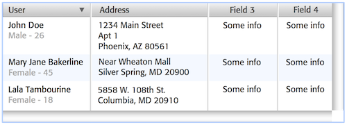
You can try displaying multiple lines per record, e.g.:

alt text

You can also go a step further by making each row a summary view that can be expanded so that the user can see the complete record, e.g.:

alt text

In the pic above, the user is interested in Mary Jane's complete info, so she clicks on the triangle next to her name to see the complete record.

Also, I disagree with your premise that "column hiding is somewhat out of the question". If there really is that much information, the user is going to want to hide something. You may want to have them all visible by default initially; but there should be a way for the user to hide some columns as she goes.

8
  • 10
    What kind of reason for anything is "because the boss says so"? Why does he say so?
    – Rahul
    Commented Sep 14, 2010 at 17:01
  • 6
    @Jason no offense, but I wouldn't just do what my boss says if he ordered me to do something wih no reason; I'd get a different job. If you're working for this guy (as a UI designer?), why does he not let you do your job? Arbitrary orders like what you're describing don't suggest an atmosphere of trust to me.
    – Rahul
    Commented Sep 14, 2010 at 18:12
  • 30
    I find that when I approach my superiors with humility and ask them to explain their reasoning (as a student would ask a teacher) my questions tend to be well received. Commented Sep 14, 2010 at 19:15
  • 15
    @rahul i didn't ask a question on here on how i should talk to my boss about something. i have a problem with certain constraints that i am to work within and was wondering if anyone had any ideas on a creative solution. telling me to try to change the constraints isn't what i'm looking for. it's like telling a person dying of thirst in the desert to just go buy a bottle of water :)
    – Jason
    Commented Sep 15, 2010 at 14:44
  • 11
    I'd say it's more like asking the person dying of thirst in the desert why he went into the desert in the first place, but I get your point.
    – Rahul
    Commented Sep 15, 2010 at 14:59
117

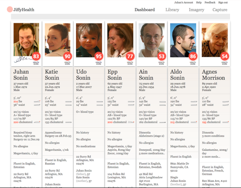
If the columns are out-growing the rows, you can try to put the rows as columns

alt text

7
  • ha! very creative... won't work for my application (mostly numeric data) but an interesting solution nonetheless :) thanks!
    – Jason
    Commented Sep 15, 2010 at 14:46
  • 3
    It could work for You, but requires a huge change and I bet You don't want to have to rewrite ;) IMHO it's the best idea here. Vertical scrolling is good.
    – naugtur
    Commented Sep 16, 2010 at 9:02
  • 3
    @naugter it is definitely a good idea, but doesn't work for comparing numeric data. and yes, it would be a bitch to rewrite.
    – Jason
    Commented Sep 16, 2010 at 21:21
  • This is what i was thinking as a solution and the answer already exists
    – Strikers
    Commented Apr 29, 2015 at 8:58
  • 4
    I'm not sure I understand how you can't compare data in columns just as easily as data in rows.
    – threed
    Commented Jun 16, 2015 at 17:20
63

This sounds a lot like the case where the customer/product manager wants everything on the main screen vs. everything you need on the main screen.

IMHO, a dashboard screen should give the user an overview of everything... but to get details on a portion of that (e.g. the 275% increase in sales this week) the user should "drill-down" into the data to see the table(s) of info on where the sales came from.

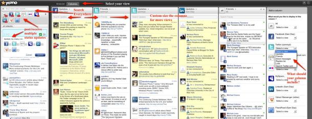
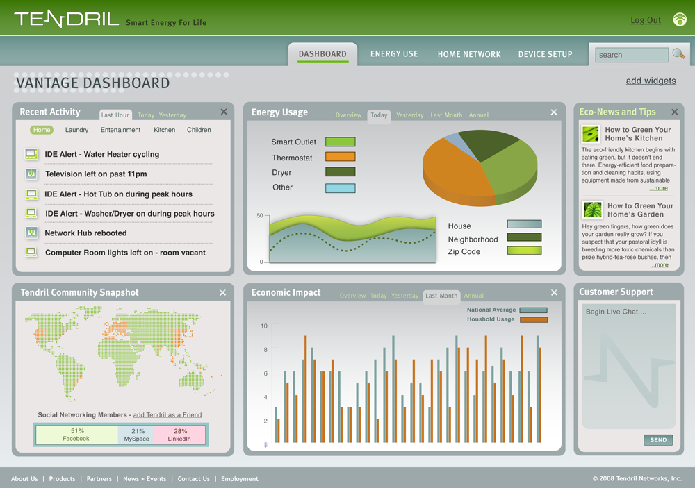
Over-complicating the "main" view to try and show lots and lots of information ends up failing as the user gets lost in a swath of data. The examples below are just random things I found on Google, but in screen A you can hardly even decide where to start - vs. Screen B where content is neatly organized into overviews.

example of overwhelming data: alt text

example of simple, easy to digest data: alt text

12
  • 16
    +1. The insight here is that the customer doesn't necessarily know what she wants or what's best in a given situation. That's the job of the interaction designer! Trust us. We know what we're doing. ;)
    – Rahul
    Commented Sep 14, 2010 at 10:07
  • 13
    Jason, it's hard for us to help you when you give reasons like "because that's the way it is". If you could try explaining why you need to see all the columns, we might be able to come up with some other ideas. The fact that scunliffe's answer is getting upvoted suggests the community feels that this is the best answer based on the information you've given us.
    – Rahul
    Commented Sep 14, 2010 at 17:00
  • 5
    @Jason - I feel your pain, but from what you've noted in the comments and the screenshot you added, it appears that you are essentially rendering a "spreadsheet" on screen. There's nothing wrong with a spreadsheet, if that is what the user really needs, but just like in MS Excel - you will only be able to get 12-15 meaningful columns on screen and to see the rest you will need to scroll horizontally. My advice would be to reduce each column's header to provide enough info, but not overly exceed the width of the data in that column. (see next comment)...
    – scunliffe
    Commented Sep 15, 2010 at 12:02
  • 5
    @Jason The user really must edit data inline? Yeah? NO! The user should not be editing data in a table. Sorry, that's just plain, bad design. The designers are thinking like programmers and that's precisely why you're in this predicament. Editing the record should be pulled out into a details view. Oh, but the table lets you see other records. First the users probably don't need to see the other records. But, if they really do, allow multiply opened details views, cloning, and / or other functions. Anything to get that damned table out of my view.
    – xanadont
    Commented Sep 15, 2010 at 20:18
  • 5
    @xanadont i disagree with what you think is bad design. while it may be bad design for some applications, for this application it is absolutely necessary. the user is looking intensely at a lot of data that is changing in near real time. for him to be whisked away to another screen to make a tiny change and then sent back again would be bad design. also, his changes are relevant to all the other data around him, so pulling out into a details view is distracting.
    – Jason
    Commented Sep 16, 2010 at 21:19
41

Table is a good way to present large amount of data. However, with more than 5 columns, tables quickly become unreadable. If your data is changing in real time as you say it, the user most likely won't be able to make his decision in time if he had to look at 15 different columns at the same time.

Google knows best that the most important consideration when looking at a large amount of data is sorting. You need to sort by its relevance to user. Every piece of data may be important, but some piece of data are more important than the others, you need to identify which piece is the most important and which pieces are not, this heavily depends on the business' goal.

Not all columns are created equal

Some columns are more important than the other:

  • some columns must be read first before data in another column becomes relevant. English speaking users reads from left-to-right, columns should be read left-to-right when possible;
  • some columns are important only in their relative order, i.e. their absolute values don't really matter, e.g. date-time. You can hide this column, and use sorting to give the sense of order;
  • some values are only important as high, medium, low. The small difference between two "high" values may not really affect decision-making by much since there are other factors that affects decision more significantly. You can use "green", "yellow", "red" icon instead of the full text to save space.
  • some columns may be read-only, or need to be edited less often than some other, there are groups of columns that are very likely to be edited together. Sort your columns so that the columns that requires editing together is grouped together;

Not all rows are created equal

A very common mistake when sorting, is to sort by some useless arbitrary order, like alphabetic order or date or numerical values. Ordering that is static and consistent is useful if you need to search values, but you should let the computer do the searching for you. Instead, in most cases you'd want to order by its relevance.

Some of these may or may not apply in your case:

  • recently updated data are more important;
  • higher values transactions or transactions in a certain range of values are more important;
  • false values or true values are not important;
  • (more complicated) false values are important only when another field has a certain value, otherwise it's true value that is important

You need to identify these goals for your users, and and do a weighted sorting of your data and columns accordingly. If you have not identified which goals are the most important for your users, then you're not really designing. After you identify which data is most important, then you can proceed to hiding some of the less important datas, or abbreviating them, or abstracting them into icons. Icons are easy to absorb, and your user don't want to spend three seconds reading a 8221 and 1463 if he can spend one-tenth of second looking at "green circle" and "red cross".

Some values are important only in certain context

Highlight interesting values. The user may only be interested in transactions with a certain value in a certain field. And the user might know he'd never touch transactions which is too high or too low for his preference; you can filter them so the user does not even need to see them. You can even hide a whole column, if the user say he doesn't have a use for the column.

1
  • Excellent, excellent answer. One small thing I'd tweak would be to try a "minified" column instead of a hidden one, since that appears to be anathema to this customer. That might be a non-informative but clickable thick separator line, or something slightly wider that shows a color/icon (and also expands when clicked).
    – Jon Coombs
    Commented Jan 22, 2016 at 20:41
34

what data does the user actually need to see?

If only we could get a straight answer to that. Instead of "it depends".

I keep on running into this problem, and every time I Google I end up back here at Jason's excellent question.

And there are many excellent answers, but I smell a meta-topic that we all seem to skirt around yet I think is worth unpacking.

First get a handle on the true range of User Intentions

When faced with situations like this, I find it useful to take a step back and ensure we have a good appreciation for the diversity of user intentions within our system. I drew a simple diagram to illustrate what I mean:
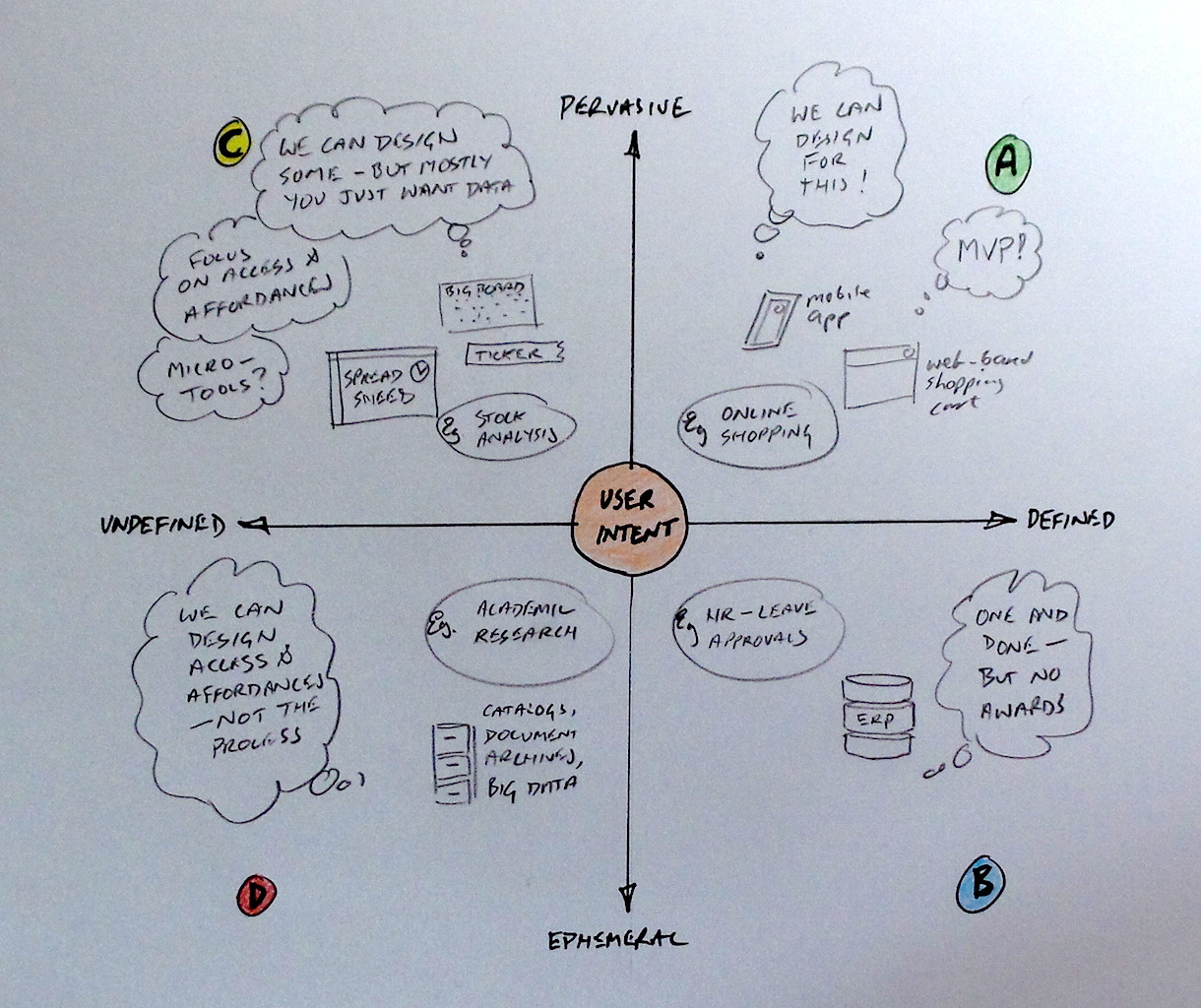
domain of user intents

Here I'm considering two things:

  • How well can we define the users' activities?
  • How well can we predict when users need something?

For example:

If we know that every morning Sales Managers review their sales pipeline by value and close date, then we can design an dashboard for that and know it should be "close at hand" every morning. This is what I'd call a defined and pervasive use case.

When we see investment analysts pouring over the stocks in their portfolio, we know they are constantly assessing their positions using a range of standard techniques, but we can't pin down at any given moment exactly how they are doing the assessment. This is especially true if it is in response to an external stimulus (like a call from a colleague on the trading floor, or a story in the Financial Times). This is what we might call undefined yet pervasive.

Perhaps we know that department heads are responsible for managing their costs and budgets. But do we understand what managing exactly entails? And this may change over time - for example at the start of the year the company could be focused on market share and revenue optimisation, while by Q4 everyone is focused on cost reduction. This can lead to very different kinds of review and action. This scenario I might call undefined and ephemeral

And so on .. I think you get the picture.

Deciding Where to Focus

The upper-right quadrant is obviously the best place to be as a designer. We can pin down what users really need, and put our effort into designing the best experience for them. We can eliminate all the cruft in our application that doesn't add value to the experience. We can win awards if we do it well;-)

Unfortunately, the world is a messy place. Chances are that our users are all over the chart. And that can change from minute to minute.

Our usual response, and still the best advice you will hear regardless of discipline (programmers, designers, entrepreneurs) is simply focus. In extremis: do one thing and do it well.

If you are in a startup or working on an MVP, this is easy and self-selecting ("we only build this for users who want to do X").

For everyone else, I'm suggesting we instead need to appreciate first which quadrant(s) users want and need to work within, and use that as a lens to focus our effort. If our users work in Quadrant D, but we are trying to force them into a Quadrant A solution .. it will not be pretty, and the users will always win in the end anyway.

Jason's Scenario

The real Jason probably long moved on, but many of us have our days when we are Jason. From his description, it seems the starting assumption/proposition is that Jason's users are all about Quadrant C - always very busy doing stuff we can't easily define with the data sets we provide.

In other words, classic knowledge workers. We particularly struggle to build systems for these folks, because they know and respond to lots of things that our poor computers haven't a clue about.

It is no surprise that the humble spreadsheet still rules supreme in places like finance departments. Once the ERP systems are done with all the transaction processing, most of the work remaining falls squarely outside the top-right Quadrant... and a spreadsheet is still the ultimate blank canvas for working with data.

So what can we do? I'd suggest two parallel strategies

Identify use cases for Quadrant A treatment

OK, maybe most of the work needs to get done in the pseudo-spreadsheet view. But maybe not all. When we pick up indications of defined-pervasive usage, we can build specifically for that (another view, dashboard page, or punch-out).

There are many good answers and comments already attached to this question that are in a way getting to this: how to find the Quadrant A gem in the mess of Quadrant C?

How do we find gems in the rough?

  • old school - spend hours/days/weeks working with users to find out what they really do
  • find champions from the user community who can explain how things really get done
  • look at the data. Can we discover predictive behaviours leading up to a defined action? e.g. before placing a sell order, users always seem to look at views A and B, sort by C and D, and run report E. It may at least give us a place to start examining more closely...

Build the best Quadrant C experience possible

But with systems like this, it is often a Taylorist pipe-dream to think we can eventually reduce it all down to a neat set of use cases we can design Quadrant A solutions around.

If we can't build for complete and well-defined end goals, perhaps we can still make great leaps by focusing improving the journey for the users?

Focus on Access and Affordances

So we don't know exactly what users are trying to do, but we can improve their ability to access and manipulate our data. For example:

  • best-in-class searching, filtering and sorting
  • column show/hide. Better yet: show/hide column groups
  • easy download of data to do my own analysis
  • select from a set of pre-defined views for specific purposes
  • maybe I can save and use my own custom views? Maybe I can share that view with co-workers
  • as a user I can "scale" my view as required. For example:
    • font size
    • more/less detail per cell
    • thin-row/fat-row/pinterest-mode

Focus on Micro-Tooling

We don't know the whole story of what you are trying to achieve, but we can deliver parts of the puzzle. For example:

  • obvious drill-down on rows for more info
  • "right-click" tools:
    • pivot by this column
    • goal-seek a new value for this cell
    • pop-up historical trend for this row/cell
    • pin this row and rank others around it

Focus on adding value to Data

We don't know exactly how our people are turning our data into Information-Knowledge-Wisdom, but we should be looking for opportunities to continually improve the value we can add to the data.

e.g. today I just give you raw production numbers, tomorrow I can give you that plus the change since yesterday/last week/last month.

So while people will probably still be in control of extracting knowledge and wisdom, perhaps we can get better at presenting information instead of just data.

6
  • 4
    ( Jason lives! ) This is a fantastic articulation of the problem. I'm addressing this in a reporting product right now and it's really exciting to see the Quadrant C users getting into a sticky experience. It can be done! Commented Jun 5, 2015 at 19:11
  • 1
    Very nice answer. "column show/hide. Better yet: show/hide column groups." Even better still (IMHO): minify/expand columns or column groups. Collapsing/expanding is much less scary and easier to manipulate as a user. It could be a clickable, 3-pixel wide separator, or add a few more pixels and show a color or skinny icon. Clicking expands to the actual number.
    – Jon Coombs
    Commented Jan 22, 2016 at 20:56
  • 1
    just joined ux to upvote this answer :)
    – RickyA
    Commented Sep 15, 2016 at 12:14
  • +1 just for the chart alone, even if the rest of your post were completely horrible advice (which I'm sure it isn't) Commented Aug 30, 2017 at 22:52
  • I would have preferred if the ordering of your quadrants followed the same pattern as the ordering of quadrants in mathematics. Quadrant 1 starts in the top right, and moves counterclockwise. Commented Nov 27, 2019 at 20:10
28

I know you've selected an answer, but I wanted to bring up something that I think is pretty important: data vs. information. I've been thinking a lot about this recently, so it's at the front of my headmeats.

What you're doing is showing data. It's raw, it all seems really important, but in reality most people don't need to see the data. What they really need is information that's been generated based on the data. You mention in one of the comments that users can "see a graph when they hover over the row", and I think that's backward. The raw data should be available on demand, but the default view should analyze the data and show the resulting information.

This isn't to say graphs are the correct choice, but an alternate display of the key findings of all that data might be a wiser way to go. This is harder to develop, conceptually, but will make the end product more of a useful tool than simply a place to lookup things. The question to ask your users is "what do you want to know when you're looking at this screen?"

1
  • 3
    +1 process the data (refine it) in a way that matches what human reviewers already do with the data. The ultimate top-level view would be a nice RED-YELLOW-GREEN scorecard for each section and the possibility to drill down on domain items and rules which created the score... Commented Oct 5, 2010 at 16:43
17

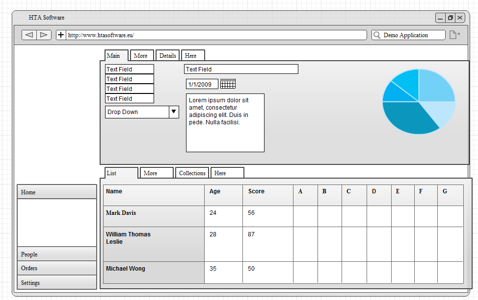
What we do is divide the screen basically in two parts. The upper half shows details about the currently selected item, the lower half shows the grid with a paged list of items available.

The tab controls are used to display detail/ collection views of what we call nested details/ collections. These are formed by foreign key relationships.

Hope this helps you somewhat. mockup

2
  • +1, I like how your foreign key relations are mapped to the tabs.
    – Travis J
    Commented Apr 25, 2012 at 21:07
  • Your example helped me generate some new ideas for a grading solution -- thank you!
    – mahalie
    Commented May 23 at 3:49
15

I'm a bit surprised, that none has suggested the Master-Detail pattern yet.

We have exactly the same problem in several of our own products: Too many columns to fit on a screen, however, every piece of information will be relevant in some use-case.

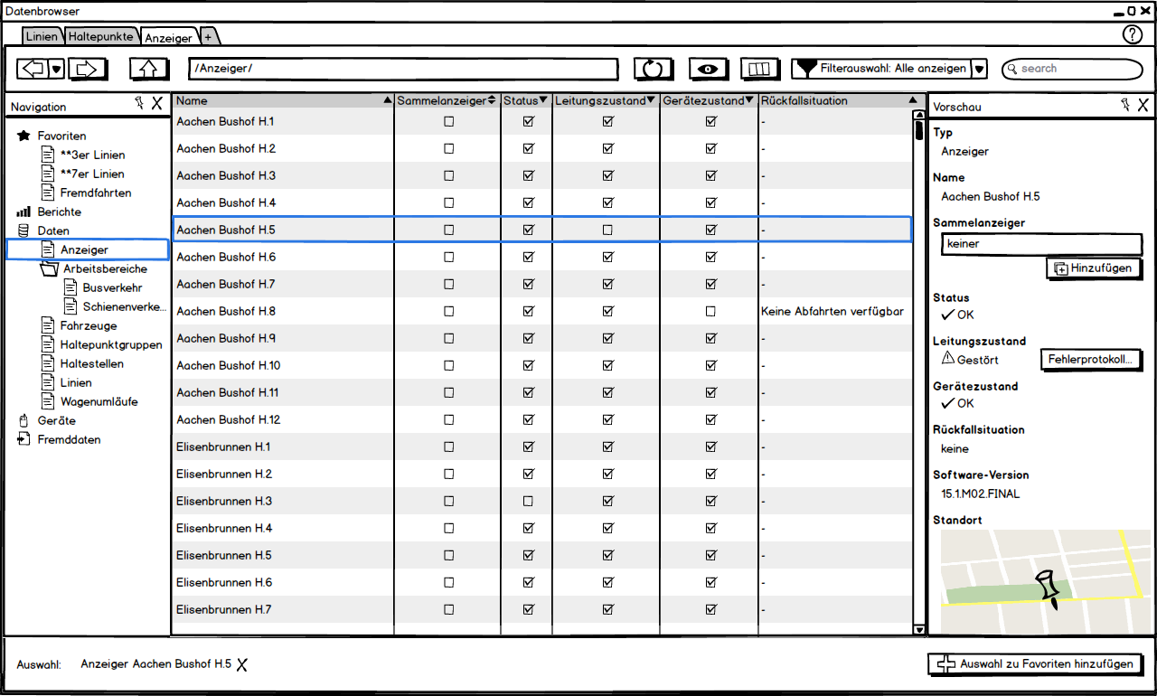
Actually, we decided to do, what you(r boss) ruled out: Cutting the default number of visible columns to roughly 5-6 carefully selected attributes to cover 90% of use-cases. For the selected row however, we display all attributes in a property pane on the right side of the screen. The user sees the most important attributes of as many rows as possible in the table, and as many attributes as possible for the selected row in the property pane.

The user may still add/remove columns from the table, just like in the Windows Explorer, if she deems other columns more important than the ones choosen by us, or even dismiss the property pane and resort to horizontal scrolling, if the user decides that's what she really wants.

The introduction of the property pane has some nifty advantages:

  • You can provide more meaningful editing UI if the data is meant to be edited
  • Often, you can present the data more appropriately than in a table cell. Think of an photo taken of an employee, a set of GPS-coordinates shown on a map, the possibilities are endless.

Pardon the labels being German, but it should get the idea across:

enter image description here

14

One example I can think of that might inspire something is MLB.com's standings page, which is a table with way too many columns, but the customization interface is instantly intuitive (to me - and it's not aimed at a techie audience). You probably don't want MLBAM's arbitrary limit on the maximum number of columns you can have, of course.

The biggest UI problem with column hiding is usually getting the hidden column back - unless they've fixed it recently, "unhide" is really hard to find in Excel, for example.

3
  • +1 this is also the type of answer i was looking for. this is a very creative solution that i will present. thanks for this link!
    – Jason
    Commented Sep 16, 2010 at 19:37
  • i wish i could accept two answers, because this one is great. it's gotten preliminary approval by other devs and should probably be approved by el jefe. thanks so much!
    – Jason
    Commented Sep 16, 2010 at 19:52
  • 2
    Looks like they've changed it (four years later) and there's no longer customization. Is there somewhere else I could look maybe?
    – Thaeli
    Commented Dec 2, 2014 at 20:51
8

Hardware for sure, but I would suggest commodity multi monitor setup. Two 19" compared to asingle 24" is dramatic when working with wide tables or spreadsheets.

Additionally, fuzzify/normalize critical columns (columns that indicate to the user that further analysis needs to be performed, and possibly further action). Group by those fuzzy values.

The other trick might be to incorporate 'pinned' columns so that as a user scrolls left or right the pinned columns trail to the opposite end of the screen based on scroll direction.

3
  • 6
    +1 Buy more screens - if the wish is to have more columns visible than fits a screen, then get more screens - bolt them to the wall and have 10 of them in a row - now you can fit a lot of data for review ^^ Commented Oct 5, 2010 at 16:40
  • 1
    Deserves more upvotes. If all the data is genuinely needed all the time -- and Jason's reponses to other options seem clear on this -- then making the display bigger is the only option. It sounds like a financial markets app, and if it is, then multimonitor setups are very common.
    – e100
    Commented Sep 16, 2011 at 17:45
  • 1
    lol this is a funny answer. I agree with e100 that multimonitor setups in financial applications are common. However, I do not believe that if a technical problem arises it should be solved with this type of solution. Very hacky. I have done some trading in my time, and it is possible to have the whole verbose interface on one screen. In fact, it is almost a requirement for many online trading brokerages (eTrade, Charles Schwab, ScottTrade, TDAmeritrade - to name a few). Usually multiple screens are used for multiple applications, not just for one unsightly one.
    – Travis J
    Commented Apr 25, 2012 at 21:12
6

I think you need to have a talk with you boss about this one. displaying all the columns and all the rows will clutter the screen beyond usable. It's like asking to park a truck on a passenger car parking spot. Does not end well for the truck and the parking space.

What you should ask yourself and the client is what steps the user is going to take to evaluate all the data. What is the decision based on first, then what needs to be checked. From that you can begin to understand how the user will be using you application. Once you know that you can streamline the data and present them in a manageable report.

from what I see in you example the overall data cannot be caught in one view. this means the user will have to go back and forth between the two comparing space. This can result in a wrong decision because the data is read wrong. errors in the business you are working for can cost a lot of money. by telling your client that he will probably understand that you need to avoid those errors by painting a clearer image.

OPTION: If you are comparing data rows I suggest minimal data in the overview and selecting a couple to compare will create a report with all the data properly compared (graphs, numbers or any other visual aid).

ALTERNATIVE OPTION: Go to your boss, say that you will do it his way but put an alternative design on the table. When time comes and the hordes of angry users are at his doorstep you remind him that you created an alternative design. politics in technology are never my favorite. but it is sometimes just needed!

6

Perhaps you can group low-valued columns (i.e.: values in the range [0..100)) into sub-columns.

Instead of:

| Description | Count | Mean | Sum | Foo    | Bar   |
| Lorem ipsum |     1 |    2 |   3 | $ 1.00 | +0.2% |

Present as:

| Description | Totals    | Foo    | Bar   |
|             | C / M / S |        |       | 
| Lorem ipsum | 1 : 2 : 3 | $ 1.00 | +0.2% |

Where ":" is a sub-column separator, and C / M / S means "Count/Mean/Sum" (or whatever data is displayed there).

If the absolute values of the data aren't important, you may transform percentages into stacked bar icons.

If a column is the percentage of another column, you may use the target column's background as a progress bar. In fact, depending of the variety of data domains, the cell's background can indicate what value it contains, and drop currency prefix and/or superfluous formatting.

1
  • there's a kernel of a great suggestion here. e.g. "most of the time I don't want to see all the contract-related columns, but when I do, I want to see them all". Reminds me of the row/column "outline" feature in Excel - IMHO a killer feature (that no-one seems to know about). Much better than having to show/hide column by column. I've been on the lookout for this on the web, but so far I haven't found any library/framework that makes it easy to support. It would be nice if Datatables supported it.
    – tardate
    Commented Mar 14, 2015 at 4:21
5

As a rule you should not be at the whim of your users' every desire. It's your job as a professional to reimagine their needs in a way that appropriately and efficiently summarizes the masses of data. Computers are great at gathering hords of data and humans are bad at interpreting that data. Resist, with all your might, dumping unformatted, unsummarized tables to the screen.

Consider searching on Google - most searches typically return millions of hits. But do you ever navigate beyond the first page? If you're like most, hardly ever. What do you do if you can't find your answer on the first page? You'll rephrase your question and narrow the results until your target DOES appear on the first page.

Go through the Google Search exercise as you think about your app. Only rarely is listing an unfiltered dump of records appropriate.

Another example - consider the contacts or music tracks on your iPhone. I would be very surprised if you didn't immediately tap the letter-scroller on the right and jump to the alphabetized section. The full, complete listing of records is there more for candy (show off the phone's scrollability) than anything else.

Now, all this can also be applied to the data that you show horizontally (number of columns). Figure out a creative and intuitive way to summarize that data. An added benefit to nailing this is these are the things that make an app enjoyable to use. Add enough of these thoughtful tweaks and polishes and the app even becomes "fun" to use.

At the very least you're thinking about the problem; this is farther than most devs go. Good luck!

4
  • thanks for this answer. in response: the data isn't unfiltered by any means. there are plenty of filters and sorts in place that i just cropped out of the screen shot. the problem isn't getting the correct data, it's fitting all the data into one place. also, i don't, nor ever will, own an iPhone. your google example is interesting, but is a bit like apples and oranges for my application. my users need all the data available to them so they can edit and make decisions extremely quickly as seconds can mean thousands of dollars. this is why i need everything there all at one time.
    – Jason
    Commented Sep 16, 2010 at 19:45
  • It sounds like you need configurable automatic algorithms to make those decisions for your users while they oversee the process? Or if there's so much money in it, get a long row of screens for each user - problem solved. Commented Oct 5, 2010 at 16:47
  • 3
    Wow, just wow. I would hate to be a user of this app. Staring at a screen all day and if I miss one thing it's going to cost my employee thousands of dollars. That's stressful physically (eye strain) and mentally. I'm now more convinced than ever your manager is clueless.
    – xanadont
    Commented Oct 5, 2010 at 22:52
  • But there are visuals that can be added to help the user's eyes, such as color-coding. And real-time highlighting of the most recently-changed cells.
    – Jon Coombs
    Commented Jan 22, 2016 at 21:05
4

I don't know if you are allowed to do this, but what about not using a table? Show a list of items, here's an example of a movie list:

* Movie title 1 *
Cast: actor a, actor b
Year: 2000       Runtime: 100 min       Rating: 75%

* Movie title 2 *
...
1
  • But do include some kind of sorting.
    – user371
    Commented Jun 1, 2011 at 18:04
4

Here are a few ideas:

The real question is this: what data does the user actually need to see? Do all the rows populate all the columns in your data? Mine does not, but it is far from a 'sparse' matrix kind of display.

1) fisheye view
Ever think of a fisheye view? Hard to find a good javascript solution, but java applets are easy enough to find.

2) hover tips
Just show the concise numeric data (at varying precision based on range) and expose the column titles on hover? You may want/need to highlight cells of interest and let the user hover over them to see what column they are

3) grouping
Group items with similar columns populated into groups, and create several tables with simlar items, leaving out the non-populated columns from each table. You need not actually have to know apriori how to group them... You can create a bitmap or hash of which columns are populated for each row and then sort/cluster the rows into common column sets. An alternate algorithm is to simply sort by number of columns populated. I have found this to work quite well and helps identify groupings easily, and exposes minor inconsistencies pretty well.

1
  • Regarding (2), hover is a good idea, but in this case I'd set the value extremely low or go for an instant mouseover, since speed is of the essence. If a more precise number is a quick mouse movement away, that could be much better than expanding/unhiding/hovering.
    – Jon Coombs
    Commented Jan 22, 2016 at 21:04
3

Since we don't know why the users have to see all the columns or why you boss thinks they want to see all the columns, you're going to get the get rid of some colums solutions. Here's mine. Have a way for users to select, order & save their preferences for the columns they want. I'm sure there is a significant number of users that would like to only see 5 columns. The real problem is they all don't want to see the same ones. Eventually, they will have so many columns that a horizontal scroll bar will appear. My guess is these 'spreadsheet junkies' won't mind. They'll feel right at home.

1
2

I just have to throw in my two cents here, despite the fact that this question is so old.

If you have a bunch of data that is ALL necessary for the user to make decisions, then obviously there's a decision-making process that's based on that data. Rather than putting the onus on the user to make those decisions based on raw data, what you should probably focus on instead is figuring out how to process that raw data in a way that's more useful to the user.

For example, if you have columns A, B, C, D, and E, and A needs to be updated when B and C are less than D but greater than E, then instead of showing your users all of those columns, just have a single column that displays whether or not that condition is currently true.

Instead of swamping your users with data, you need to establish a layer of business logic that USES that data. Not only will it greatly simplify the complexity of your GUI, but your users will most likely be incredibly grateful to you for making their lives easier. You should always attempt to identify tasks that are easier for computers than for people, and offload the responsibility for those tasks to the computer.

7
  • thanks. good point for sure, although not applicable in this case. if i recall, he literally needed to see every field. the problem wasn't that he couldn't see or interpret all the data, but that i simply didn't have enough real estate to show everything and was looking for clever ways to save real estate.
    – Jason
    Commented Dec 10, 2014 at 23:24
  • 1
    Gotcha. As someone with a good bit of UX design experience, though, I will just mention that many times what users ask for is not, in fact, what they really want. Whoever asked you to do this may have just described a problem and asked you to implement the only solution HE could think of, but that doesn't necessarily mean that what he thought of was the BEST solution. Many times you can stick a design in front of a user who asked for something completely different, but once they understand WHY you suggested an alternative solution, they'll be all for it. Not always the case, but worth a try Commented Dec 11, 2014 at 21:46
  • 3
    Just because someone SAYS he knows exactly what he wants, doesn't mean he's actually hit upon the ideal solution. I can't tell you the number of times I've been asked to create a very specific UI for a very specific task because the person who wants it has decided that it's the best solution to his or her problem. And you know what? 95% of the time, sitting down with them and discussing everything BUT what the solution should be has turned up better ideas that they strongly prefer over their original request. Maybe consider that when EVERYONE is telling you this, they MAY have a point. Commented May 13, 2015 at 20:08
  • 1
    le sigh... i guess there's no getting through to some people.
    – Jason
    Commented May 13, 2015 at 22:01
  • 2
    @Jason, that comment cuts both ways. I'm prepared to accept that all of that information needs to be on screen to some degree of precision (with more precision just a mouseover away?), but when it comes to optimizing the size/prominence/summarization of cells, or the addition of computed fields, or of condensing multiple cells together (and widening rows?), your response to repeated requests for more info has been to say we should all just take your word for it that the column layout is already creative/perfect. But then why ask the question at all? Bigger/more screens becomes the only answer.
    – Jon Coombs
    Commented Jan 22, 2016 at 21:15
1

The first thing that comes in mind is resizable columns. Since you say that all the columns should be visible, and the data must be in a table format. The column names can be in an 45 degrees angle so they would be easily identifiable and at the same time would take up less space.

3
  • The 45 degree angle idea is pretty good. Fortunately, the size of the data is bigger than the size of the column header, so this isn't the source of the problem.
    – Jason
    Commented Sep 14, 2010 at 16:34
  • 1
    Nor is your data the source of the problem.
    – xanadont
    Commented Sep 15, 2010 at 20:22
  • +1, Resizable columns, although not that out of the ordinary in a desktop app, really sounds interesting to do in a web app! This could definitely save some space.
    – Travis J
    Commented Apr 25, 2012 at 21:24
1

Make it dynamic in that you control which columns are displayed and then use intelligent defaults. A good example of this is Google's External Keyword Tool, where you can add/remove/sort columns at will. With dynamic columns, you can have your cake and the boss can eat it.

1

I agree with Erwin regarding graphs. Sparklines may be appropriate.

Here's a pithy discussion of this sort of thing on Edward Tufte's site:

http://www.edwardtufte.com/bboard/q-and-a-fetch-msg?msg_id=00002r&topic_id=1

2
  • Sparklines are for ranges of data, particularly over time spans. From the question & the comments the data appear to be a snapshot in time Commented Sep 15, 2010 at 22:12
  • we actually use sparklines in the cells.. they aren't visible in the screen shot because those rows have no data :)
    – Jason
    Commented Sep 16, 2010 at 19:40
0

I had this exact problem, with 25+ columns. All text data so no numbers. Basically its an huge inventory with way to many fields.

Currently, arrow keys up and down still selects row, but left and right keys hides and un-hides a column so that the entire table moves the the left.

Coupled with a really nice search, this solution is not bad.

Of course the default view is fully user customizable.

0

Actually we also met such problem with too much data display in a table and user requires to see more columns directly instead of horizontal scrolling.

What I know possible solution and what we also tried in our design:

  • Try shrink the column width, like brief the wording or value.
  • Brief view with expanding option, to allow user to view more details when necessary. but can view necessary info with the first look.
  • Master details display, with brief view first and an detail view in below or aside part to show more information.

Someone have more special solution or idea?

Not the answer you're looking for? Browse other questions tagged or ask your own question.