20

So, I am a week and a half into a new project, and I've been designing for a resolution of 320px * 480px. I am new to the game and I've just found out that that resolution is too small considering the high density displays of newer smartphones, and that my graphics will look blurry on new devices.

My ignorance is really costing me and I'd like to find out if there is an equivalent of the stock resolution mentioned above (which I assume was used before the high density displays were introduced).

If you have any suggestions on how I can salvage my existing graphics short of redoing the .PSD's that will also be appreciated.

6 Answers 6

22

Instead of designing your UI for a single resolution, you should design it to be resolution-independent. Take a look at how this is handled in Android: http://developer.android.com/guide/practices/screens_support.html

The resolution you are using (320x480) is a typical MDPI resolution, so you could basically continue using it, as long as you deliver your graphical assets for the app in other DPI sizes as well:

  • LDPI (low): x0.75 the size of your current graphic assets
  • MDPI (medium): the size of the graphical assets you are currently using
  • HDPI (high): x1.5 the size of current assets
  • XHDPI (extra high): x2.00 the size of current assets

The operating system then uses whichever graphic is the best fit for the device.

In iOS, all of this is much easier, as you just have to provide two graphic assets, one for old screens (320x480) and one for new retina screens (640x960).

2
  • 1
    Your answer is talking about pixel density, not about resolution.
    – JohnGB
    Commented Mar 14, 2013 at 12:59
  • 1
    You're right, I clarified the answer a little. The different sized Android graphical assets do link to screen sizes as your answer illustrates.
    – Arqh
    Commented Mar 14, 2013 at 13:36
15

The resolution that you design for depends on the resolution that your target audience will be using. Sometimes you know this in advance, but if not, you need to try remain flexible within a set of resolutions.

This is one of the reasons that responsive design is so useful. You need to design without a fixed resolution in mind, but design in a way that is flexible and will work for a range of resolutions. I would typically look at iOS and Android resolutions (with Android being the largest market share), and make sure that any design works well in either of them.

You also need to distinguish between hardware resolution and design / css resolution as for many phones the two are not the same.

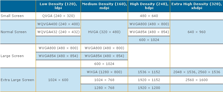
Android Resolution Chart: enter image description here

5

What can be confusing is that there's the screen dimension resolution, and then there's the pixel density resolution. They're often related, but not always.

For instance, an iPhone 3 is 320px * 480px.

And iPhone 4, with Retina display is 640 x 960.

However, both devices treat the screen as being 320 px wide. It's just that the Retina display will have double the pixel density available to it.

As an example, if you created an icon 100x100 and displayed it on both devices side-by-side, they'd look physically the same size. To take advantage of the retina display, though, you'd create a second icon 200x200 and give that to the retina device. It will still be the same physical size, but now has 4x the pixels so will be sharper/clearer.

And easy way to design for iOS is to take your PhotoShop file, set it up at the retina display dimensions, and then design viewing it at 50%.

Alas, iOS makes it fairly easy to do all this as there's a fairly direct relation between the two types of screens. This isn't always true on other devices--especially BlackBerries, where a higher pixel density screen usually equates to having more content on screen, but all the content rendering much smaller.

2

The reason for blurriness is that when the image is increased in size there, it is not increased in perfect numbers, ..

If you set the main resolution to 100x100, it will look fine on 200x200 and 300x300 ..etc, but it will not look fine on 150x150 or 160x160.

If the image is increased in size or decreased in size by 1x,2x,3x,4x, or 0.5x,0.25x,0.125x it should be fine, not perfect though.

You should consider making it resolution independent, your application should detect the resolution and handle display accordingly.

1
  • +1 for mentioning blurriness resulting from imperfect scaling. This can have a huge impact, especially if your assets have already been scaled from a source image. I always recommend starting with the full resolution (or vector) source image and only scaling raster images (non-vector) down by negative powers of 2 (0.5x, 0.25x, 0.125x, etc.). Commented Jun 23, 2015 at 15:33
1

Most of the current mobiles and tablets are of very high resolution.

1080x1920 could be an average option for now a days (Sep 2017).

Please check the below link https://mydevice.io/devices/

0
0

Every graphic element that is not a photo should be designed as a vector to save you the pain of having to recreate your assets if something needs to be scaled up.

Meanwhile, high-resolution photo assets can be placed within Photoshop as smart objects also making them resizable to a point.

If you use both of these methods it shouldn't matter what size your Photoshop file is at the design stage.

Your Answer

By clicking “Post Your Answer”, you agree to our terms of service and acknowledge you have read our privacy policy.

Not the answer you're looking for? Browse other questions tagged or ask your own question.