64

Problem: the user has a list of about 5-20 uncategorised items and needs to categorize them into 2-4 groups. The tricky part is that the same item can be placed into more than one group (this is an edge case but needs to be supported).

From what I can see there are two design patterns that apply:

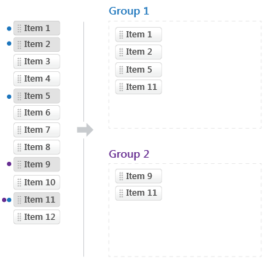
Drag-and-drop:
Basically user is provided with a list of drag-able items which he/she can then bucket inot groups

The main issue with this pattern is that because the same item can be placed into more than one group it means that it's not really a 'move' interaction, the item has to stay in the uncategorised list in order for the user to be able to also place it into another category. Another consequence of this is that the uncategorised list never shrinks so it's not immediately clear which of the items in it have been grouped and which remain unassigned

Here is a possible design that tries to handle the above issues. Items which have been assigned to groups appear darker. Also I use color (coloured dot corresponding to the group label color) to help the user see which group(s) the item has been put under.
enter image description here

Checkbox table:
A table-style UI where each item can be assigned to a group by checking the checkbox for that group's column. Checkboxes rather than radio buttons are used because of the multiple group assignment per item requirement. Here is an example:
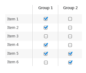
enter image description here

The main disadvantage I see with this UI is that it's not immediately easy to see what items belong to a given group. Also it's a bit more clumsy to move items between groups once assigned (2 step action: user has to uncheck one checkbox and check another one). This can be remedied by providing a separate listing of the items in each group beside the assignment table UI. This list can either be non-interactive or support drag-n-drop for moving items between groups. Example:
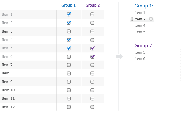
enter image description here

To be honest I'm not completely satisfied with either solution. I'm wondering if anyone has any better ideas or improvements to this design?

3
  • 11
    +1 for putting the effort into showing your previous work on this. A well presented question on a complexed topic.
    – JohnGB
    Commented Dec 5, 2012 at 2:30
  • I'm not prepared to make an answer of this, but it depends on what device you'll be targeting. On a PC, I'd say checkboxes are fantastic. Simply using SPACE and TAB I can do an awful lot in quite a short time. If this is a mobile device where the interaction is more 'physical' then dragging and dropping is most likely the way to go. Also, yes, just to reiterate what @JohnGB said, +1 from me as well for a well constructed question - very nice!
    – R4D4
    Commented Dec 23, 2012 at 10:07
  • 1
    A related question and answer. Commented Jan 3, 2013 at 17:00

8 Answers 8

14

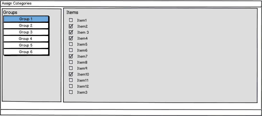
It's more a question of whether you need to see the entire mapping or not. If you don't have to see the whole mapping at once, there is another possibility.

mockup

download bmml source – Wireframes created with Balsamiq Mockups

If the entire mapping is essential then your best approach is to use a matrix that will allow people to view the entire mapping.

Keep in mind that using Drag and Drop UI is nice but can be tiresome if there is a repetitive action that needs to be done by the users - checkboxes can make repetitive tasks much easier.

11

A lot depends on how many items and groups you expect there to be, as well as how many you expect someone to be actively working with at a time.

If working with large numbers of groups and items, the first option would become unusable. Although, I would tend away from it even if the numbers were small.

The second option may not look fancy, but is both simple to use and understand, while also being able to adjust well to larger number of items and groups. I don't see any major weakness of it other than the fact that it isn't a new way of doing it. But that is its strength.

The third option is a nice improvement on the second, but only with low numbers of both groups and items.

I would suggest option 2 with a few changes. Add the ability to sort by any of the columns (groups) and have a summary panel on the right that shows what groups an item is in when that item is selected.

2
  • +1 The idea of making the group-heading a sort-button sounds interesting. This only would need some solution for returning to original sorting, i.e. item's order. Imagine you sort to have group1 checked items on top, and then want to return to the original order of the items. Having a summary panel on the right only adds information a second time and might be confusing as to where you actually perform the assigning of items to groups.
    – kontur
    Commented Dec 5, 2012 at 8:40
  • 1
    @kontur the sorting buttons should take on the fairly standard table column sorting options of sequentially sorting in one direction on first click, then the other direction on second click, then the original order (unsorted) on third click, then repeating. Commented Dec 5, 2012 at 9:39
6

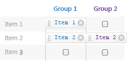
Why not combine the two? Use the initial display of the second, and allow users to select checkboxes. (Selecting checkboxes is far faster and easier than dragging and dropping, which makes this superior to Option 1.) So that the user can easily tell what items are in a given group by glancing down the column, have each checkbox turn into a button as soon as it's checked. (This button can look like those you show on the far right side of Option 2b with an x on it than can be clicked to remove the item from the group and turn the button back into an unchecked checkbox.) You could even make it so that a user is able to click and drag the button to move it between groups in one fluid motion, while they would still have the intuitive but slightly slower option of unselecting it one column and reselecting in another using checkboxes.


Edit: Here's a quick mockup of what I mean.

enter image description here

3
  • This was going to be what I suggested. I think if you had a dual drag/drop and checkbox option it could be both intuitive and speedy. E.G. When clicking on an item it would display a small checkbox showing the 2-4 groups very close by. This would combine with the (in my opinion) excellent drag and drop layout.
    – Alex
    Commented Dec 5, 2012 at 9:52
  • 1
    I'm a bit confused by this mockup. Why is "Item 1" in blue lined up with Item 1 list on the left and then "Item 1" in blue and purple lined up with Item 2 list on the left? Was that just a typo? Should that second row read "Item 2" in blue and purple?
    – Muers
    Commented Jan 3, 2013 at 16:02
  • @Muers Thanks for pointing that out. Yes, it was a typo. I've fixed it now. Commented Jan 3, 2013 at 16:32
5

I think that both paradigms make sense but not when presented at once.

As a follow-up question: Do you need to accomplish this activity on a single page? (e.g., is it part of a form?)

If this task is part of an item management experience that is core to the product I would reccomend a two page approach as is used in iTunes for playlist and Google+ for circles.

On the "list of items" page the user can see a list of all the existing groups and can drag and drop items into these groups. Each group might diaplay the number of items that have been added. You then might label each item with the number of groups it has been added to, when an item is selected the group(s) that it belongs to can be highlighted.

When a group is selected the structure of the page would change to clearly differntiate the items that were in and out of the selected group. Item that are out of the group could then be dragged in or multi-selected to move them into the selected group.

4

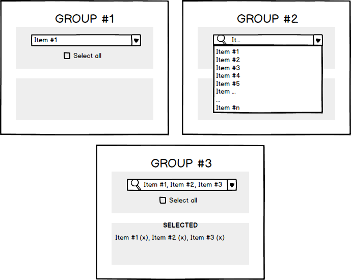
How about showing groups with an "auto-suggest" capable selection list. These groups could be further put in a responsive grid (organized according to your layout rules).

You can additionally show selected items in a tag-cloud-like component like Group #3

enter image description here

1
  • I found this very helpful when you have a lot of items
    – Oleksandr
    Commented Feb 5, 2016 at 1:22
1

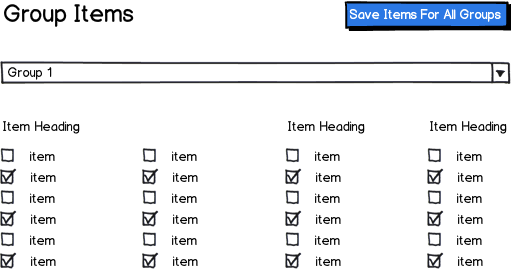
I would suggest a variation of your second option, but only show one group at at a time to minimize the user's confusion. In many cases, drag-and-drop just adds more work for the user when a simpler method exists.

mockup

download bmml source – Wireframes created with Balsamiq Mockups

In the mockup above, the group is selected from the dropdown box list and the checkboxes change dynamically depending on the selected group. Notice that the save button is above the group select to indicate that it will save all groups rather than just one. Having the group selection in a dropdown also makes this pattern a great deal more scalable, no matter the number of groups.

If you are doing this for a web interface, you could use this as a progressively enhanced solution, with the fallback being all groups being displayed at the same time, one on top of the other.

1

What is the primary task?

  1. Assigning items to a group
  2. Comparing groups
  3. Moving items between groups
  4. Something else?

I think that #1 is best supported with drag and drop. A good example of this in practice is google+ circles. #2 and #3 are probably best supported with the check box grid shown above or some variation on that concept although I think there could be issues with information overload with large numbers of items or groups. That could be more or less of an issue depending on the frequency of use for the target user group. As others have stated, I would avoid combining patterns and just stick with the one that best supports the primary task.

0

Some consideration needs to be given to the physical size of the work you will be using. If this task is spread across the whole screen then drag and drop becomes an issue. A couple of systems I have worked on the feedback has been holding down mouse buttons while dragging long, (the feedback did say long), distances led to many errors as fingers came up before they should have. If the drag and drop is click, slight turn of wrist, drop then most people will handle it with ease, even older folks with some movement problems.

The checkbox is a great idea for nearly any size grid and is better suited to those users who want to use keyboards rather than mice.

As usual the suggestion of a combination of both methods would win my vote as it provides a solution to most users. Development becomes somewhat longer but that is not your User's concern.

The answers all appear to be based on taking an item and assigning it to a group. I don't understand the relative importance of item and group but does it make any sense to use the group as the primary source and "pull" items from the list into the group and then move on to the next group.

Your Answer

By clicking “Post Your Answer”, you agree to our terms of service and acknowledge you have read our privacy policy.

Not the answer you're looking for? Browse other questions tagged or ask your own question.