58

I’m not a professional chef, but I do know my way around the kitchen and its machines. The dishwasher, the fridge, the freezer, the stove and the oven all works as expected in many homes. Could you start the dishwasher, my friends might say, but they never say – heat this in the microwave oven. Probably it’s because they are programmable these days, and have plenty of buttons with arbitrary non-standard, non-conventional icons and no explanatory text to help. Fortunately there is a trend among microwave oven manufacturers to add a panic-button at the lower left of the control panel. It’s the button that starts the microwave oven at max effect and runs for 30 seconds.
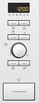
Microwave oven UI

But I wonder why that is. All other kitchen machines could be operated fairly well if you give it a little time, but the microwave just doesn’t. There can’t be different designers, but maybe more options where microwave oven UI designers had to invent new symbols for new features and add a note in the manual?

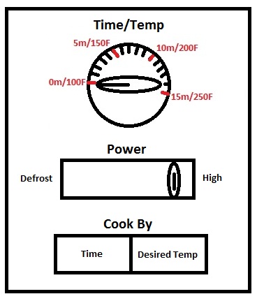
Micah Wittman has even made an effort to start a “Microwave Oven UI Standard Project” to overcome this problem. I’d be happy to join if it is still running. So far this is his suggestion:
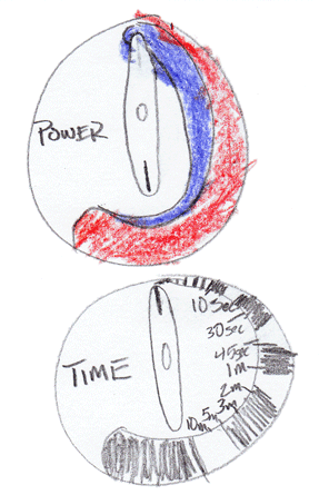
enter image description here

Still one wonders, why do Microwave UI fail?

16
  • 5
    What do you mean by "his suggestion"? That UI has long been in use on microwaves, before these new digital buttons (which I agree are confusing). My mother still has one of those microwaves with analog duration and power wheels and it looks something like this. I have a similar variant, with a wheel for duration, but a button for selecting power (which I almost never change from max). Also, it has a display which shows you a timer, that is, what duration you have selected, and the duration wheel has "steps" when you turn it, to snap to certain durations.
    – Anderson
    Commented Oct 19, 2012 at 12:03
  • 4
    @Anderson I think he want to implement it as a standard, not that it is his design. That's what I think is "his suggestion". Commented Oct 19, 2012 at 12:07
  • 8
    @BenBrocka Your youth's showing. :) Analog dials were very common on 80's models because the mechanical timer was cheaper than a digital solution with a collection of discrete chips or a microcontroller. Commented Oct 19, 2012 at 16:59
  • 1
    My big problem is that the limited display + the programmability leads to a reference on an external lookup table. I hit "defrost" and it says "Which program, 1-4?". I have no way to know. So most of the buttons don't help.
    – MNGwinn
    Commented Oct 19, 2012 at 17:44
  • 1
    I'm sure there is a sexist answer in how men and woman are different in the kitchen, but I don't want to go there. :)
    – Reactgular
    Commented Nov 26, 2012 at 20:53

14 Answers 14

32

One UI is analogic, the other (the failing one) is digital, that is, the appliance is a microwave-computer mongrel.
Alan Cooper, in his book "The inmates are running the asylum", teaches us that when you mix a computer with anything else, you always get a computer no matter what the anything else was.
Thus, mixing an oven with a computer, the outcome is a computer.
If you don't happen to have the Inmates book, you can read the chapter online opening the Amazon link above and following the Look inside the book link. After scrolling a lot the chapter is available, it's a highly recommended reading, somehow humorous, enlightening.

Then, back to the reasoning that tends to answer the question, IMO there are two main issues:

The first issue is that digital controls are less intuitive than analog controls. For example when you operate your mother's microwave, even for the first time, you know that turning the knobs clockwise you set a higher power level or a longer time. This is not so with the digital UI.

The other issue, an important one, is feature creep. The designers (usually engineers) try to give us more, because it's rather inexpensive, so they can solve us problems that we don't actually have.

Consider a digital UI made up of two button pairs, one pair to control power and the other to control time.
The effect of the buttons appears in a display, changing the power level gauge or the displayed time.
The UI completes with a [start] and a [stop/reset] button.
A digital UI such as this would be perfectly usable, even for everybody's grandmother (given that the labels are printed in a suitable font size).
This UI is usable by anyone because such an UI is aligned with the user's mental model.

Because, ultimately, the usable UI is the one that's aligned with the user's mental model (this concept is explained in another book by Alan Cooper, "About Face").

And an anecdotal story. I work for a software development factory, in locations populated by hundreds of people in their twenties, mostly of the nerd type.
At lunch time they avoid those microwaves of the digital type. Some kids really loathe them. The analog ones have a greater audience.

13
  • If you want to set a precise time, e.g. 20 secs (with microwaves, 10 secs can make a huge difference), then an analog control would make it more complicated. Especially since you need a range up to about 2 hours. This could be done with a non-linear analog control, but that would probably confuse most users. Commented Nov 26, 2012 at 15:48
  • 3
    @DannyVarod, what are you microwaving for two hours? Commented Nov 26, 2012 at 20:56
  • 5
    @DannyVarod Exact times are unnecessary. If I want 20 seconds, I'd rather just hit go and stand there for 20 seconds, than fiddle with some UI for 15 seconds to get the time precisely right. Commented Nov 28, 2012 at 4:24
  • 1
    @DanielAlexiuc If you have to heat a bottle of milk for an infant, the exact time is very important. Commented Nov 28, 2012 at 10:08
  • 4
    @DanilAlxiuc: what is really important is the temperature of the milk, isn't it? Also, given a fixed time, the final temperature depends on the initial temperature in addition to time and power. Parents have to touch the bottle, time settings are helpful. Ultimately the parents are responsible for the toddler, not the microwave.
    – Juan Lanus
    Commented Nov 28, 2012 at 11:00
25

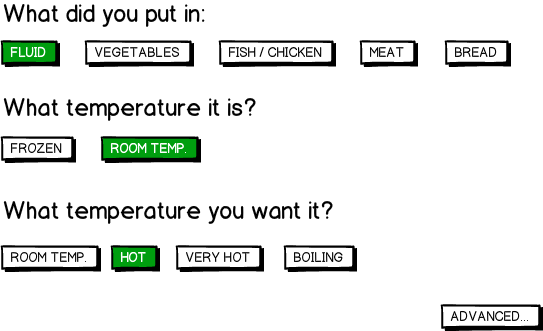
You made me think about it. My mental model is:

mockup

download bmml source – Wireframes created with Balsamiq Mockups

Please remember, it is not even UI wireframe, so forget the button sizes, fit for user expectations and all such UX stuff. Just shared a MM.

Oh, and another thing. No weighting information is intentional.

21
  • 9
    +1 I really like this example because it makes the primary focus the cooking, rather than the manipulation of the tool.
    – msanford
    Commented Oct 19, 2012 at 13:56
  • 7
    Are you a wegetarian? :)
    – Wander
    Commented Oct 19, 2012 at 15:02
  • 7
    I find it distrubing that people think microwave UIs fail.. I've not found a digital one I couldn't easily figure out, and even mid price range ones will have messages telling you what to do. The most basic usage is the easier; enter in the amount of time you want and hit start. How is that a fail exactly?
    – Andy
    Commented Oct 19, 2012 at 15:13
  • 4
    @derobert: Why do you think I should input the weighting info about a food I just put into it? Am I better at weighting? Is it too expensive to weight it in an oven? Remember UX. Commented Oct 19, 2012 at 20:19
  • 17
    I couldn't disagree more with this answer; to me, this is what's wrong with the current trend of microwave UI. When I microwave something, I'm generally following the instructions on the packet. What if I'm reheating pasta (in your UI)? It's inherently unable to accommodate what people generally need to do.
    – Kit Grose
    Commented Oct 22, 2012 at 0:22
12

To answer your question directly, I believe microwave UX is bad because people buy microwaves based on the feature list on the box (and "one-touch cooking of up to 99 different types of food!" sounds like a good thing while you're in an appliances store), and microwave computers can be engineered most cheaply if you ignore good design. Basically: as much as it drives me mental, I'm unlikely to throw away my microwave because its UX is terrible, and I'm not generally able to review the UX of a new microwave before I buy it.


More generally, microwave UX is a topic I spent some time discussing in my UX presentation Don't Cook Babies. You can watch the relevant section on YouTube. Tog also spends a little bit of time making a great point about microwave UI efficiency here.

To summarise my complaints with microwave UI:

  • The main way I wish to use my microwave is to put some food in it, and then follow the instructions on the food packaging itself to ascertain how long it needs to be in for. That means I generally want to enter a specific amount of time.
  • Manufacturers have all decided to put a bunch of pre-defined presets on the control panel instead of numbers, which I guess is great if you confine your cooking to those types of food, but means you're completely lost when you heat something that is either not one of the presets, or is a combination of multiple presets (e.g. reheating a plate with both meat and vegetables).
  • Most microwaves now have some kind of quick cook button, but they all tend to behave differently from microwave to microwave, so you can't ever learn how to use it reliably (as shown in the video, mine goes up by 30s increments at first, then spontaneously switches to 1m increments, then 10m increments at some point, and begins cooking immediately after first pressing the button).

To me, there are two main functions I wish to perform on a microwave:

  1. Cook food for the time indicated on the packaging. The hardest part about this is that the packet generally says something like "cook for 3 minutes at 1,000W", and while conversion tables exist, I have no idea what power my microwave is running at, so they don't help me at all.
  2. Defrost a certain amount of meat before cooking it. This is actually generally pretty well supported by most microwaves (although I still think they give me too many options). On my microwave I have to press "Defrost", then choose "Defrost by weight" (by moving my finger to the OK button), then type the weight in grams (moving my finger again), then press "Start" (moving my finger again).

What I literally never need to do is take a bunch of unpackaged food, e.g. "meat" and cook it for some unknown-to-me, but known-to-my-microwave amount of time (which microwaves seem to be optimising for nowadays).

To me, the ideal microwave UI would work as follows:

  • Provide a keypad to type in the time you wish to cook for (in minutes and seconds). If I press "Start" or just stop typing for more than, say, 5 seconds, start cooking on high for that long.
  • Put a weight sensor inside the microwave that can measure the weight of the food I put in it. Put a button on the front called "Defrost", that when pressed weighs the food and tells you how much it weighs in grams (e.g. 502g). You could type a different amount over the top of it if you need to (e.g. if the food is on a heavy plate), or you can just press "Start" (or walk away) and it would defrost.

Some things that wouldn't be possible on my microwave:

  • Manually specifying a heat level (always either defrost or high).
  • One-touch cooking of a variety of crazy things, including (but not limited to) healthy babies.

I think I would be able to preserve the ability to set the time but I don't value that functionality particularly highly myself (though I understand I'm apparently in the minority on that point).

13
  • 1
    Yes, my combi microwave/grill/oven does 1,2,3,...9,10, 15, 20, ...Really frustrating for all the pre-made stuff that says heat for 12 or 14... I mention that half because it's bloody irritating and half because if designing a standard for microwaves, it needs to support microwave/oven/grill combos too.
    – Ian
    Commented Oct 22, 2012 at 15:28
  • 2
    The reason the microwave UI is not intuitive is because the marketing push with microwaves is all the "great" features is places at your fingertips. Back in "the day", when microwaves were new and exciting (and had dials - in the US) the entire reason for buying one was convenience. They were supposed to revolutionize the kitchen and free up the overworked housewife... etc. That snazzy digital interface is designed to demonstrate all its "high-tech" features and sell the machine, not help you use it.
    – ph33nyx
    Commented Oct 23, 2012 at 14:23
  • 1
    Well, you could have it as a specific option. Or if most packages say "microwave on high" and mean 1000, just make your "high" setting 1000, and if it goes to eleven make it "extra high" or "super high" or something.
    – Random832
    Commented Oct 24, 2012 at 0:48
  • 1
    @yisela thanks, but I don't have any studies to cite and back up my opinion, so I simply added to this answer which talks to my point at the beginning ;-)
    – ph33nyx
    Commented Oct 29, 2012 at 21:03
  • 1
    @TRiG: I'm aware of people using their microwave for that purpose, but I'm not sure it's a significant enough use-case to justify sacrificing simplicity for. I guess I'm OK with customers needing a separate egg timer (perhaps my fictional kitchen appliance design company will sell them together as a package).
    – Kit Grose
    Commented Nov 27, 2012 at 3:42
9

I worked on the UI of the Microwave in the photo.

The problem is in order to sell product the Sales & Marketing are convinced you need features. More features = good. (Increased selling price).

So as an Engineer how do you add Auto cook, auto defrost & selection of other features whilst keeping thing simple. Some Models you also have sell worldwide so no English text is allowed. You have to use symbols.

For basic cooking on the Oven shown, you rotate the dial to the time you want & hit the start button. Or keep hitting the Start+30 until you get the time you want.

If you want more advanced features you can start to use other keys. Belive it or not there are some people out their who use their microwaves for serious cooking & want the extras.

We have tried to keep the basic controls, seperate & simple to use, But in the end the best you get is a control panel like edgarator's.

A couple of buttons people use and lots of them they don't.

3
  • +1 That's a great answer. I didn't notice the marketeer aspect of things, which we, consumers and users, feel is great in order to pay a higher price. Thanks, and welcome to UX.SE andye! Commented May 19, 2014 at 11:52
  • Always great to have the people actually involved in the design to answer the question, because it is very easy to be critical without knowing the whole story and realizing the different competing pressures that result in the final design. As for microwaves with better features outselling ones that are easier to use - I think the jury is still out on that one...
    – Michael Lai
    Commented Feb 7, 2016 at 9:06
  • I came to this question after visiting the US and being amazed why they make microwave ovens so complicated there. The answer, as I suspect, is not engineers, but Sales & Marketing. So happy my own microwave has exactly the two dials it needs (power and time).
    – gerrit
    Commented Apr 22, 2016 at 9:39
5

How about:

enter image description here

Originally for temperature cooking, I put that a temp probe might be useful, but it would be even better if the microwave could automatically detect the temperature of the food without you needing to hook up sensors to it. Maybe it could somehow measure the thermal radiation of the food as it cooks to get an accurate reading... Also, it would be nice to have an estimated time till the food is completed, so that you can bump up/down the power level if you want your food to be ready at a certain time, or maybe reverse that and tell the microwave "I want my chicken to be 165 degrees by 6:30pm, now make it happen microwave!".

7
  • 3
    I would hate a modal knob. I just know I'd end up twisting it in the wrong mode. Two knobs would be easier to use and take up about the same amount of space. Commented Oct 19, 2012 at 17:40
  • They make microwaves with temperature probes. Or at least did at one point, my parents had one 20 years ago...
    – derobert
    Commented Oct 19, 2012 at 17:49
  • @derobert: Did the microwave shut off when it got to the temperature you wanted to cook your food to? If so: SWEET, I want it!
    – Briguy37
    Commented Oct 19, 2012 at 18:09
  • @Briguy37 yes, that's how it worked. Google tells me they still make them. Of course, microwaves often heat unevenly, so...
    – derobert
    Commented Oct 19, 2012 at 18:20
  • @BryanOakley: That's true, although I'm not sure about it taking up the same amount of space since you'd still need the ability to select which cooking mode you are using. Maybe instead of a single "Start" button you could put your "Cook By" "Time"/"Desired Temp" buttons there.
    – Briguy37
    Commented Oct 19, 2012 at 18:27
4

The big problem with the dial approach suggested by Micah Wittman and quoted by you is that the dials can be inaccurate - mainly because they were originally a mechanical device. There are a number of issues that this raises:

  1. You wind the dial to 30 seconds (say) but you might not get it exactly right and it could be anything from 27 to 33 seconds (for example).
  2. Then as the dial winds down to zero it might actually take more or less time than it was set to.
  3. When it hits 0 a mechanical switch has to trip to turn off the oven. This takes time.

As the dial wears through use the potential error can build up, and you end up with food that's either undercooked (hasn't killed any bacteria, has cold spots) or overcooked (impaired flavour, hot spots that can burn).

The digital timers are a response to this, whether they are ones where you enter the times directly or turn a dial to update the time.

This isn't to defend the current designs - they could be better - but it's an explanation of where we are today.

What's required is to translate the physical act of turning a dial into something that sets a digital timer to an exact value and rather than controlling the countdown responds to it. Something like a touch screen that mimics the dial might be a workable solution.

7
  • 2
    While this is true if the dial were purely mechanical, it doens't need to be: there is a dial in the centre of the interface panel Benny posted and it's digital.
    – msanford
    Commented Oct 19, 2012 at 13:52
  • 1
    There's no reason why a mechanical dial can't control a digital timer. You might still have the issue of hitting 30 seconds precisely, but it seems reasonable that for times <= 30 seconds, increments of 5 seconds seems very reasonable. Who has ever purposefully set a microwave to 27 seconds? If the mechanical dial says 27, simply round the digital up to 30. Commented Oct 19, 2012 at 14:41
  • @BryanOakley - no there isn't. But the early dials were mechanical
    – ChrisF
    Commented Oct 19, 2012 at 14:42
  • @BryanOakley Since you asked, I set microwaves to the second, if I cook the same food a lot I adjust based on past results, down to one second increments. It probably has little effect but it takes the same amount time to hit any 2 buttons, so why not?
    – psr
    Commented Oct 19, 2012 at 17:37
  • @BryanOakley I have, on my parents' microwave, when warming milk to create hot chocolate. The microwave worked well, if you got the power and time correct to within about a 2 second window - that didn't align with multiples of 5.
    – Izkata
    Commented Oct 19, 2012 at 18:22
4

I don't understand what's wrong with the number pad and a power setting. Sure it doesn't cook turkey breast with a button, but neither does the turkey button. Anyone who has used a mid-low range microwave knows those buttons are nearly worthless. Why not satisfy peoples need for marketing with an "AUTO" button, which tries and fails to cook EVERYTHING. Rid the micro of all the extra buttons, give the sales a marketing gimmick, and the customer peace of mind.

Is it unethical? Probably. Any more than multiple buttons that don't work? no.

2
  • 1
    The compromise I've seen is to dual purpose the number pad. Under each number label is a lightly colored label for a specific food. I have no idea how to use these features, but they're there :)
    – Brian
    Commented Oct 22, 2012 at 17:23
  • Maybe just a single, monolithic button labeled: Try not to burn the crap out of it!
    – user67695
    Commented May 22, 2017 at 19:55
4

I agree with the sentiment of this question. I own a combi microwave oven that can also function as a hot-air oven and as a grill, and the operation is not easy at all.

But even if I limit myself to the microwave functions, there are many issues. There are modes for defrosting stuff, but the selection is using some arbitrary number that I have to look up (the food-types corresponding to the numbers are printed on the edge of the oven door...) and I always have to put in the weight I put in. Then, if I just want to operate manually, I actually have a dial available for the time and power, but it is the same dial. I have to use a button to switch if the dial operates the power or the time, and I can't see both at the same time. So, plenty of problems there...


My ideal microwave

I think my ideal microwave would support these use cases:

  1. Follow the recipe kind of operation, so set a time and power accurately. I don't want to mess with conversion tables. If the device physically can't handle the given power, let it do the adjustment for me, but don't make me do the math. Use separate inputs for time and power, and show both.
  2. Heat to a specific temperature. For instance, I have a baby, and I'd like to have the formula heated to 37 degrees C, no matter how cold it was when I put it in or how much is in the bottle.

That's really it. Defrosting is just heating to a set temperature. For quick operation, perhaps a set of pre-set, often used temperatures would be useful. I'd like the oven to do the work as much as possible, including measuring the temperature of whatever I put in as well as measuring the rate and evenness of the heating so it can adjust the power it uses or instruct the user to stir the food if needed. That should avoid needing to input the type of food I put in.

1
  • Maybe the microwave could read QR codes and "make it so"? What a tangled Web we weave...
    – user67695
    Commented Oct 3, 2016 at 14:15
3

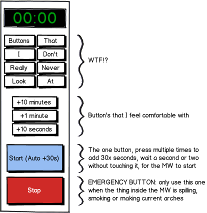
I really like microwaves with an interface like this, I remember when I started looking at these in houses, I got amazed with the wittiness of the designers...

mockup

download bmml source – Wireframes created with Balsamiq Mockups

Need 2 minutes -> press +1 Minute, +1 Minute Start or Start 4 times...

I've never come across something like, "Microwave for 2:48" so pretty much, no one really ask you for fractions, it's either, 1 minute, 2 minutes, 3 minutes, 5 minutes or 10 minutes...

The logarithmic approach works best for me, and the quick start button makes wonders...

1
  • 1
    How about just the blue and red buttons?
    – user67695
    Commented May 22, 2017 at 19:57
2

I am astounded no one has mentioned the most useful button (and the only one I use besides opening the door) on the microwave, "add one minute and start" button, everything else is supplementary.

If a microwave UI has this button it gets a pass, if it has a button to read my mind and also analyse what substance has been loaded into it to calculate the time and power to run at but doesn't have this button, then it's a bad UI.

2

Top 4 reasons why microwave UIs fail:

1.) They are not designed to be USABLE, they are designed to be MARKETABLE based on comparison of feature lists.

2.) The people who design products like this A.) almost NEVER watch real users try to use the product in the environment / scenarios the product will be used in, and B.) on the rare occasions UX observations ARE part of the design process programmers and designers frequently have no empathy for users and tend to "explain away" the user's struggles.

3.) Products with digital controls and UIs are "computers" and run on software. Software is designed for the convenience of programmers, not for the convenience of users. (Read "The Inmates are Running the Asylum" by Alan Cooper. It's still the rule rather than the exception).

4.) Good UX is difficult and expensive, ESPECIALLY for embedded system designers. Who on the team of microwave designers is an expert in human cognitive processes? In my experience it's highly unlikely that even ONE person on such a team has ANY training, interest or experience in human cognition.

Read "Plans and Situated Actions" by Lucy Suchman. It's a hard read, but she nails the disconnect between programmers and UX.

<><>

I found this article while looking for a decent quality microwave with simple controls. I've searched for 40 minutes. I think no such thing exists. It should be so easy:

  • Two "soft" dials: • Time, with a digital display to indicate exactly how much time is set/remaining. • Power, with a digital display to indicate the % power in 10% increments. • Variable ratio: turn slowly for small, faster for large increments
  • One lighted button: hit Green to go, Red to stop

If the product manager wants to add a bunch of garbage buttons, presets, programs and sensor controls go ahead if you must. But if the simple controls above are included (and visibly grouped on the panel) the microwave will be easy to use.

1
  • Make the people who design and build the product use it.
    – user67695
    Commented May 22, 2017 at 20:00
1

Personally, I am a fan of the two-dial variant, mainly because most microwaves I had were still stupid machines where a complex UI would just fake a complex device, that they are not. So what about newer and upcoming microwaves that are really "high-tech"? Would they demand a complete UI makeover?

I recently saw this microwave at an electronic store (which represents my personal worst case in microwave UIs). Apart from the membrane buttons, which by the way had no tactile feedback at all, we are presented a grid of seemingly unarranged control elements. Above all, the user is deprived of a conventional time and power selector. Instead he gets three different "Auto" setting and the possibility to enter the weight (?) of the meal.

While the microwaving system itself might be cleverly designed and the auto features are working as they should, the poor UI makes it very hard to trust the backend. And when you have no control of the cooking parameters, you HAVE to have faith in the automatic.

Maybe the two-knob version is already obsolete, but modern devcies that could use more suitable UIs should still communicate the feeling of the simple machines that microwaves once were.

1
  • 1
    I disagree strongly, that interface is remarkably free of cruft for an interface that's controlling three separate devices. It also has very standard time control buttons. I'd feel comfortable using it, and I don't even speak the language it's written in. On the other hand, I've never encountered a microwave with a wheel on it, so it might be I have a different user model to you.
    – Racheet
    Commented Oct 25, 2013 at 15:41
1

The real problems are:

  1. All the automated modes that don't work. Ovens don't have them and people don't get confused.

  2. The microwaves with analog wheels that have more than one function or some non-standard function. - The wheel, if any, should control either the time or the power, not both and not the mode/function.

  3. Small or hidden start/stop buttons - these should be the largest buttons and next to each other, either at the top, or better yet - at the bottom (since they are already there in many usable models).


A microwave should have a clean, simple UI:

  1. Optional - For combined devices (e.g. MW+Grill+Oven) - Select mode (if not default = Microwave).
  2. Optional - Select power (if not default = MAX).
  3. Select duration.
  4. Start

Also, microwaves should have a pause/cancel button, enabling the user to stop the cooking and then continue with the start button or the cancel the cooking.

An additional useful feature could be increase/reduce time (without waiting for operation to end).

The duration has to support fine resolution for short durations e.g. 10sec, 15sec, 20sec and etc. and long durations. This is hard to implement with an analog dial, especially since the user needs accurate feedback.

If the duration is not set with a dial, it should have a numberpad (assuming physical buttons are used), not +/- buttons which can take a lot of presses to get right.

The mode, power and duration should not use the same controls.

The controls should have clear labels (e.g. no icons that no one understands and no text that is poorly translated).

If the microwave has different modes, then the power should have separate controls per mode (e.g. 250W, 500W, 750W, 1000W for MW vs 100-250 degrees for oven vs upper/lower/both for grill).

1
  • I kept puzzling over the use of "100 degrees" on this and other answers, until I realized that you-all are not in the US. (Otherwise, why heat food to barely above room temp?)
    – user67695
    Commented May 22, 2017 at 19:59
0

The reason why microwave oven are so complicated is due to the competitive features that each manufacturer puts out to out-do one another. More features means more buttons and options.

It doesn't matter how useful or user-friendly that feature is, as long as it is unique and adds an additional tick on the box.

I doubt if anyone ever used the "Cook frozen chicken" or "Boil corn soup" feature (or any other advanced options like that) with their microwave ovens.

In my opinion, a microwave that offers basic Timer + Heat Level setting is the best. Anything more is just useless and makes the interface harder to use.

1
  • 2
    I've always believed that it's the job of a ux professional to take the feature set a device/product has, and create an interface that makes it intuitive. Claiming something has "too many features" is just abdicating our responsibility as an interface designer. WE go to war with the featureset we have, not the featureset we would have preferred, and we're damned well supposed to defeat the enemy anyway.
    – Racheet
    Commented Oct 25, 2013 at 15:55

Your Answer

By clicking “Post Your Answer”, you agree to our terms of service and acknowledge you have read our privacy policy.

Not the answer you're looking for? Browse other questions tagged or ask your own question.