2

I'll do the best to explain this, but please ask clarifying questions as needed:

I basically have a schedule attempting to map out seven stages of an event, which occurs over a period of roughly a week. This data is presently in timestamps which are difficult to read and hard to draw conclusions from, and I would like to present it visually some how.

Each stage has an estimated period of time in which it might occur, and these times can overlap with other stages because they are estimates (and in fact typically will).

In addition to the estimates, in certain stages I will sometimes know when part of the stage is known, with certainty, to be occurring.

The purpose of this map/schedule is to allow a user to look at the schedule and instantly recognize what periods of time stages are likely to occur, and what periods of time stages are definitely occurring.

How do I translate my timestamps into some sort of visual to convey this information?

1 Answer 1

6

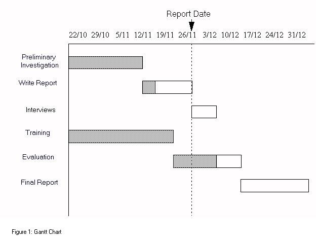
Your stages sound exactly like activities in a project. Visualizing the planning for a project is usually done with a Gantt Chart. A simple one might look like:

enter image description here

The dark part of each bar represents the minimum time an acitivity takes, the transparent part indicates the margin on the duration.

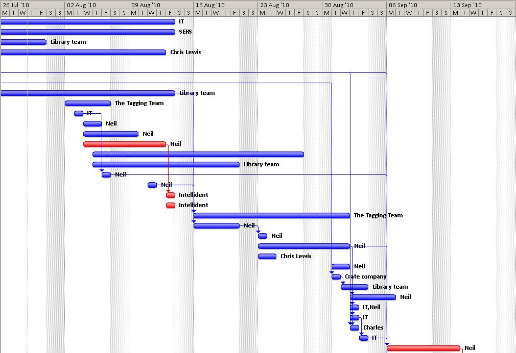
When project activities can depend on each other, for example B should not start before A has also started and only when C has ended, these relationships can also be visualized by including lines/arrows between activities. For example: enter image description here

Just google for images of Gantt chart to get some inspiration.

Update in response to comment:

Each stage:

  • can have margins on both start time and end time
  • latest start time does not necessarily occur before the earliest end time
  • can have minimum time (latest start time until earliest end time)
  • can not occur at all (latest start time after earliest end time)
  • can be happening at report time

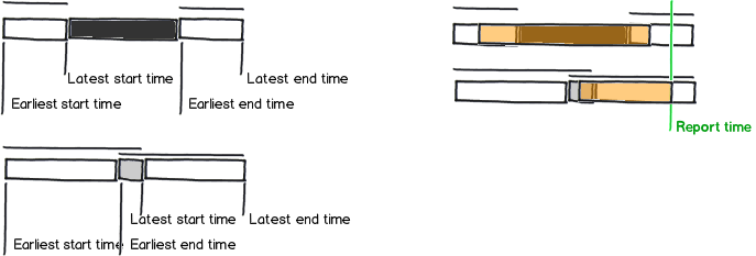
I think you can get a long way with a bit of clever shading and an indication of the actual start/end times:

  • Use a different shade saturation for stages that have a minimum duration and those that do not.
  • Indicate the start and end time margins with horizontal bar (at a different height) above the stage bar.
  • Indicate actual start time and/or end time by shading with a highlight color.
  • Use transparency in the highlighting so the original information isn't hidden.

mockup

download bmml source – Wireframes created with Balsamiq Mockups

1
  • Not a bad idea, I'm struggling a bit to create an implementation though. The problem is I have a range for the possible start time (will occur between these two times), a range for the possible end time, and occasionally a range when I know a stage occurred (though not necessarily all of the stage, so the first two are still relevant). To complicate things more, the range for the start time and end time overlap. It's just very difficult to make the chart make sense with all that going on. It's also easy to mistake the ranges for the actual stage, which occurs in the midst of the two stages
    – xtraorange
    Commented Jul 21, 2012 at 1:59

Your Answer

By clicking “Post Your Answer”, you agree to our terms of service and acknowledge you have read our privacy policy.

Not the answer you're looking for? Browse other questions tagged or ask your own question.