7

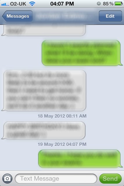
Why aren't text messages viewed on the iPhone iOS displayed at full width? I can think of several reasons why it would make sense:

  • Short messages won't have unnecessary line breaks, long text messages will be easier to read.
  • Text messages with an even width and alignment will have an improved sense of vertical and symmetry.
  • Contrast of colour and the tails of a message bubble indicate if a text is an incoming or outgoing message.

iPhone

4
  • 9
    I believe it's a visual affordance to allow you to more easily see if the message you're looking at was sent by you or received from someone else. The color difference also helps, but does not help as much with those who are color blind.
    – GotDibbs
    Commented May 19, 2012 at 15:47
  • 3
    I wonder if layout is the same for languages that read right to left?
    – Dan
    Commented May 19, 2012 at 21:45
  • 1
    I think you should've blurred the status bar and the buttons as well, just to be on the safe side ;) Commented May 20, 2012 at 17:16
  • I don't have an iPhone but I've seen pictures where it goes full width when one side is doing all the texting - can anyone confirm? Commented May 20, 2012 at 19:02

3 Answers 3

20

Because whitespace is important. Being able to quickly skim the list and pick out who said each response is important. By adding left and right whitespace it makes the list of messages far easier to scan. It also makes the application instantly accessible from the very first sight; if it were just white and green with no justification, then people seeing the application for the first time would still be confused.

Edit: Returning years later to expand upon this.

99% of text conversations are between two people, not groups. In messaging apps where group discussion is common, just picking out your own comments is not a great reason to reduce the readability in all the ways pointed out in the quetion. But when the conversation is between two individuals, the value of separating the two parties visually becomes more valuable than the readability of the paragraphs themselves, especially when the majority of messages when texting are very short and are unaffected by the shorter format.
3

What's done here (in contrast to the administration of single messages in an inbox or outbox) is to show all messages between you and one other person in a chronological order - this establishes a relation between single messages, illustrates a dialogue and finally is a really useful feature.

As a metaphor, speech bubbles as in comics are utilized. With some adaptations as e.g. showing messages below each other (not next to each other) which is necessary to put emphasis on the chronology and of course because of the limited screen width.

I agree that the "whitespace" is necessary to clearly represent this metaphorer and to differentiate the directions (incoming / outgoing) or "actors" (me / counterpart).

0

It's mimicking a side perspective of two people facing each other having a conversation. Each person on one side of the phone. The less white space you have, the less you know who is talking.

Your Answer

By clicking “Post Your Answer”, you agree to our terms of service and acknowledge you have read our privacy policy.

Not the answer you're looking for? Browse other questions tagged or ask your own question.