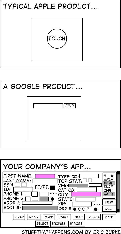
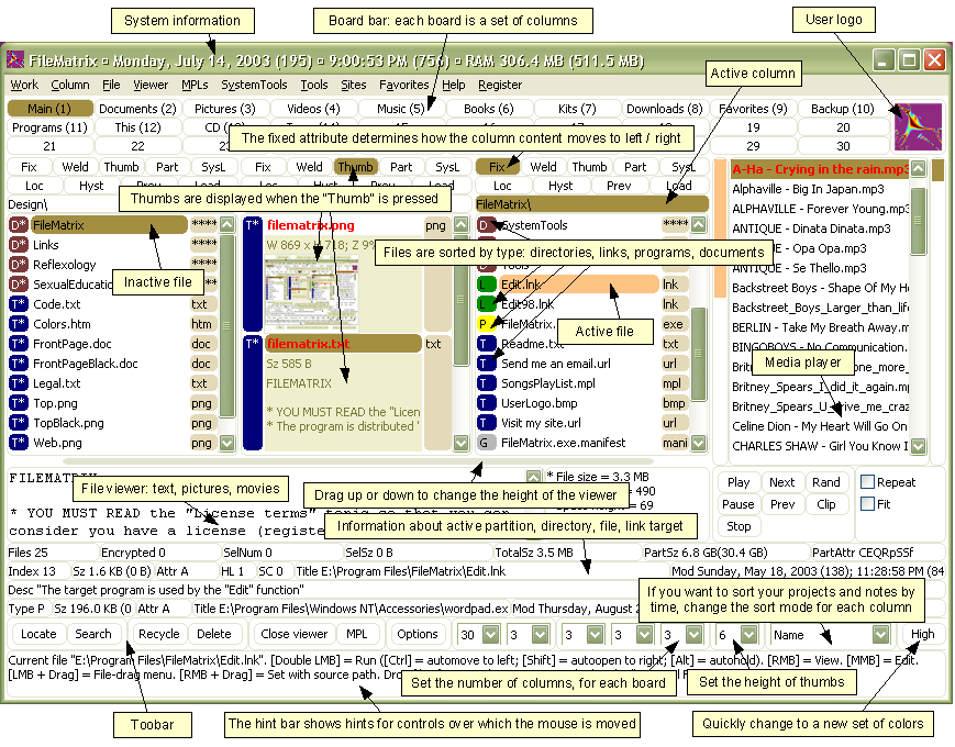
I think the title says it all. "Cockpit-like" is what I've come up with, but I'm looking for better ideas.
-
4I like the term 'craptastic'. That or 'designed by offshore outsourcing'– DA01Commented Oct 21, 2010 at 20:26
-
5Being a pilot, most cockpits are laid out exactly like you want them to be... Problem is, you have to know how to use it before you even stand a chance at learning how to use it. Same with poorly desgned interfaces. Documentation on these is usually inversely proportional to how easy to understand: More difficult = less documentation. I have bar a verrrry long margin, seen these type of intefaces come out of Offshore outsourcing projects, so i'll go with that...– JohnnyJPCommented Oct 22, 2010 at 8:26
26 Answers
"This looks like it was designed by engineers."
-
5I take offense to that. Engineers are more than capable of designing good interfaces. In fact, I would say that graphic designers are MUCH worse at designing a USABLE interface. Commented Oct 22, 2010 at 16:41
-
9The problem is that most engineers design with implementation details in mind and focus on possibilities. That makes great interfaces when your users are engineers, too. Of course there are exceptions. Commented Oct 22, 2010 at 21:15
-
2
-
3I'm with Charles. Poor design is poor design... and I've seen an awful lot of bad design by people who call themselves "designers" - and some rather good design by folk who call themselves "engineers". I find broad characterisations of one group by another harmful.– user597Commented Oct 23, 2010 at 17:43
-
3That's not a broad characterization of one group. That's just a statement of reality--good design takes practice, experience, and specific training. That doesn't mean you can't be both an engineer and a designer, but someone who is just an engineer is unlikely to produce good UI designs, just as a designer isn't likely to produce good engineering. I mean, would you hire a plumber to perform heart surgery? Commented Oct 24, 2010 at 5:44
Being a "Rube Goldberg" device is commonly used to identify complex, but mostly useless things.
And cockpits are getting better...
-
What I'm talking about isn't uselessness, just complexity. (Usually of the undesigned or poorly designed variety, though I'm sure in the case of actual cockpits, there's a ton of design in them. And I'm sure they are getting better, but they still have that reputation....)– sprugmanCommented Oct 21, 2010 at 17:28
-
Rube Goldberg machines mostly did do something useful, just in a very complicated way - en.wikipedia.org/wiki/Rube_Goldberg_machine . See also "Heath Robinson" for our non-US friends. Commented Oct 25, 2010 at 19:43
-
I guess that Rube Goldberg machines require careful designs. Therefore, I do not think that it is a good name for something which lacks designing. Commented Nov 3, 2010 at 21:12
Paraphrasing Alan Cooper: The remarkable thing about a dancing bear is not how well it dances -- it's actually terrible -- but that it dances at all.
Cluttered?
Or point them to this lovely cartoon :-)
http://stuffthathappens.com/blog/2008/03/05/simplicity/

I'd say "Cockpit-like" is a poor analogy since while the interface is complex they are highly designed. The complexity is needed - there's just a lot of information that needs to be easily accessible.
I've heard the phrase "What a 1040" used before.
(FYI non-US folks: Form 1040 = US tax return.)
"Lotus Notesesque"
-
1Or how about simply "Notesque"? Rhymes with "grotesque." Commented Oct 22, 2010 at 20:49
-
But the program is called "Lotus Notes", not "Lotus Note". Commented Oct 24, 2010 at 5:33
-
3
Our particular favourite term to use in our office is "Facerolled."
As in, "When they designed that, they must have just rolled their face across their keyboard and hoped for the best."
How about:
A Bureaucracy
A Boston (with streets running in ad hoc directions, it’s one of the hardest cities in the US to navigate).
A CASTLE
A Mortgage Derivative
-
2
A long time ago, a Micky Mouse watch was one that quickly fell apart, hence Micky Mouse this and that, so how about Micky Mouse interface?
I like the term angry fruit salad even though it's usually about the overuse of colors.
Part of the problem you'll run into is finding a term that has a wide enough distribution - many terms like this are specific to a particular culture or geography.
That said, here are my suggestions.
- A hodge-podge user iterface
- A dogs breakfast user interface
- A user interface only a mother could love
Interested to see other peoples ideas.
How about?
- Clutter-ware
- SNAFUI - Situation Normal All F'ed Up Interface
- Anti-Designed Interface
- Anti UI (pronounced ant-eye-you-eye) :)
The classic comparison used to be the Space Shuttle's UI.
Just be careful which buttons you press on re-entry...
http://www.nasa.gov/centers/langley/images/content/70412main_KSC-99PP-0412.JPG
Call it a "Death Star". Remember what all the control devices aboard that looked?
Microsoftesque?

