7

I have a dropdown box that I can use to select a device in the following manner:
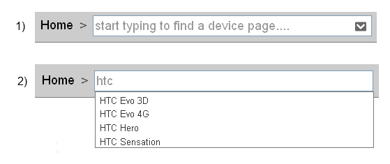
Device Dropdown

When the user selects a device, they are taken to a Device Homepage. The device homepage contains information about the devices and it's associated testing info.

There are 3 categories of device:

  1. Supported Devices - these are devices that are supported by, and have been tested with, the application
  2. Unsupported Devices - these are devices that are known about, but are guaranteed to fail
  3. Other - these are devices that sit between 1 and 2, they may work 'unofficially' and often have user-generated content associated. We can often infer compatibility for these devices by looking at different metrics.

Here are the user stories we are trying to solve. The user is a call center agent.

  • Primary - As a user I want to be able to select a device and find information relevant to test compatibility so that I can use it to inform and help my customer

  • Secondary - As a user I want to know whether a device is supported, un-supported or in-between so I can set my customer expectations and perhaps find a workaround

The Problem

It is not immediately obvious to a user, even once they have selected the device, which category the device falls into. This frustrates users and affects engagement with the tool. We know this information about each device so we can display it.

The question

At which point in the interaction should we let the user know which category a device is in? And for devices in category 3, how can we display some kind of inference, or confidence level to the user within this interaction?

9
  • 2
    Would it be true to say that in both of the user stories you list, the user will want/need to view some information on the device homepage regardless of the category? If that is true, shouldn't the primary concern be on fixing the device homepage rather than the dropdown box (& if so, can you mockup that?) Could also be I'm misinterpreting your question.
    – jcmeloni
    Commented Mar 15, 2012 at 21:07
  • Good point. I think as a call center user ('I have to delight my customers as well as get them off the phone as quickly as possible') they would appreciate the information as early as possible in the flow. The Device Homepage has multiple data sources, so a summary view I think is useful....
    – Jon White
    Commented Mar 15, 2012 at 22:08
  • Are you saying that, since device home page pulls data from multiple data sources, the page loads very slowly, so user finds herself waiting idly? Can you also clarify what you mean by a "Summary view"? Couldn't you solve this by simply appending the device name with suffix? For example "HTC Evo (supported), HTC 4G (unsupported), HTC Hero (unofficial), etc? Or maybe graying out the font for unsupported, and italicize the font for unofficial?
    – Jung Lee
    Commented Mar 16, 2012 at 1:17
  • 1
    Question: What happens when you type HTC and then press enter? Does that bring me to a "search results" page, or is it required that I select (or fully type) a model name from the drop down box? In other words: does the drop down box show suggestions or search results? Commented Mar 19, 2012 at 15:16
  • In your question you talk about a drop down box and about a device homepage. Is there something in between those two, like a search results page?
    – User 1
    Commented Mar 19, 2012 at 15:24

8 Answers 8

3
+50

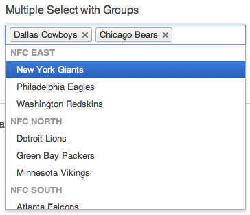
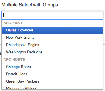
There is a amazing jQuery plugin that addresses the issue nicely... I´ve been using it for a while and it works quite nicely. It does supports categories. Of course selected devices are removed from the selection list and can´t be selected twice.

It´s called Chosen.

enter image description here

enter image description here

3
  • 1) You assume that the OP is working on a webapp. 2) It doesn't seem to allow lookup for single select with groups.
    – dnbrv
    Commented Mar 19, 2012 at 12:04
  • Right, I assumed a webapp - I´m clearly biased ;). It should help for any app though as it´s always good to have something to actually try out vs. a sketch. :)
    – thomasf1
    Commented Mar 19, 2012 at 12:32
  • This is very nice! Commented Mar 19, 2012 at 17:07
9

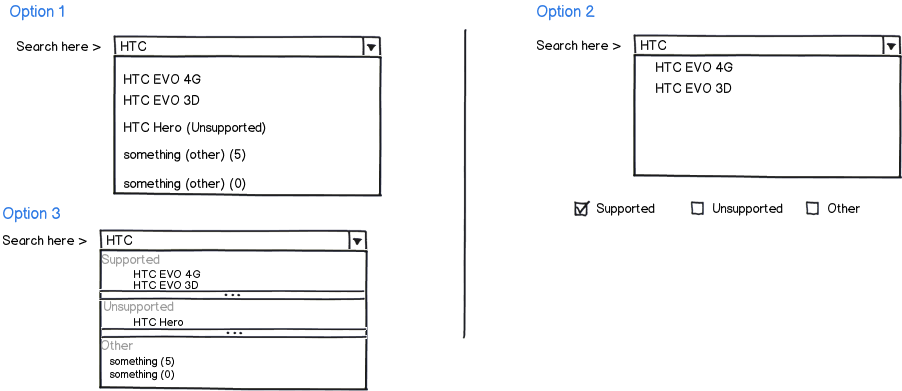
I can think of three approaches for this :

mockup

download bmml source – Wireframes created with Balsamiq Mockups

With regards to letting the user know at which point the device is unsupported,I would suggest doing it at the earliest so that the customer agent doesn't spend a great deal of time trying to help and then in the end give the response that the solution that since the device was unsupported,they cannot help them.

However you did mention that the agents are more then welcome to try and find workarounds for unsupported devices,once you lay the current situation out to the user (customer) and try to work with him in establishing a solution, your customer satisfaction would be higher as you have highlighted your current limitations but have expressed a willingness to work with him in resolving the problem

Edit: Based upon your comments,I just updated my mockup (option 3) to show a potential filtering system in which the different types (supported,unsupported and others) are used to filter the options available.The supported and unsupported options are self obvious but in case of the other case,if there an user written article about how to support a specific system or mobile phone,it should be tagged appropriately with a tagging convention of the mobile name as well as something like "other". You can then use an programmatic approach to increase the count associated with each mobile selection every time a tag is made against an "other" option

6
  • +1 for option 1, which is where I was going to go with my answer.
    – jcmeloni
    Commented Mar 16, 2012 at 12:59
  • For option 1, how could I designate a scale for 'other'. let's say 'number of user generated articles' is a good barometer of compatibility. Would you put this in the dropdown also?
    – Jon White
    Commented Mar 16, 2012 at 20:20
  • In that case,you have a content management problem which you need to consider since you have to define how your different groups are structured. How about calling other as "undefined" ?
    – Mervin
    Commented Mar 16, 2012 at 20:23
  • What I mean is I have Devices A, B, C and D. A is 'Supported', B is 'Unsupported', C and D are both 'other', yet 6 has 20 user-generated articles written about it inferring that it is likely to work. D on the other hand has zero. What could I use to infer that C is more likely to work than D?
    – Jon White
    Commented Mar 18, 2012 at 22:29
  • 1
    @MFrank2012: It's not cool to say "Based upon your responses" when you blatantly copy another answer (not a comment to yours) that was added later.
    – dnbrv
    Commented Mar 19, 2012 at 6:03
3

You've got 2 options for showing the type of items while searching for them:

  • One: An appended indicator, which can be a graphic (e.g., check mark, cross, and cross) or plain words in parentheses (e.g., supported, unsupported, and other), with the items sorted alphabetically regardless of their type. A pre-pended indicator will not work because, in this workflow, users look for the match first and then for its type. It would look like this (I've intentionally mixed graphics with words):

mockup

download bmml source – Wireframes created with Balsamiq Mockups

  • Two: Displaying search results grouped by type (supported, unsupported, and other) and sorting them alphabetically within the group. This way users can scan results in the supported list first and then brace themselves for the unsupported and other. Microsoft uses this pattern in Start Menu search box for Windows Vista and Windows 7:

    enter image description here
    Note: Microsoft limits the number of results shown to just 3 when there're matches in multiple categories and makes category titles clickable links to expanded results. You might not need this part of the pattern since the number of results in your case will likely be smaller.

In the end, I would test both approaches to see which one allows users to find the needed items quicker. There're logical arguments in favor of both but nothing can beat real test results.

1
  • +1 for icons and un-cluttering the UI a bit. I would disagree with your statement that prepended indicators would not work - think of the input field and the dropdown having some padding added on the left and show the icon there instead; this could be easily excluded from the matching algorithm. The bonus of such approach would be users' increased ability to scan potential matches for compatibility (which cannot be comfortably done if presented in a non-grid form)
    – Oleg
    Commented Mar 19, 2012 at 21:09
2

In contrast to most answers posted already, I believe it is wrong to try to show the category in the drop down box itself. The main reason for this is that the drop down box acts as some kind of search box. The category that a device falls in is a property of the device itself, not of the way that you try to find the device. In other words: the suggestions in the drop down box are there to help you find the correct device more easily. Adding the category there will not help me find the device more easily. (It could in fact make it harder as the added information distracts).

I believe the only correct place to show the category is in the page where you show all other device properties, i.e. the Device's Homepage.

Let's make a comparison here. Suppose you where making a website about movies. The user can navigate to any movie in the database, by entering the name, or a part of the name. Suppose I type "dolphin", the combobox would show all movie titles that contain the word "dolphin" in the title. Would you say it is good to have the film-rating category mentioned in this drop down box? I think not. But if you think that would be nice for some reason then the next thing you are going to be asked is to add other properties as well. Release date, main actors,... Once you navigate to the page of a movie, then I would show all this information. If you then want to make the film-rating category more obvious, then put the rating label in giant-monster size on that page. alternatively, or better yet, you could talk to a graphical designer that is able to make this into an eye-catching-can't-be-overlooked yet nice looking thing.

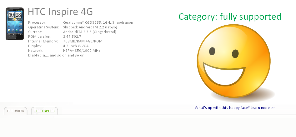
Let's focus again on your problem: "It is not immediately obvious to a user, even once they have selected the device, which category the device falls into.". Then I think the solution is easy. You need to adapt the Device's Homepage in such a way that it is more obvious.

I am not a graphical designer so I lack the skills to make this look good, but this should give you an idea of what I propose:

enter image description here

1

I am not sure why you have chosen not to use a table instead of a dropdown for this, maybe it's not applicable in your solution.

However, if you had a table instead, displaying whether a device is compatible or not would be seamless, plus you could easily display additional information in other columns that could be beneficial to the user.

This combined with a search form, a text field for searching models and possible additional parameters would, as far as I'm concerned, be the optimal solution for what you want to do.

The user would instantly see if their device is supported right off the table. And if the user seeks additional information, the items in the table could link to a information page for each model, similar to what a click in the dropdown is supposed to do now.

1

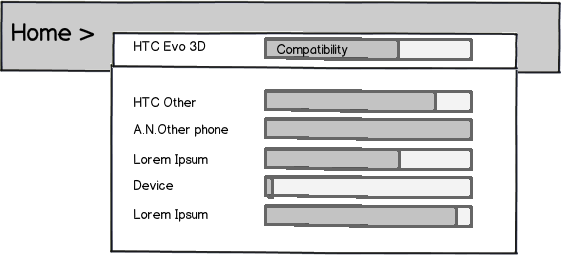
OK, I'll suggest a different approach here to try to address all three categories of phone as well as inferring just how compatible those in category 3 are.

I've gone for a visual indicator in the results, sort of like a sparkline / progress bar. A full bar means that phone is fully compatible, and empty bar means it's not supported at all and any degree inbetween means it's supported to some measurable extent. That way everything is all kept in one line for the device and each item can be presented in a single line - there's no need to split the results into sections such as some of the examples here. You can also tell the compatibility of all items in the list at a glace and compare one with another.

mockup

download bmml source – Wireframes created with Balsamiq Mockups

0

I enjoy the straightforwardness of an autocomplete menu layout you've initially provided. The key is building on top of it in a non-obtrusive manner, so here are my counter-arguments to some of the other suggestions (this is not a personal stab at MFrank2012 :)

Approach 1: inline "supported/unsopported" or pictograms. Informative, but clattered and distracting.

Approach 2: multiple search options (search only supported/unsupported etc.) - potentially forces the user to re-enter data as they don't know whether or not their device is supported to begin with. Problem not solved for when multiple checkboxes are selected.

Approach 3: grouping items in the autocomplete dropdown - distorts the logic of sorting prompts alphabetically/by most requested. Effectively interferes with the primary purpose of autocomplete.

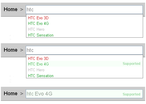
I'd suggest unobtrusive colour coding - green for supported, red (not the kind that burns your eyes) for unsupported and grey or maybe orange for something in-between? For bonus points there'll be hover interaction (the option will confirm it's state) and when an option is selected it could be confirmed in the input as well. That last step could also have input border colour adjusted, but this is not mocked up in my attachment below:

three states mocked up - text entry, option hover and input completed

2
  • 1
    Color coding alone doesn't work for colorblind people and your secondary cue is too far away to be noticed immediately.
    – dnbrv
    Commented Mar 19, 2012 at 12:05
  • @dnbrv: ah, of course it doesn't (imo would still be a good idea to keep it on top of whatever accessible method is chosen as a base); re #2: the intention to move it to the other side of the dropdown was so that it does not interfere with the primary function of selecting an option. Admittedly, this was an effort to up the aesthetics as well (same text pushed left against the product title? ugh), but seems flawed now. Maybe some kind of dropdown grid would work, with a clearly dedicated second column for the status field?
    – Oleg
    Commented Mar 19, 2012 at 19:30
0

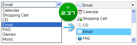
If I where you I would add and image of the device on the left side.

Like these examples...

enter image description here
JavaScript image combobox

ASP.NET ComboBox - Icons from Database

4
  • 2
    What does that add for the user?
    – Jon White
    Commented Mar 21, 2012 at 13:36
  • 1
    Altough that may be nice, showing an image of the device would not solve the problem in any way.
    – User 1
    Commented Mar 22, 2012 at 12:24
  • @Mackelito: Your examples don't work because they're just drop-down enhancements while the OP needs auto-complete.
    – dnbrv
    Commented Mar 22, 2012 at 16:10
  • Well I was thinking of a combination of both :)
    – Mackelito
    Commented Mar 30, 2012 at 8:33

Your Answer

By clicking “Post Your Answer”, you agree to our terms of service and acknowledge you have read our privacy policy.

Not the answer you're looking for? Browse other questions tagged or ask your own question.