5

My question is when, if ever, a shadowless version of an icon is preferred over the shadowed version.

By shadowed I mean the tiny, almost imperceptible little black gaussian blur below the icon.

I should also mention that it is a web application I'm developing.

2
  • 1
    Could the down voter add some information to Felipe to coach on why you have down voted?
    – DigiKev
    Commented Jan 21, 2012 at 18:38
  • Upvoted, because this is not a bad question imo. Commented Jan 23, 2012 at 13:04

4 Answers 4

3

It depends on the application.

Youtube uses these shadows to create a clear indication of what a button is. As you can see here, the Safety button is ready to be clicked. The shadow draws attention so the other buttons (these are footer elements intended to be inconspicuous) fall into the background.

enter image description here

If your visual design is very three dimensional and or involves a natural lighting scheme, these shadows can add more than aesthetics, they provide affordance.

However shadows don't always fit. Windows Metro has a crisp, flat, typographicly focused design.
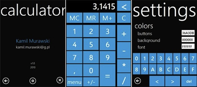
enter image description here

Here buttons and icons are made apparent by their contours, not their shadows. Shadows are a 3 dimensional effect and rarely have place in a 2D plane.

0
2

It's purely for aesthetics and to give a sense of reality to the user, things that you want to give stronger presence on the page need shadows and those that make the whole page look better also need shadows.

The shadow gives the 3d perspective so you can give shadows to things that really exists in relative your web applications or just use it for call for action buttons.

2
  • 1
    It's not purely for aethetics at all as I've noted in my answer. The added affordance can be very important, especially on pages where many banners and text background effects make it hard to tell what a button is (granted those are their own design problem).
    – Zelda
    Commented Jan 23, 2012 at 21:53
  • @BenBrocka : Ya i agree thats the reason I also told that it is used to give sense of space and reality to the user. Ty !! Commented Jan 25, 2012 at 13:18
1

I think the good use of shadows can make a button or icon look real, but that really depends on your approach to the design, from my own personal experience shadows work best with not so complex icons, otherwise it creates too much visual noise.

0

A small dark pixel line would indicate that the icon lays on the button or layer. On one side it can be just aesthetics, on the other it can increase the feeling of contrast. So it's a question of what you want it to look like or that sould be the "job" of your icons. Think about that first, then decide what would fit your application. Form follows function but make it nice and beautiful too. :-)

Your Answer

By clicking “Post Your Answer”, you agree to our terms of service and acknowledge you have read our privacy policy.

Not the answer you're looking for? Browse other questions tagged or ask your own question.