1

I am exploring the best UX solution for newsletter checkbox (i.e. newsletter signup) for social sign on (SSO - sign up with Google, Facebook, Apple etc).

The problem: SSO are required to have middle step where the actual decision of signup/login is on a third party. Newsletter signup, by law in some countries, require an action of confirmation (checkbox, email input, etc) but it cannot be moved to the SSO screen.

Solutions I can think of:

  • Add extra step to SSO flow. Disadvantage: I don't need to ask anything else besides the newsletter, it's irritating users with extra step.
  • Ask for newsletter signup before clicking the SSO button. Disadvantage: confusing since (for example, Google) button is very recognizable action and checkbox will be missed. Also I cannot make it required, so customers will likely skip it.
  • Ask for newsletter signup after login via a banner or popup. This is what I'm currently doing on startnew.app, it's a small popup but attracts the eyes (I can tell by heatmaps)

What do you think is best and why? Am I missing some other way?

3
  • I've seen companies that use the SSO, once the user has an account, a popup will say "Finish your account", in which it would ask for further information (maybe a job role or location - information that the SSO wouldn't have provided), the newsletter checkbox could be here?
    – Harrison
    Commented Mar 25 at 16:08
  • Thanks! Yes, this is what I mentioned in #1 option, I just don't want/have to collect anything else, and having step just for newsletter might make it irritating?
    – Ilya
    Commented Mar 25 at 22:07
  • It is a tough one, having things like the SSO (as it does feel like you lose some control/customisation). It depends what other information you will need after the SSO process, if you needed a Date Of Birth or Preferred Language (or the other things mentioned) before the user could continue, then you could force the user through the popup, but your at the mercy of user drop-off (which is where autocompleting forms will help). One thing I've done in my professional role is have the modal be optional for a time, giving the user the option to skip it (say) twice before making it mandatory.
    – Harrison
    Commented Mar 26 at 9:14

1 Answer 1

0

Small, non-interruptive popups are great for subscriptions even if people don't enter your signup flow. I think you should keep that on your site regardless of how it's performing vs. signup conversion.

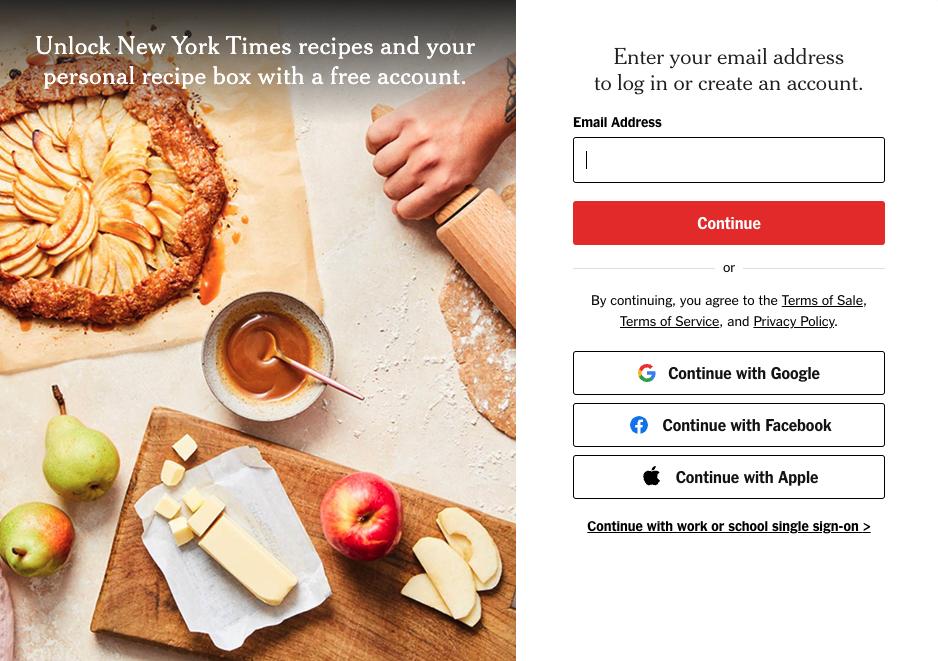
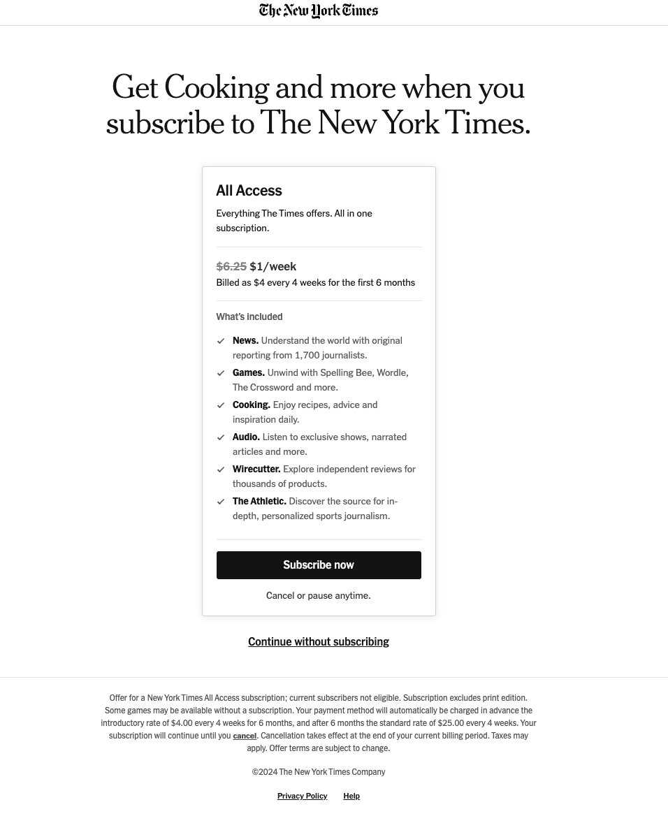
For your social signup folks - adding another step in the flow isn't uncommon or even annoying, if you use the step to convince users of the value of subscribing. After continuing signup with Gmail, the New York Times site shows a clean, targeted message selling the value of a paid subscription, and one click to start the opt-in. For an unpaid ordinary marketing email subscription, you could probably do even less. Just allow the user an easy way to say "no thanks", and that should cover your compliance requirements.

Before logging in with social:

NYT cooking - step 1 screen

Right after social login:

NTY - step 2 screen - opt in

1
  • Thank you - I cannot upvote but I definitely would've! My situation is that newsletter is not a main driver of conversion, or product. Unless many people would opt-in, I will keep it same, so making it less annoying was my "idea validation" approach.
    – Ilya
    Commented Mar 25 at 22:11

Your Answer

By clicking “Post Your Answer”, you agree to our terms of service and acknowledge you have read our privacy policy.

Not the answer you're looking for? Browse other questions tagged or ask your own question.