17

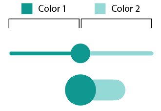
Our brand's primary colour is green, and so we've been using it for a while as the primary colour for our design system (clickable buttons, elements, etc. as shown here):

enter image description here

Now I've just realised that we've also been using it to indicate liveliness/success - e.g., showing that something is turned on, etc.

I feel like this is a different semantic usage. Should I try and find a new colour for this new usage, or could I use the same colour in both places whilst using context to indicate the different meaning?

An example of the alternative usage for "on" or "success" is a badge indicating that something is currently enabled, like so, where we're showing which of 4 outputs are on in a compact form. These are not interactive. (They are smaller than they appear here, not sure how to shrink an image in Stack Exchange).

enter image description here

3
  • 2
    Despite the semantic difference, what could be wrong with associating your brand to liveliness and success? :-P
    – Bergi
    Commented Nov 30, 2022 at 2:00
  • 17
    Your company colour is more of a teal than a green; why not just use an actual green? like #0c0 Commented Nov 30, 2022 at 10:56
  • 1
    Use UI elements like check boxes. These sliders are bad UX in any way and that's why developers need to rely additionally on color, as the whole Material design didn't include useful labels. A real-life switch would have labels to the left and right of the switch. Material design doesn't include any labels and other UIs using these switches use the very ambiguous position inside the switch to show the current state, but moving the switch into the direction of the text does the opposite as what the text says. Don't contribute to the mess, use good old checkboxes.
    – allo
    Commented Dec 2, 2022 at 15:11

6 Answers 6

37

DO NOT RELY ON COLOUR ALONE.

Status indicators should never rely on colour alone.

If you have any colourblind users (approximately 4.2% of people are colourblind) this will make statuses difficult to read.

Always accompany your status indicators with a meaningful/helpful symbol so that your users know exactly what the status means - Does it mean that a process has completed? Does it mean that an answer is valid? does it mean that a value is rising? etc. Help your users with that little extra layer of information

If you're using meaningful symbols then you can go back to using your brand green for success indicators because you're not just relying on the colour anymore ... and who doesn't want their brand associated with success, right?

EDIT for additional help:

Test your UI in greyscale - if it doesn't work then you need to rethink the way your using colour.

EDIT 2 for more accessibility:

Using icons with statuses also helps users with cognitive and situational needs by making the information quicker and easier to understand.

EDIT 3 For better math:

The total colourblind population is around 4.2% - Thanks Azor Ahai -him

5
  • 4
    Jenkins uses blue to indicate success instead of green precisely for this reason. Commented Dec 1, 2022 at 12:11
  • 3
    Great comment - accessibility is key and was a missing part of this conversation. Thank you Roux.
    – Tom H
    Commented Dec 1, 2022 at 16:41
  • 1
    8%? From WP, "In individuals with Northern European ancestry, as many as 8 percent of men and 0.4 percent of women experience congenital color deficiency." That's 4.2% Commented Dec 2, 2022 at 20:14
  • 1
    Good Spot @AzorAhai-him- - I'll fix that now! Commented Dec 2, 2022 at 21:19
  • 1
    To add: depending on your design, you may also want to make sure the symbols or icons you use are uncolored. A red circled exclamation point could be as just as illegible. Commented Dec 2, 2022 at 21:43
11

When it comes to coloring things like on/off indicators, selection indicators, links, error messages—interface "signals"—use colors people expect to see for those things. Here's where standards help streamline cognition.

Brands on the other hand ought to be unique, distinctive. So using a brand color, teal, as in this case, strays from colors people are used to seeing when it comes to supporting a change in state of something, or the importance of a message.

Two distinct things here: brand, and interface signals. Using elements of the brand design to style signals weakens both.

Our brand's primary colour is green...

...we've also been using it to indicate liveliness/success...

I feel like this is a different semantic usage.

...Emphasis on different.

The purpose of branding is recall, association, recognition, and emotional response. — An example of recall and association is when I say "potatoes", you say... ?? When I say "secret recipe" you say... What comes to mind? If products or services come to mind it's because their branding recall and association strategy was successful. Even more can be explored regarding logo/trademark/phrases recognition and emotional response.

The purpose of coloring interface signals is to support cognitive interpretation, learning, and recall of changing information, or prioritize, or categorize information.

Surely they need to harmonize, but being too similar blurs the lines of distinction, and therefore weakens the support for either particular purpose.

The brand is the hero, all else must support and harmonize, but it stands out. Your site information signals and supporting color strategy is the sidekick...doing the heavy lifting.

Brands, by nature, are unconventional—unique, unexpected. Interface signals and cues ought to follow convention—common, expected. Your brand palette is limited. Conforming your signal/cue color strategy to your brand colors reduces brand impact and interface clarity.

6
  • 2
    What is your actual suggestion to answer the question though? (I'm also not sure I agree with some of your points. There are lots of brands that use a brand color liberally to great effect (example: Target). The comparison to an accent wall isn't the same thing. If I want to be known as "the blue house", having all my walls be blue instead of just one accent wall is going to be more effective.) Commented Dec 1, 2022 at 13:24
  • 1
    @Scribblemacher Hi. Thanks. The main point is when it comes to coloring things like on/off indicators, selection indicators, links, error messages, etc. to use colors people expect to see for those things. Here's where standards help streamline cognition. Brands on the other hand ought to be unique, distinctive. So using a brand color, teal, as in this case, strays from colors people are used to seeing when it comes to supporting a change in state of something, or the importance of a message. Two distinct things here: brand, and interface signals. Am I making my response clearer? Commented Dec 1, 2022 at 15:55
  • 1
    I updated my response to lead with what I think is most important—use conventional colors for interface signals. After looking at the Target site I see that my "feature wall" analogy is a bit weak in this context, so I removed it. However, Target's liberal use of "Target Red" is in the graphic design of the page, which is part of their branding effort, not interface signals, such as the "Keep me signed in" checked checkbox on the Create Account page, which is standard green. Commented Dec 1, 2022 at 16:09
  • "Potato"→Potahto, "secret recipe"→sauce. Not sure what the word association here is meant to demonstrate.
    – Iiridayn
    Commented Dec 1, 2022 at 20:22
  • @Iiridayn This is very localized and cultural but when I hear "potato" I think of "Idaho", and "secret recipe", "Kentucky Fried Chicken". Maybe it's just me. :S Commented Dec 1, 2022 at 20:25
10

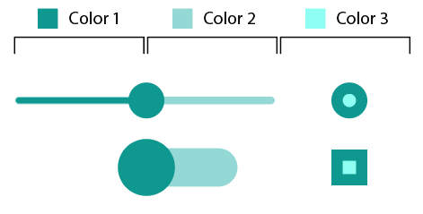
In the example of the first image you show not only the main color but also a dependency relationship between shades of the same color: the light color as the axis and the dark color as the object:

enter image description here

You can define a second dependency relationship similar to the previous one with a third hue bringing the lightest color to a maximum saturation:

enter image description here


Result:

enter image description here

This way you can clearly show the differences in status while maintaining the same color gamut:

enter image description here

If you keep the three colors, each one in its representation "layer", you perceptually achieve optimal coherence.

enter image description here

6

Not a big fan of color only indication. Even if you use different shade of green, if someone has trouble seeing colors properly, they might not be able to tell them apart. Why not just use a checkmark and a cross, that's pretty ubiquitous.

The grey squares should probably be better adjisted for contrast. Maybe make them a little darker or make the cross black (but that would look bad)

enter image description here

Oh and there is no harm in making the squares as large as a capital letter would be.

4

Use a different green for statuses. Many color palettes accommodate both warm and cool shades of colors; in your case, you could use your cool "brand" green for components, and a warm green exclusively for status indicators.

4

This won't necessarily apply to all controls and statuses but I noticed a nice little feature on Wix today. They use a symbol to indicate status as well as slightly fading the control. If you're only trying to show the status on the "Enabled" option in the question then this should work for you.

Control with symbols and colour change

Your Answer

By clicking “Post Your Answer”, you agree to our terms of service and acknowledge you have read our privacy policy.

Not the answer you're looking for? Browse other questions tagged or ask your own question.