I'm designing a money management app, and I'm curious what does people react to the color red and green.
Incomes should be displayed green or red? And expenses?
I'm designing a money management app, and I'm curious what does people react to the color red and green.
Incomes should be displayed green or red? And expenses?
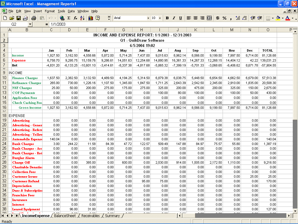
Common situation is that green/black numbers mean positive balance and red numbers mean deficit or negative balance.
So, I'd say that income should be green or black and expenses in red. Is what most people would be familiar with.

(source: quikdrawsoftware.com)

In a money management app Expenses should be top priority, while Income a secondary information. The main reason being that Expenses happen more often opposed to an Income, which usually its monthly.
IMHO the color doesn't it even matter - the typography and layout on how Expenses/Income is shown its much more important.
A '+' or '-' in front of a number is already good enough to tell what something is. Relying on color for your main element of the interface its bad. Use colors for uncommon elements where you want to bring attention.
A red color could be shown for Expenses that are big, maybe as a set % of the average income. How much this % is would depend on what a 'big expense' is considered by a user.
I wouldn't use colors for income - a money management app purpose its to save money, not to show off to someone how much you earned.