29

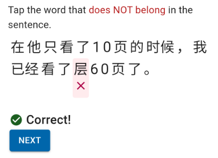
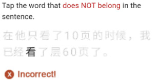
I have a language-learning app that shows the user a sentence with an extraneous word added that doesn't make sense in the context, and they have to choose which word doesn't belong:
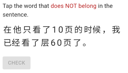
Choose the word that does not belong

When they tap a word, it marks it with a red X, indicating this is the one that they chose as incorrect.

enter image description here

One user gave feedback that the red X was confusing since it looked like an indication that they answered the question incorrectly.

It seems inherently confusing, because there are two contradictory ideas of "correct" and "incorrect" at the same time, i.e. if the word is incorrect, the user's selection is correct, and vice versa if the word is correct, the user's selection is incorrect.

What is the best way to indicate to a user that they have correctly chosen the incorrect option?

7
  • 2
    I don't know Japanese, but is the word extra like "This sentence has box six words" or is it wrong, like "This sentence has yellow words" Commented Mar 16, 2021 at 18:22
  • 3
    @AzorAhai-him- Yes you got the right idea. The sentence in the screenshot is "When he had read 10 pages, I had already read floor 60 pages." Commented Mar 17, 2021 at 4:47
  • 2
    Not really enough for an answer: You could also place the X over the character/word. A thin X (so the character stays readable enough) and a red background
    – Martijn
    Commented Mar 17, 2021 at 8:44
  • 2
    Or (@Martijn) a strikeout rather than a cross. A slash would probably look better than an <s>html-style line</s>
    – Chris H
    Commented Mar 17, 2021 at 13:28
  • 2
    Have you considered reframing as "the word that should be removed" rather than "the word that is incorrect"? (Because its problem is contextual, not inherent.) Commented Mar 17, 2021 at 22:37

6 Answers 6

47
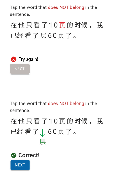
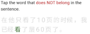
  • If the word is in the wrong place, the logical situation when the user answers right, is the word leaving its position
  • If the choice is correct, the color should not be red
  • If the choice is wrong, the word stays in the same place and changes its color to red

s


enter image description here


4
  • 28
    A good companion to this might be rephrasing the question to "Tap the word that should be removed from the sentence", or something like that - positive rather than negative phrasing.
    – David Z
    Commented Mar 17, 2021 at 1:06
  • 6
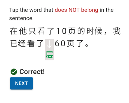
    It would be really cool if it animated: bad word slides out, rest of words slide together to fill the gap, DING congratulations green success
    – user67467
    Commented Mar 17, 2021 at 22:15
  • 4
    Examples 2 and 3 would not work well if the correct answer is in the first line; ditto if there are 3 or more lines of text and the correct answer is in the middle somewhere.
    – MonkeyZeus
    Commented Mar 18, 2021 at 14:05
  • Alternatively, just make the extraneous word fade out (whether or not the rest of the text animates to close the gap) -- turn it blue or green to indicate the correct word was selected, then fade it out. It provides a positive animation and allows the user to see the proper sentence. As an aside, don't lean too heavily on green/correct and red/incorrect -- red/green colorblindness renders these distinctions moot, and is reasonably common.
    – Doktor J
    Commented Mar 18, 2021 at 21:55
9

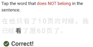
Keep the focus on their choice as the rest is irrelevant at that very moment, mute everything else.

enter image description here

enter image description here

You can also slowly fade the other words back in if they are allowed another chance after they have failed.

If you want you can forgo the correct or incorrect message completely, but make sure you keep the colour blind in mind (example of correct answer, word is in green):

enter image description here

2
  • I was thinking about greying out the extraneous word, but this is even better!
    – xjcl
    Commented Mar 18, 2021 at 1:15
  • 3
    I'm not sure I like this: as it makes the sentence hard to read and puts so much focus on what "should not be there". If the goal is to learn how to make sentences or similar you wish to show the "corrected" result in a prominent place.
    – paul23
    Commented Mar 18, 2021 at 21:33
6

Instead of showing it with a red X, you could either

  • move the word out of the sentence to somewhere else in the screen
  • hide the word altogether

In both cases, you can optionally move the remainders of the sentence together. Both have the advantage that what you see in the end is a complete, correct sentence.

Other than that, questions asked 'in the negative' will always be harder to grasp and validate that those which have a 'positive' wording. I like @DavidZ's suggestion in the comments to change it into a positive statement like "Tap the word that should be removed from the sentence".

2

I am afraid that @Danielillo's answer gives you trouble when the 'not belonging word' is on the first line.

What about this?

When the user selected: enter image description here

When the answer is correct: enter image description here

When the answer is incorrect: enter image description here

1
  • 3
    Please avoid leaning on red/green to indicate incorrect/correct. It is not user-friendly for colorblind users, which is somewhere between 4-10% of the male population (depending on ethnicity; it's more prevalent in some population groups than others). Otherwise I think this is a pretty solid answer.
    – Doktor J
    Commented Mar 18, 2021 at 21:57
1

In a general sense, I would think about the operation the user has performed and how you communicate the result of that operation.

Either the user has succeeded or failed in the task. I would separate that from the concept of the word being "wrong".

How I would solve this is to indicate to the user what they have selected in an obvious way, but one which doesn't have a semantic meaning, then focus on communicating the success of failure of the task.

0

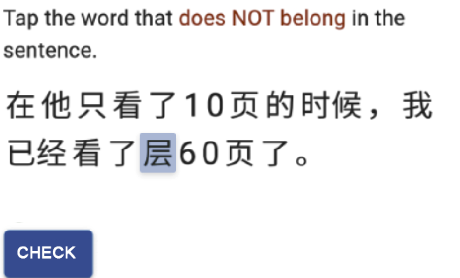
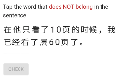
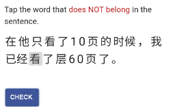
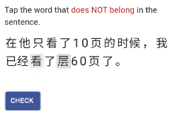
Highlight the selection and activate the  [CHECK]  button.


select check


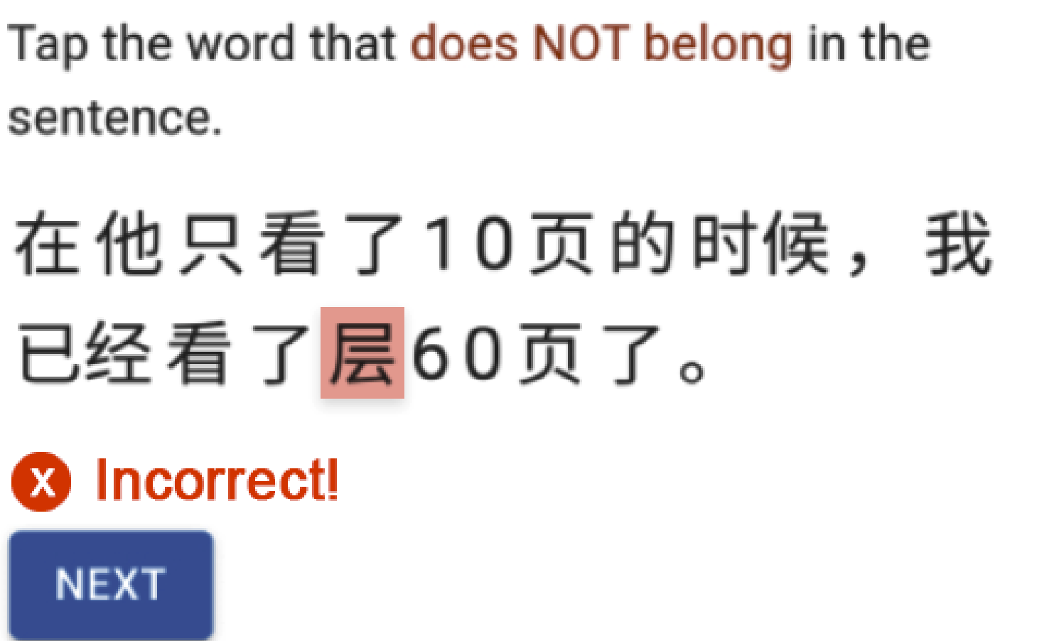
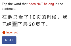
If the selection is wrong, display "Incorrect", and depending on the design of the program flow, either provide a  [NEXT]  or  [TRY AGAIN]  option.


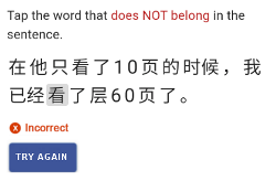
incorrect next incorrect try again


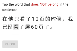
If  [TRY AGAIN]  is an option, when clicked, remove the "Incorrect" message, slightly dim the highlight of the previously selected wrong character, and display the dimmed  [CHECK]  button.

When the user makes another selection activate the  [CHECK]  button.


check again dimmed check again


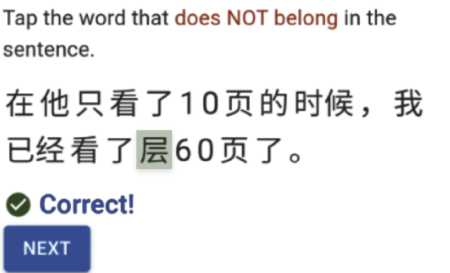
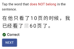
Upon a correct selection, dim the correctly selected character, display "Correct", and activate the  [NEXT]  button.


correct


Your Answer

By clicking “Post Your Answer”, you agree to our terms of service and acknowledge you have read our privacy policy.

Not the answer you're looking for? Browse other questions tagged or ask your own question.