1

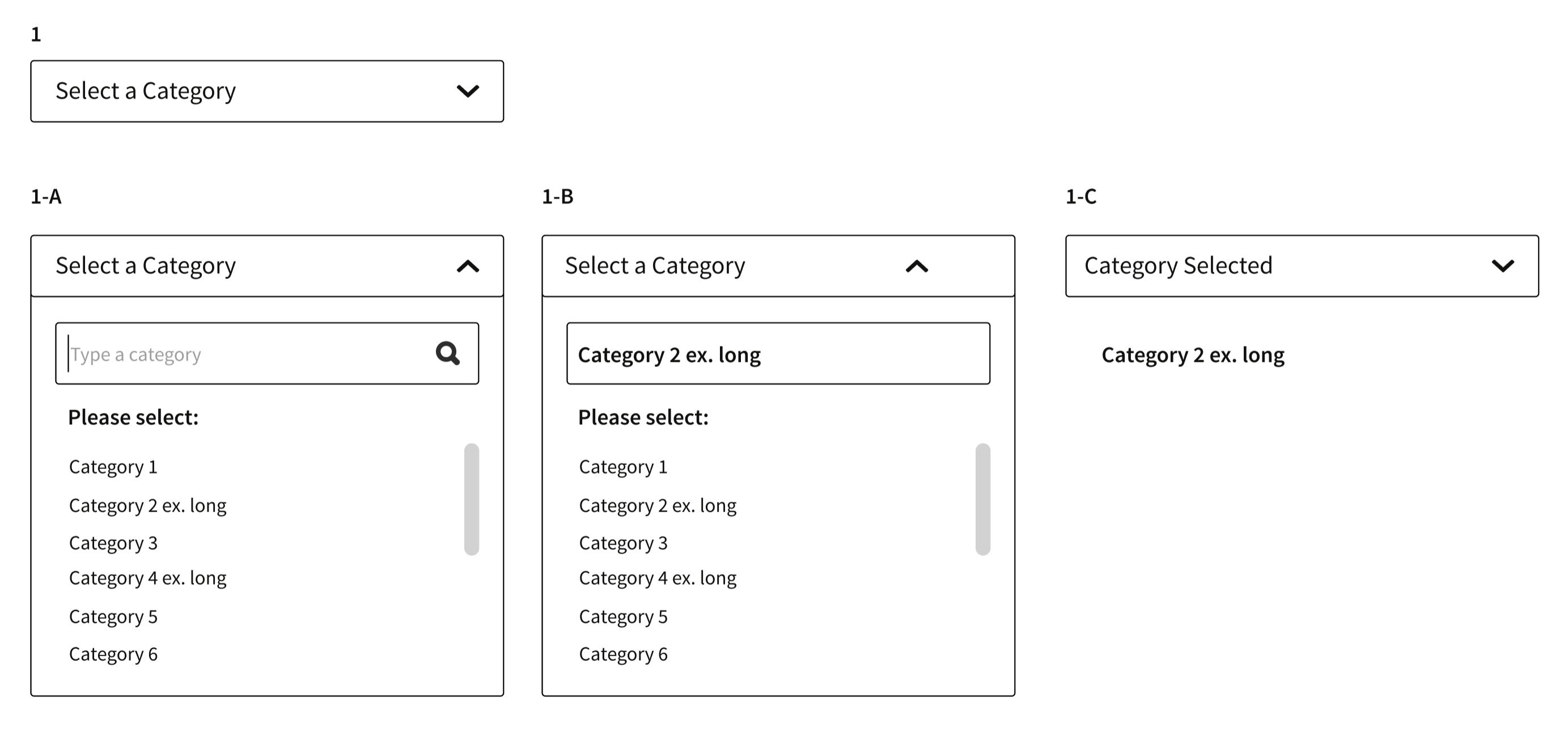
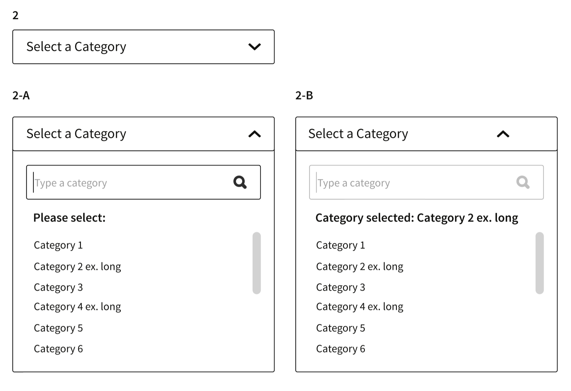
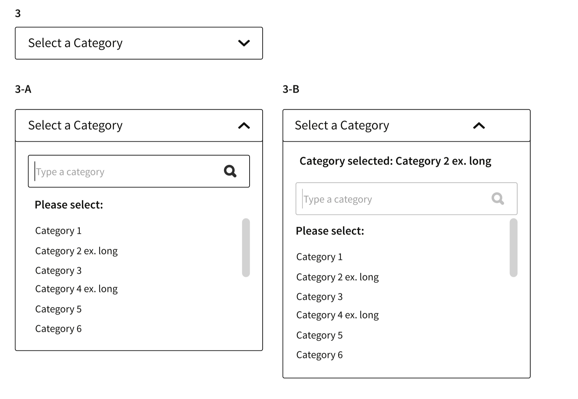
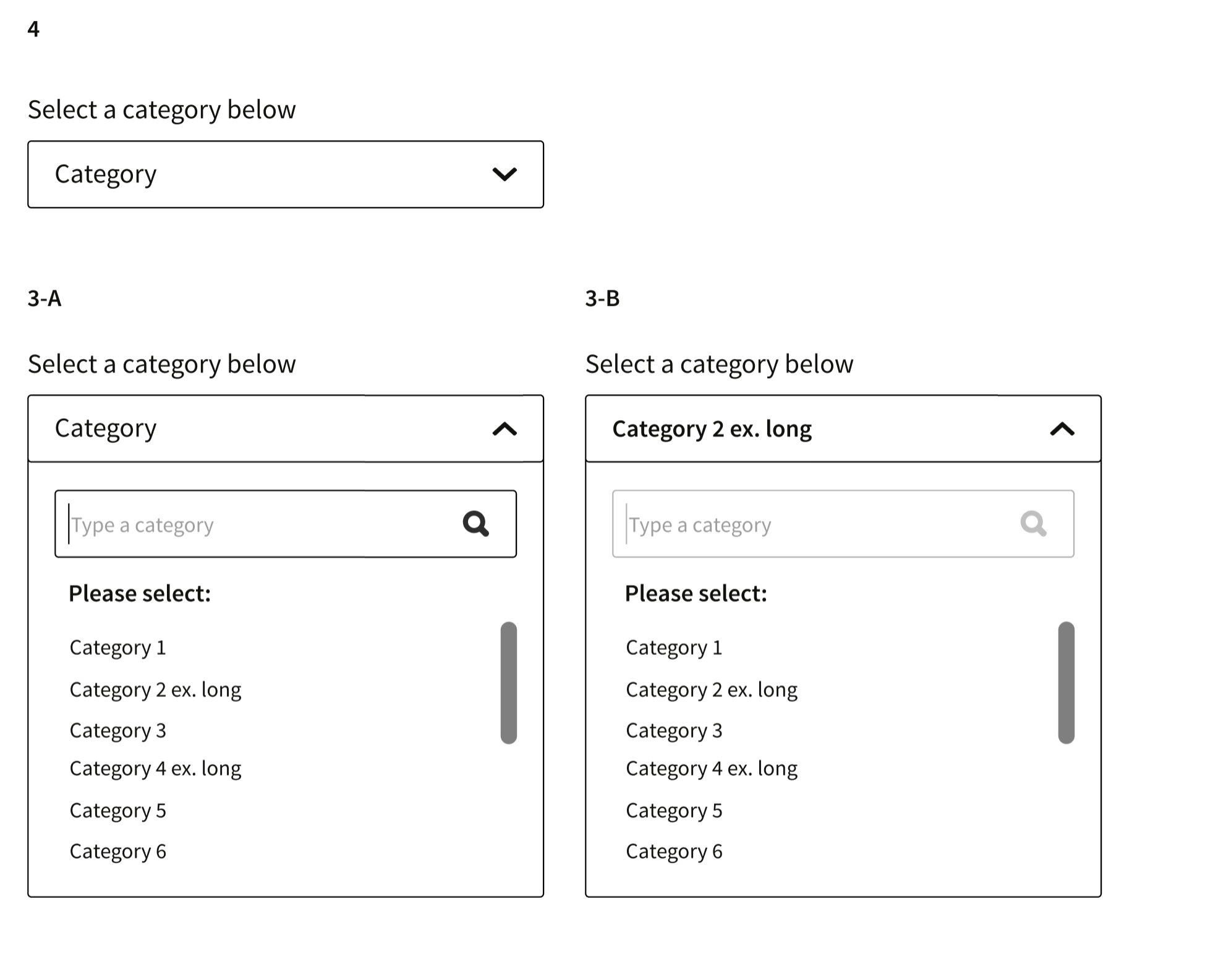
Recently I was faced with the following dilemma. By trying to combine a drop-down that must contain items with a top search/type field (autocomplete and search) inside of the drop-down I realised that the user may get confused. Despite I know this piece of Ui is used in many websites and applications what is your opinion when after you select and choose an option you must also display the results.

I attach my case study examples.

Case 1

Case 2

Case 3

Case 4

1 Answer 1

2

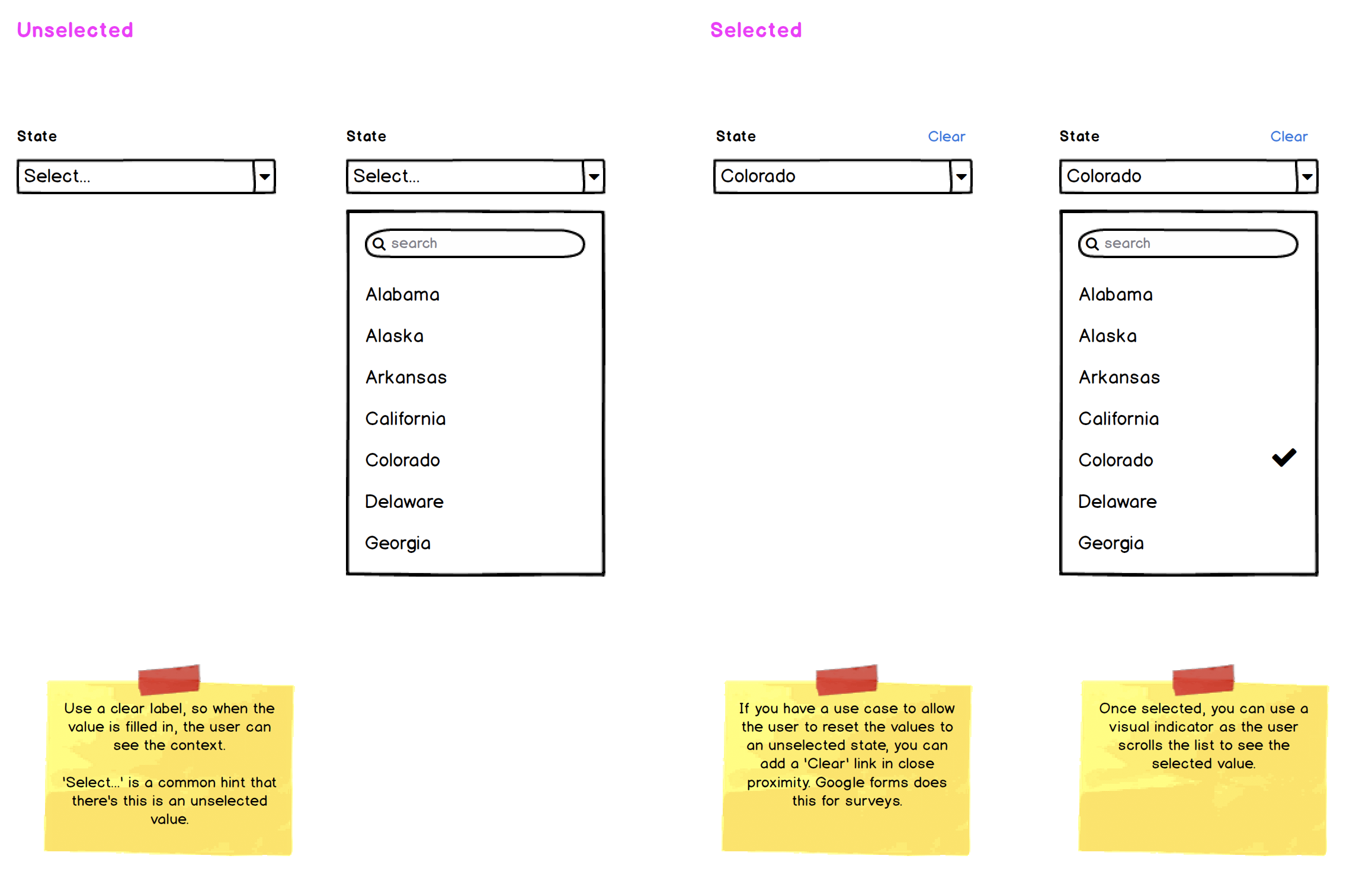
This is where a proper label helps. In your example, you have no labels above to indicate what you're asking the user to select.

You're correct in that this is a common UI control. You have a couple of abilities and indicators you can add here; allowing a 'clear' function, and proper labeling.

You don't need the additional 'please select' instructions inside the dropdown. If it's a complex instruction or reason, you can make the label clearer, or even add 'hint text' below the dropdown, so users can have some clarity.

enter image description here

1
  • Hi. Thank you so much. This, is why I wanted to put this to the UX Design Dev community. I think the UI has potential but, if the design is not correct can lead to confusion. Commented Nov 19, 2020 at 9:23

Your Answer

By clicking “Post Your Answer”, you agree to our terms of service and acknowledge you have read our privacy policy.

Not the answer you're looking for? Browse other questions tagged or ask your own question.