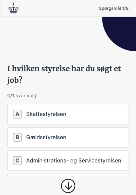
Currently, I started to be concerned about the "scroll arrow" within the interface. The scroll arrow indicates that the first visible section it's not all and it's more content to scroll. I was trying to find any research about it. Is it bad or good habit? In the example below the scroll, the arrow indicates that there are more options to pick from withing a form - ( just for an example ). Personally I believe that's rather not a good solution. I'm curious about your point of view? Any insights/research?
1 Answer
Personally I think it's unnecessary, and counterproductive in case you have to put a back-to-top button if the form is too long.
There are other ways to indicate that there's more content.
One of the Gestalt laws says:
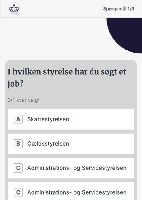
- Closure: The human eye prefers to see complete shapes. If the visual elements are not complete, the user can perceive a complete shape.
If the form container is shown as an incomplete shape, the user will scroll down to see it complete and indirectly will view all the content:
This is just one example, not a final design. I'm sure you can investigate other design options instead of resorting to the hackneyed arrow button.
-
2As Don Norman once said: if you have to put a label on something your design has failed (or something along these lines)– PhillipWCommented Aug 24, 2020 at 20:42
-
1I agree with you. I just was wondering if some research is available regarding it Commented Aug 25, 2020 at 4:56
-
-
1The "research" is application of the Gestalt Laws from psychology.– PhillipWCommented Aug 25, 2020 at 8:12


