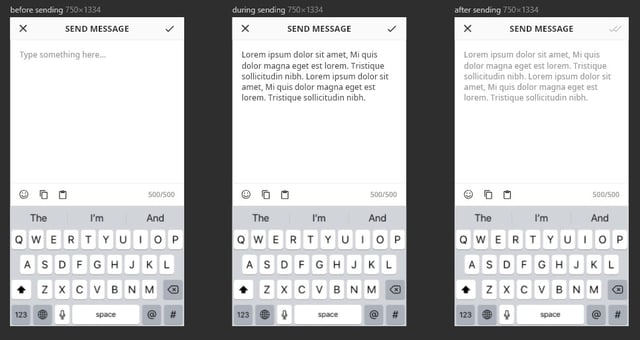
Currently, I am designing a mobile screen where the user can send a message to their friends.
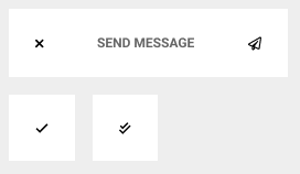
In order to show that their message has been sent, the upper right hand corner check-mark goes from black to a greyed out double check-mark (i.e. from a pressable button to a non-pressable icon).
However, I am not really that happy with this design – I feel that it is not intuitive enough. I am wondering what I can do to improve it and better convey the idea of "message sent" to the user.
CLARIFICATION EDIT:
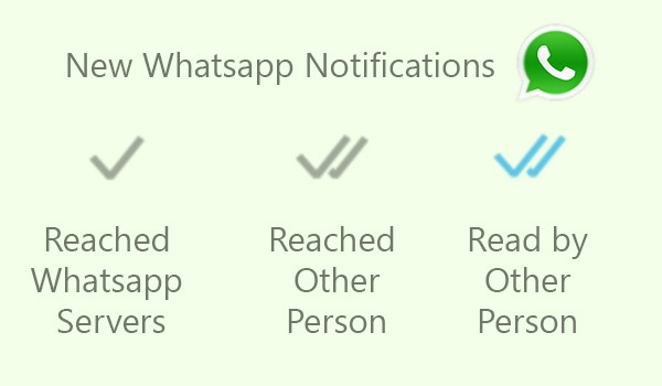
I have already used ✗ to represent "back/cancel", ✓ to represent "okay/confirm", and ✓✓ to represent "message read" - in other parts of my application design. Also this is not mean't to be a modal popup.


