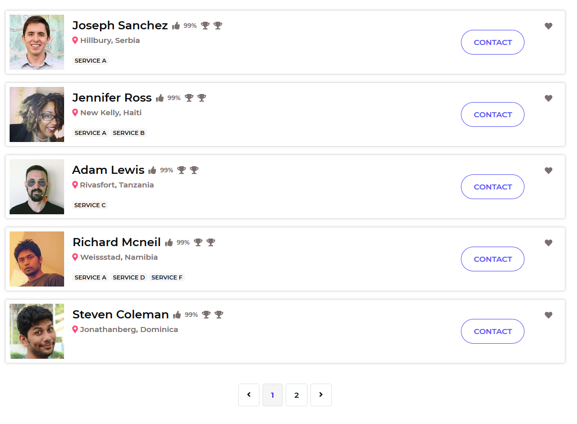
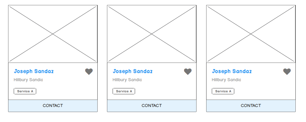
My website's main page displays summaries of users' profiles. Each profile summary is encapsulated in a "card".
Take a look at an example here (using dummy data).
For reference, the card width is about the width of the main content <div> on StackExchange websites.
As you can see, there is a lot of empty space between the main information area on the left and the contact button on the right.
I wish to avoid multiple cards per "row" as I think that is confusing; the benefits of the current design are that they are easy for our brain to follow and read information.


