1

I have an application running on 3 platforms: Windows, Android, Linux. While the native part is practically the same, the UI part is obviously different - WPF on Windows, xml/layout based UI on Android and Swing on Linux.

On all platforms, the application's main window has a drop-down menu with 7 items. Now, some new features were added, and each of these 7 items will have 2 to 6 subitems to select from.

I am trying to find a solution that would be

  • user-friendly
  • suitable for small screens (phones)
  • more or less visually similar on all platforms

The obvious solution would be to use submenus, however, there are 2 problems: 1. When a user is going to select another option, they should see the currently selected option. 2. Submenus don't work well on touch screens, and roughly 50% of our users are using the app on phones.

So far I haven't come with a solution that answers all 3 criteria.

2
  • Are the UIs developed separately, or do they have a shared code base? Swing on Linux? Is the Linux interface developed in Java? If so, why not use the Java version on Windows/MacOS as well?
    – 習約塔
    Commented May 14, 2019 at 19:04
  • Historical reasons :-)
    – Flot2011
    Commented May 14, 2019 at 20:27

2 Answers 2

1

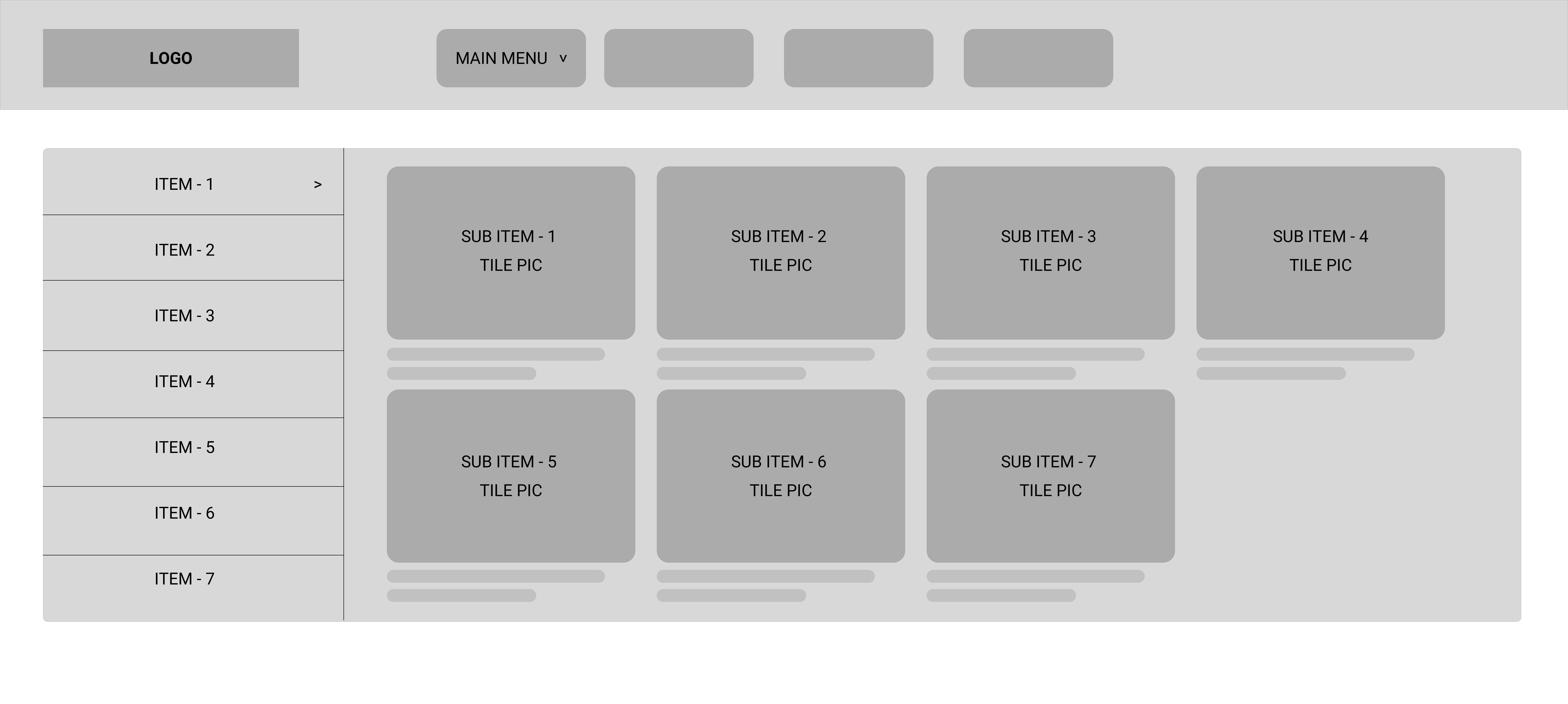
By considering the scenarios of yours, i tired to come up with the wireframe for the application which can work on windows and linux.

  1. By clicking the menu button, opens up the category pop up for the 7-items where by default the first item's sub items are displayed, sub items can be displayed as tiles in which pictures regarding the sub-item is shown along with two lines description.
  2. By clicking the sub-items respective the page will be redirected to the respective screens.

Wireframe for windows and linux

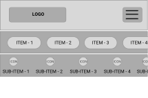
Here as when we consider the mobile view of the application's wireframe we can come up with 2 options.

Option - 1

In the below wireframe the items 1 to item 7 are horizontally scrollable & based on the selected item the sub item categories which also have same function changes.

screen 1

Option - 2

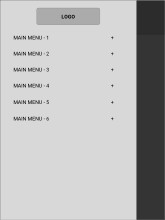
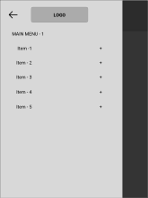
Type 2 user flow

  1. In screen one the all major items are given in hamburger menu.
  2. Sub category ( 7 items list ) will open when the main menu is selected.
  3. By selecting the item, further opens the sub items menu.
  4. Back button is placed in order to navigate back.

Screen 1 Screen 2 Screen 3

3
  • Thanks for trying to help. Unfortunately, both your options don't allow to see the current selection, which could be a subitem in any of 7 menu items.
    – Flot2011
    Commented May 15, 2019 at 20:20
  • example, for option 1 is google play store - kindly please go through it. option -2 example is ; healthkart.com (in mobile view)
    – VIGNESH_S
    Commented May 16, 2019 at 5:49
  • As I said, neither of your suggestions addresses the problem of viewing the current selection, and it is critical.
    – Flot2011
    Commented May 16, 2019 at 7:04
0

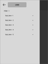
An expandable list hosting items in a NavigationDrawer (from Android/Material Design) seems a suitable choice here. On larger, non-phone screens simply have it displayed at all times. The scrolling ability of an expandable list allows for a multitude of items, although: nobody likes scrolling.

You should consider whether having the same amount of menu options available on mobile is in fact worthwhile to the user - simply copying a desktop feature set for mobile overlooks the goal to make a more productive means of "doing stuff" on the go. Having to scroll through a menu list in any way equates to an annoying experience. Hint: ignore any user/CEO/etc that says they expect the same features in a mobile app as on a desktop app.

Your Answer

By clicking “Post Your Answer”, you agree to our terms of service and acknowledge you have read our privacy policy.

Not the answer you're looking for? Browse other questions tagged or ask your own question.