1

I'm working on the redesign of an existing website. The website currently has a main navbar consisting of 8 items. The content structure (the 8 main links/categories) should be preserved in the new design; however, two of the items should be made much more prominent than the others.

Most of the solutions that I could come up with revolve around having two navigation menus, one with the important items and one with the others. I thought of putting them one above the other, with the important items being larger, like this:

# # F I R S T # #    # # S E C O N D # #
--third-- --fourth-- --fifth-- --sixth--

Or, I could have the important links visible in the page header, while the other items could be always collapsed in a popup menu.

I'm not happy with either solution. The second one in particular would effectively hide some navigation options, and I'd rather avoid that, at least on large screens.

I would like to find a solution that allows me to change the "two more prominent items" to "three more prominent items" in the future, with as little trouble as possible.

What is a sensible way to make certain items of the main navigation bar more prominent/highlighted than the others?

2
  • 2
    The 'One above the other' solution may look like the Third and Fourth are the subcategories of the First, where the Fifth and Sixth are subcategories of the Second. :(
    – Gosia
    Commented Feb 19, 2019 at 15:45
  • @Gosia that happens because of the coincidence that the First item has been rendered with the same width of the Third and Fourth - this would not necessarily happen - but I agree, it's one of the reasons it doesn't convince me, because it can happen and that would be the impression it gives.
    – Simone
    Commented Feb 19, 2019 at 15:49

2 Answers 2

1

It's OK to make some elements in your nav bigger and designed with more weight.

Also consider making your most-prominent links into buttons that sit apart from the other items.

An example of this is "Visit" and "Virtual Tour" on https://www.arizona.edu/.

enter image description here

Another example: Visit / Apply / Give on http://www.ucla.edu/ enter image description here

1
  • I like your examples, especially the Arizona University one. Thank you a lot!
    – Simone
    Commented Feb 20, 2019 at 13:59
1

If you're building a horizontal Menu like this random page Blizzard, you can do the same. enter image description here

Force your prominent items to stand on the left hand side next to the logo with bigger and bolder font, and the default items on the right hand side with default font.

I would suggest to use just one menu for this purpose. That's better from an accessibility point of view and makes it easier to morph into a mobile menu. (Or even better, if you think mobile first, the opposite way)

Maybe you'll use WordPress, than you can very easy add classes to your menu items via the customizer.

Update

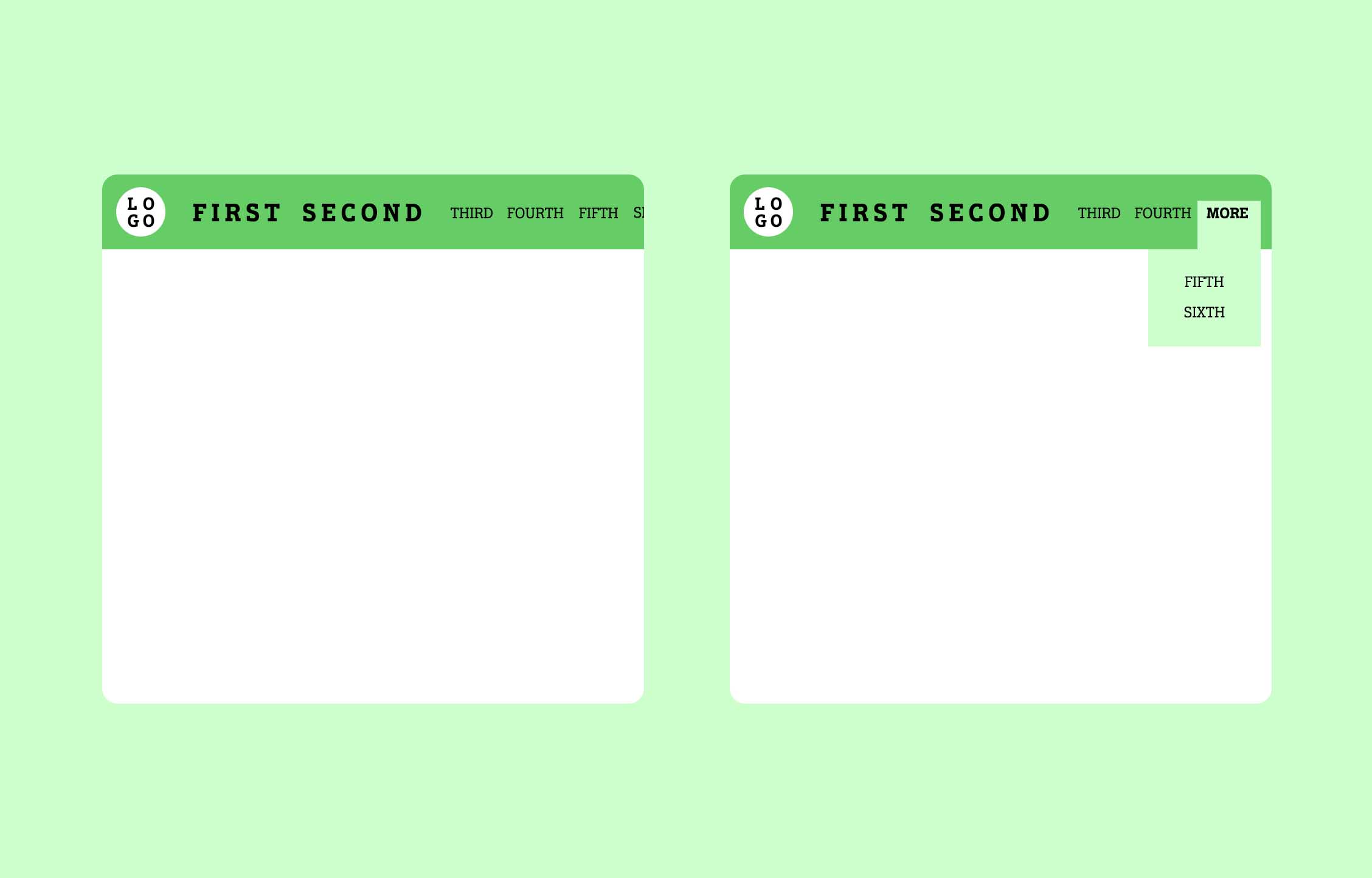
I've sketched you another idea.

Menu examples

On the left you see a horizontal scrolling menu. All items in a row with enough space to breathe. Your prominent items are always visible and all other items are hidden depending to the viewport. The user can scroll to the right to access the hidden items.

The concept on the right has the same idea, but instead of scrolling the hidden items are behind the "more" option, accessible via hover.

Both solutions would enable you to drop the typical hamburger menu for mobile devices. Instead, the menu is handling everything in a nice fluid way.

The left solution is described in an article by Steve McKinney with some nice examples.

3
  • No Wordpress. Boo Wordpress :) Thanks for your suggestion. However, the 8 items of the menu would very probably fill all the horizontal space. On medium and small screens they would be the first ones to collapse, but on large screens there would be no separation between prominent and default items.
    – Simone
    Commented Feb 20, 2019 at 13:59
  • I got your point. Please see the update on my post. And don't boo WordPress, their success speak for itself :)
    – chrisbergr
    Commented Feb 20, 2019 at 18:53
  • 1
    I like your suggestion. As for WordPress, yeah, I can't really argue with that :) But I need way too much customization in most of my projects to shoe myself in WordPress.
    – Simone
    Commented Feb 21, 2019 at 17:06

Your Answer

By clicking “Post Your Answer”, you agree to our terms of service and acknowledge you have read our privacy policy.

Not the answer you're looking for? Browse other questions tagged or ask your own question.