added more concepts
Source Link
chrisbergr
  • 365
  • 1
  • 7

If you're building a horizontal Menu like this random page Blizzard, you can do the same. enter image description here

Force your prominent items to stand on the left hand side next to the logo with bigger and bolder font, and the default items on the right hand side with default font.

I would suggest to use just one menu for this purpose. That's better from an accessibility point of view and makes it easier to morph into a mobile menu. (Or even better, if you think mobile first, the opposite way)

Maybe you'll use WordPress, than you can very easy add classes to your menu items via the customizer.

Update

I've sketched you another idea.

Menu examples

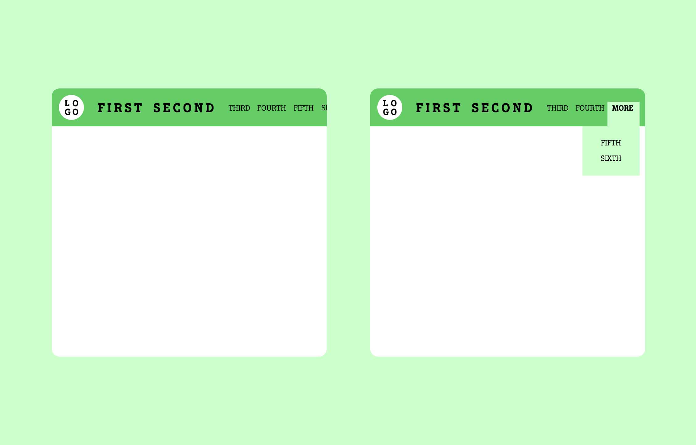
On the left you see a horizontal scrolling menu. All items in a row with enough space to breathe. Your prominent items are always visible and all other items are hidden depending to the viewport. The user can scroll to the right to access the hidden items.

The concept on the right has the same idea, but instead of scrolling the hidden items are behind the "more" option, accessible via hover.

Both solutions would enable you to drop the typical hamburger menu for mobile devices. Instead, the menu is handling everything in a nice fluid way.

The left solution is described in an article by Steve McKinney with some nice examples.

If you're building a horizontal Menu like this random page Blizzard, you can do the same. enter image description here

Force your prominent items to stand on the left hand side next to the logo with bigger and bolder font, and the default items on the right hand side with default font.

I would suggest to use just one menu for this purpose. That's better from an accessibility point of view and makes it easier to morph into a mobile menu. (Or even better, if you think mobile first, the opposite way)

Maybe you'll use WordPress, than you can very easy add classes to your menu items via the customizer.

Update

I've sketched you another idea.

Menu examples

On the left you see a horizontal scrolling menu. All items in a row with enough space to breathe. Your prominent items are always visible and all other items are hidden depending to the viewport. The user can scroll to the right to access the hidden items.

The concept on the right has the same idea, but instead of scrolling the hidden items are behind the "more" option, accessible via hover.

Both solutions would enable you to drop the typical hamburger menu for mobile devices. Instead, the menu is handling everything in a nice fluid way.

The left solution is described in an article by Steve McKinney with some nice examples.
Added image incase the page design changes in future
Source Link
JonW
  • 37.6k
  • 24
  • 124
  • 158

If you're building a horizontal Menu like this random page Blizzard, you can do the same. enter image description here

Force your prominent items to stand on the left hand side next to the logo with bigger and bolder font, and the default items on the right hand side with default font.

I would suggest to use just one menu for this purpose. That's better from an accessibility point of view and makes it easier to morph into a mobile menu. (Or even better, if you think mobile first, the opposite way)

Maybe you'll use WordPress, than you can very easy add classes to your menu items via the customizer.

If you're building a horizontal Menu like this random page Blizzard, you can do the same. Force your prominent items to stand on the left hand side next to the logo with bigger and bolder font, and the default items on the right hand side with default font.

I would suggest to use just one menu for this purpose. That's better from an accessibility point of view and makes it easier to morph into a mobile menu. (Or even better, if you think mobile first, the opposite way)

Maybe you'll use WordPress, than you can very easy add classes to your menu items via the customizer.

If you're building a horizontal Menu like this random page Blizzard, you can do the same. enter image description here

Force your prominent items to stand on the left hand side next to the logo with bigger and bolder font, and the default items on the right hand side with default font.

I would suggest to use just one menu for this purpose. That's better from an accessibility point of view and makes it easier to morph into a mobile menu. (Or even better, if you think mobile first, the opposite way)

Maybe you'll use WordPress, than you can very easy add classes to your menu items via the customizer.

Source Link
chrisbergr
  • 365
  • 1
  • 7

If you're building a horizontal Menu like this random page Blizzard, you can do the same. Force your prominent items to stand on the left hand side next to the logo with bigger and bolder font, and the default items on the right hand side with default font.

I would suggest to use just one menu for this purpose. That's better from an accessibility point of view and makes it easier to morph into a mobile menu. (Or even better, if you think mobile first, the opposite way)

Maybe you'll use WordPress, than you can very easy add classes to your menu items via the customizer.