Physical symmetry without symmetry of use
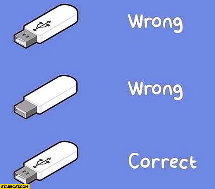
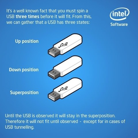
I'm surprised that so many of these answers are addressing the consequences of poor design without discussing what made it a poor design in the first place. The issue at hand here is that the USB devices have a correct orientation and that correct orientation is indistinguishable from the incorrect orientation.
In his book The Design of Everyday Things, Don Norman lists the following as the 7 fundamental principles of design:
1. Discoverability. It is possible to determine what actions are possible and the current state of the device.
2. Feedback. There is full and continuous information about the results of actions and the current state of the product or service.
After an action has been executed, it is easy to determine the new
state.
3. Conceptual model. The design projects all the information needed to create a good conceptual model of the system, leading to
understanding and a feeling of control. The conceptual model enhances
both discoverability and evaluation of results.
4. Affordances. The proper affordances exist to make the desired actions possible.
5. Signifiers. Effective use of signifiers ensures discoverability and that the feedback is well communicated and intelligible.
- Mappings. The relationship between controls and their actions follows the principles of good mapping, enhanced as much as possible
through spatial layout and temporal contiguity.
7. Constraints. Providing physical, logical, semantic, and cultural constraints guides actions and eases interpretation.
The non-reversible USB devices lack a good signifier for correct orientation. As Toby Speight mentions in his answer, the USB specification did include the requirement for such a signifier:
6.5.1 USB Icon Location
The USB Icon is embossed, in a recessed area, on the topside of the USB plug. This provides easy user recognition
and facilitates alignment during the mating process.
..but I'd argue that that's not enough for two reasons. First, that specification is easily ignored by USB manufacturers. Second, even with an embossed icon, you haven't communicated to the user what the correct orientation is unless they already know that the icon signifies orientation. A USB icon just looks appropriate on a USB device and isn't going to be noticed by a normal user as an intended signal of information. Bedrooms often have an outlet which is controlled by a light switch in the room. To signify that that outlet is the one controlled by the light switch, it's often installed upside down. To someone who's aware of this relationship, this is helpful, but to someone who isn't in the know, it's up to chance that they discover it themselves or are informed of it. Same with the USB icon. It shouldn't have been expected that people would know what it meant.

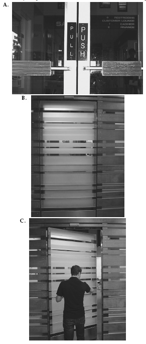
A similar issue is seen with the design of some doors. Here are a few pictures of doors from The Design Of Everyday Things again:

In the first image, the left door must be pulled but the right door pushed even though they have the same handle. In the next two images, it's not clear where on the door you should press (left or right) to open it. Don Norman has this to say about the doors:
When external signifiers—signs— have to be added to something as simple as a door, it indicates bad design.
If something as simple as a cable needed an icon to indicate which orientation was correct, it was already poorly designed.
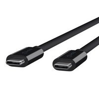
The solution? Either make a cable that's reversible or remove the misleading symmetry.
