I asked a similar question before and received similar answers:
Do users recognize "slideable" areas with dots as indicators for multiple images?
On one hand it is true that such indicators can be easily missed.
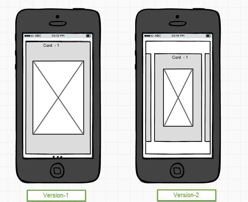
On the other hand, you have to give up some space to show the edges of those other cards, which could make readability of your card worse. Or it can require to create an extra detail page, to view that card content in full view.
As one of the comments on my question suggests, it also depends on the type of app. Is it a native mobile app or a web app?
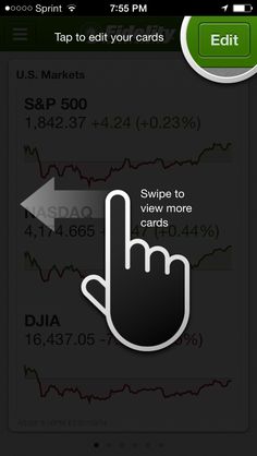
In the case of a native app you can use an interaction preview or on-boarding to indicate the possibility of swipe, as in this example:

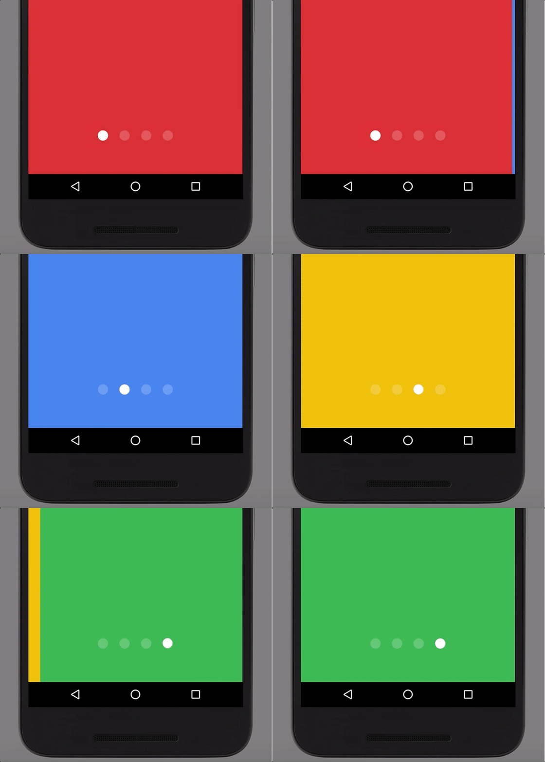
In addition to this, making the indicators visible and hard to miss drastically lowers the potential to overlook them:

(Source)
Of course it doesn't have to be this "jumpy", but simply making the dots bigger can already do a lot.

