23

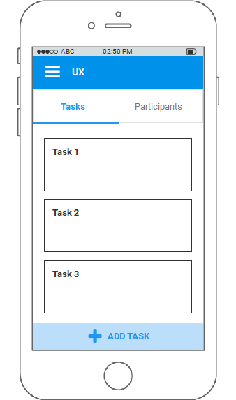
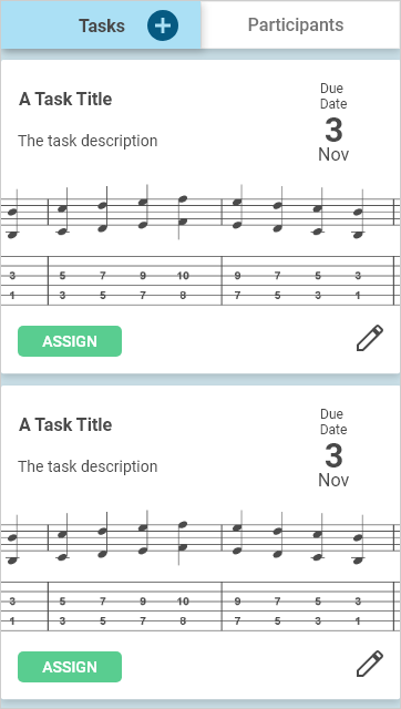
Consider a two tabbed view, in this case tasks and participants, whereby in the task view you are able to view cards of the tasks. Within these Task cards you are able to edit the content and assign them to participants.

It would also be required to create new tasks and this is where the question comes: Is it acceptable to have the 'create new task' button on the 'Tasks' navigation tab?

Here is the visual where the navy blue button on the tab bar will add a new task:

enter image description here

I'm reluctant to use the floating action button (FAB) because:

  1. adding a task is not necessarily the most common action in this view and
  2. the FAB is not so commonly used on iOS, nor is it in the iOS guidelines.

This design is for both Android and iOS mobile platforms so the answer should take into consideration both UI practices.

5
  • 35
    This looks like it would add another tab, not another task. Commented Apr 5, 2018 at 23:05
  • 1
    Perhaps you could make a small 'placeholder' task at the top of the list with just a big plus and 'create' new task written on it? I've seen quite a few things that do something like this. For instance: i.imgur.com/N0qguRZ.png
    – Restioson
    Commented Apr 6, 2018 at 15:28
  • @Restioson, that's more like an answer than a comment. Commented Apr 11, 2018 at 8:09
  • Sorry! I left it as a comment as I really don't know anything about UX design, was just adding my two sense as a user :)
    – Restioson
    Commented Apr 11, 2018 at 14:09
  • @Restioson it would be a good answer though regardless if you're an "expert" or not. Commented Aug 14, 2018 at 9:47

10 Answers 10

43

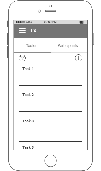
You should separate the two actions. Use tabs just for selection and for adding a task you should stick the action to bottom of visible area. Your tasks can be viewed by scrolling within the tabs and add action

Here is the wire-frame of concept explained above.

enter image description here

9
  • 7
    I agree with the suggestion to split the navigation and action, however, OP describes adding a task as "not necessarily the most common action in this view". I think it might place too much focus on a secondary action such as this. Given OP's specific situation, this seems similar to if an email application had a floating "Compose new email" button—a useful feature, but not necessarily what I'm trying to do every time I visit this page. Commented Apr 5, 2018 at 13:26
  • 1
    @RobE Google's version and Apple's version, but both are usually used for navigation, not actions. Edit: Google also has footer buttons
    – Big_Chair
    Commented Apr 5, 2018 at 15:02
  • 1
    @JoshPart yes, or the top. I’d get annoyed if I had to scroll to potentially dozens of tasks just to make a new one. Or worse, might not be able to find how to add a new task. Commented Apr 5, 2018 at 16:32
  • 1
    @JoshPart my point was to make it stick to the bottom like a floating button and the content can scroll in between. Add button will always remain at its place and the content above will scroll on its own.
    – Sheraz
    Commented Apr 5, 2018 at 18:22
  • 3
    @Shaz I got that, but OP stated that the reason he didnt' want to use the floating action button approach was because adding a task was not a main action, and having that button always visible was not an option.
    – Josh Part
    Commented Apr 5, 2018 at 18:29
24

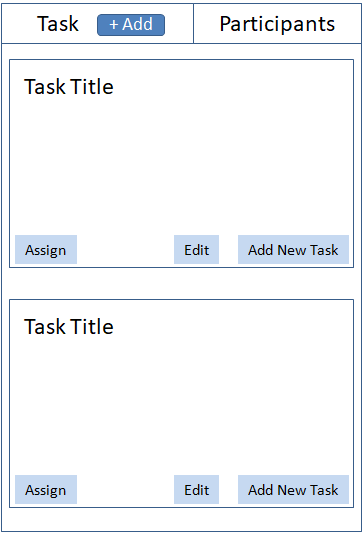
Selection category and its action can be separate, as it likely to confuse most of the users. Having a clear separation between them will be more clear and it also standard practice for mobile. You may also want to consider any other actions that users might require on the screen and group them together. Have quickly modified the wireframe earlier shared by 'Shaz' to explain the same. enter image description here

1
  • Filtering would not be used in this particular case, and it seems unbalanced removing it with just one action button in that space. However I appreciate that this solution would work for others with similar problems. Commented Apr 9, 2018 at 12:17
3

On mobile, enclosing a touch element within another touch element should be avoided if possible.

Differences in displays, touch sensors, and user anatomy can make it difficult for some users to activate the desired region consistently.

The layouts by Shaz and Yobuddy adhere to this principle, so I would lean toward either of them. Shaz's layout is simpler, but Yobuddy's layout will be cleaner if you ever support an interaction beyond 'create new task' there.

0
3

I have two suggestions to consider so please read through and consider the arguments for each.

Floating Action Button

A floating action button button provides the primary action for the screen on which it appears. I strongly recommend this approach however you've expressed concern about using these in the question so allow me to address them:

  1. adding a task is not necessarily the most common action in this view

Whilst it may not obviously be the most common action that exists within the view it may be the most prominent action for a list of tasks. Take each of the other actions and review what they apply to as I will for your mock up:

  • tabs These are part of the higher-level navigation structure, they allow the user to get to the list but they don't apply to the list
  • task card The user may click directly on the task card to edit or view that individual task, this is a property of the task within the list as it allows the user to change the card but does not modify the list (except for updating the displayed summary)
  • assign like the previous point, this allows changes to the task card rather than the list

Though there are several actions the user might take (and likely actions that could be used more than adding tasks) the creation of a new task may be the only action that is a behaviour of the list, rather than something specific to a particular task. If it does turn out to be the only property that applies directly to the list then a floating action button is likely most material tool for the job, if not consider the "Bottom Navigation" below.

  1. the FAB is not so commonly used on iOS, nor is it in the iOS guidelines

Whilst it is true that it is not yet common, it is used and is becoming more popular as material design spreads into apple's domain, as well as from android applications maintaining a single interface design. Several answers on this question show that the floating action button is in use in iOS applications including Spotify, the current Gmail interface (updated to follow the material interface) and the iOS 11 Notes App.

Note as well that, as in the Spotify case above, a floating action button is not required to sit in the bottom-right corner. The material docs have some great examples of this but unless some other alignment fits into your interface I would recommend the ordinary position for the sake of familiarity.

Bottom Navigation

This is an extension on Shaz's great answer to provide an alternative. If my previous offering does not assuage your concerns about using a floating action button or you find you do require additional actions on your list (such as sorting/filtering the contents) then I second shaz's suggestion to place the option at the bottom of the screen.

I would recommend making use of the bottom navigation bar for this feature. This is intended for navigation so though it may make sense for it to navigate to a "new task" screen, it may be out of place to "sort" from this bar. A solution here could be to use a sheet to provide sorting/filtering options, so that the button "navigates" to the sheet for that purpose.

Final Thoughts

The floating action button is the most material approach to including this option and may not be as out of place in this purpose as you have thought. The bottom navigation whilst not strictly the correct use of the component will make the option suitably visible to users of either iOS or android. If neither of these options suffice a simple three-dot menu in the toolbar (as depicted in the tab mobile examples) would still be more in-line with material design than placing the action inside of the navigation.

2

I like your idea but I would say "it depends".

If you plan to have the tabs visible at all times and scroll the tasks within the tab (I assume there are more tasks than one screen can hold) without any header within the tab itself, then the tab is the correct place. If you want to decrease users' surprise with the function of the button (many may expect adding a new tab, not an action within a tab) you can add a balloon with a simple message "Add a new task" (may be challenging for a mobile app).
Also think about the placement of the newly created task - are they sorted newest on the top or the other way round? In the latter you can immediately scroll to an in-place form for task creation.

If, however, your tabs resize to accommodate the complete content of all tasks, the header will disappear with scrolling (not clear whether you are asking about a standalone application or a web page), then unless you are at the very top, it's not possible to add a new task.

I agree that you should stay away from FAB - I was experiencing an accounting app recently and when using it on the mobile device, the button, even though placed at the bottom of the screen, is partly obscuring the list of the items.

2

I see a problem in the meaning of this place.

An action button on a tab suggests that you can interact with the tab when the tab is inactive.

The most common example is the close tab button in a browser. Another option is the new tab button at the end of the tab bar of a browser. Another possible button on such a tab would be "duplicate tab".

When you want to have the action "Add task" (in the tasklist in this tab) this is probably nothing which should be done silently in the background while working in another tab, but something which requires switching to the tasks tab.

So I would opt for another solution as suggested in the other answers.

1
  • If the OP were to do this, I would expect/hope that the (+) would only be shown when the Tasks tab was active.
    – TripeHound
    Commented Aug 13, 2018 at 10:59
2

Acceptable maybe, but I don't recommend it.

If people are looking for a way to add a new task, it could be not so easy to find since the button has no label nor any contextual clue. This design could be subject to inattentional blindness: People will not see the plus icon since they don't need the tab switch. This can be the case for people that know they can add a new task and people that don't know that yet.

A simple scroll might cost less effort than scanning every detail on the screen to find something that could be the button. This may sound exaggerated for something that is in plain sight and an icon that is seemingly obvious, but don't be surprised if it is not! Scrolling to the end of the task list and seeing a directly noticeable button with a clear label could be the better solution. Since you mentioned that this is not the most important action it is probably acceptable that it is not always within sight. Even if users already added tasks in the past; let them recall how to do it by going through the same search, it could be better than letting them remember where/what the button was again.

1

I will suggest to have at each task level id space allows, along with the next to title (which is in ur design) and as Shaz's suggestion to keep at bottom as a single button.
Solution:

1

What's wrong with using a simple plus button in action bar like this:

action bar with button

Plus button can either add task or participant depending on the current tab. You can also hide the plus button if its not needed in participant tab.

2
  • Action bar is already used for top level navigation. Commented Apr 8, 2018 at 13:06
  • Information hierarchy is not correct in your case. Add action should be within the content of selected tab.
    – Sheraz
    Commented Jan 25, 2019 at 9:26
1

I'll just put the solution that I eventually came to for this problem as it differs from the accepted answer.

I came to the conclusion that I was looking at the problem in the wrong way and that I should have focused initially on the tabs being the problem and not the "add new" action button.

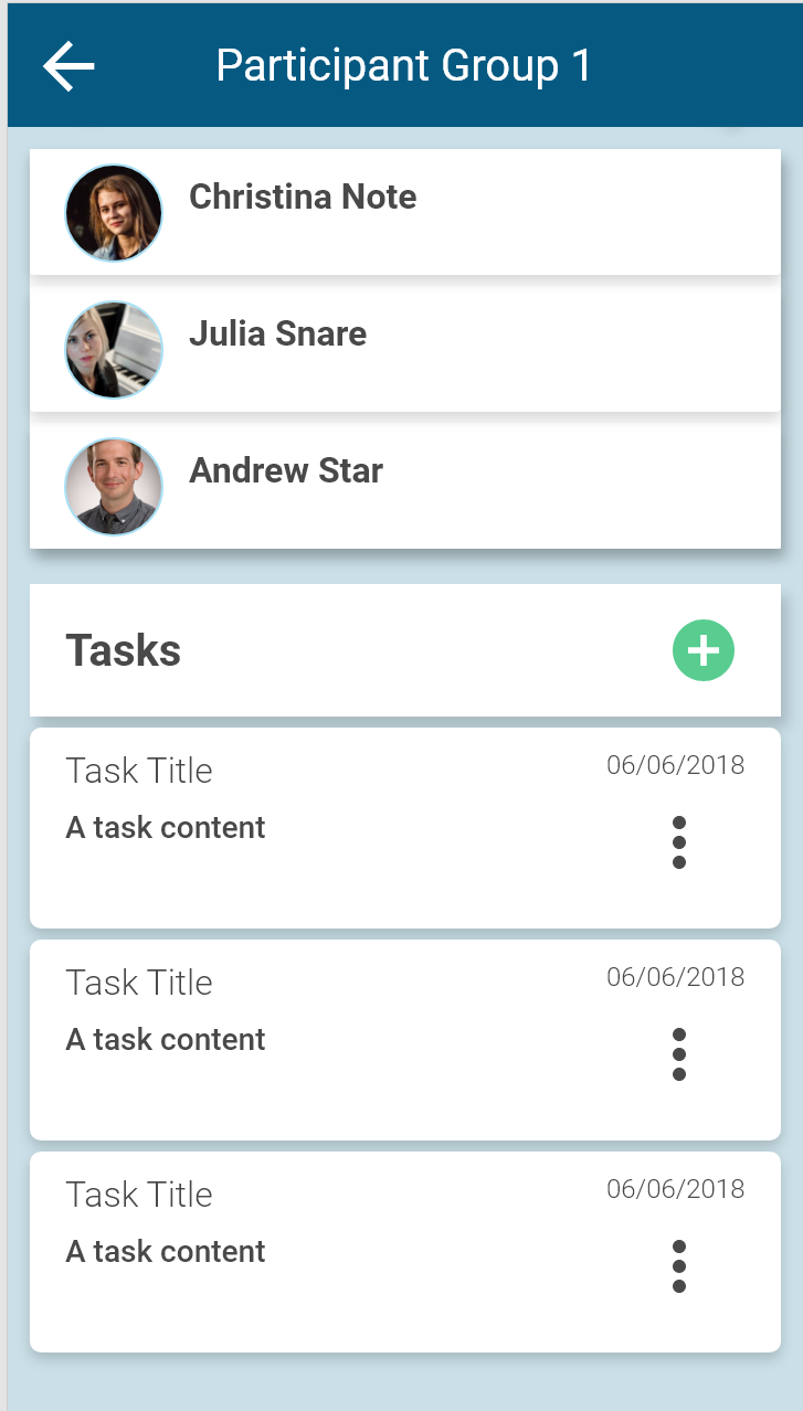
As such, I decided to merged the 'participants' and 'tasks' tabs into one page and dedicate the top and bottom parts of the page to the respective sections.

Here is the solution I came to:

enter image description here

Your Answer

By clicking “Post Your Answer”, you agree to our terms of service and acknowledge you have read our privacy policy.

Not the answer you're looking for? Browse other questions tagged or ask your own question.