1

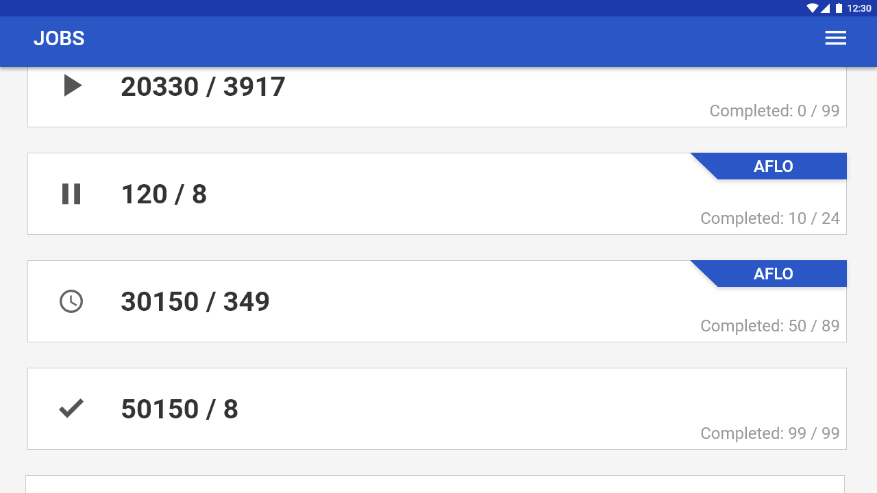
I am currently working on a landscape mode mobile app, and one of the screens needs to show the state [active, paused, pending, completed] of the jobs.

In the following image I have added the icons for the states but do they represent the paused state or the user will think that he needs to tap it to pause the job.

What would be a better alternative?

enter image description here

1 Answer 1

4

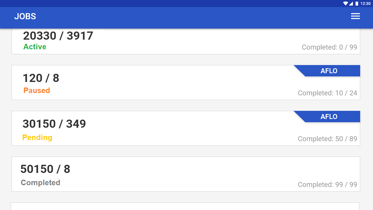
Avoid icon ambiguity wherever possible. In your scenario, a simple status string could work well for each row.

This could be done like so with color, or you could replace the "Completed: 0 / 99" with a status string instead. The icons remain in place to supplement the status.

Please forgive the awful mockup.

enter image description here

Your Answer

By clicking “Post Your Answer”, you agree to our terms of service and acknowledge you have read our privacy policy.

Not the answer you're looking for? Browse other questions tagged or ask your own question.