I have updated my answer to be a bit better laid out and also to hopefully address your follow up questions.
The following is a design that is seen in many game launcher/installers such as Blizzard's Battle.net, Warframe, World of Warhips, etc.
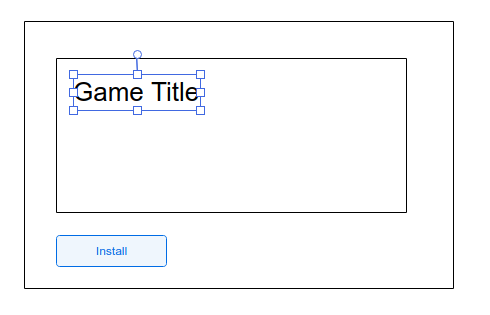
When the launcher is initially loaded and the game is needing to be installed, they show the following view containing solely the 'install' button:

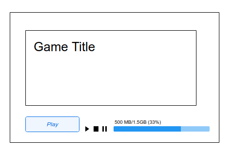
Once the game has begun installing the launcher changes the ui elements to reflect that the game is now in the 'installing' state and provides the relevant controls (and no longer the 'install' button which is not relevant in this state):

but it is important to note that during installation the 'Play' button will be greyed out, so the user cannot click it until the game has finished its installation. It is also from this view the user can control the installation - pausing, cancelling, or resuming (which were not relevant controls in the previous state).
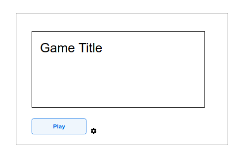
And finally when the game is finished its installation the view will replace all fo the installation controls with the now active 'Play' button, since that is the only control that is relevant once the installation has completed. It might also be a good idea to place a 'settings' icon in this state as well, so the user's can uninstall the game from here as well.

The main reason why I feel that this is a clean design is because it displays only the relevant controls that the user will care about based on the games current state - needing install, installing, installed and ready to play - meaning there will a low cognitive load (they don't have to discern the meaning of controls since only the relevant ones are displayed).
As for the implemntation details, that is more of my developer side coming out. It is not a nice design to have one element provide multiple operations or functions. So for implementation you can actually have two different buttons (one 'install' and one 'play') but you would only ever have one of the buttons be displayed at any given time.
The one thing to note is that this is only a good idea if you can visually turn on and hide the buttons seemlessly from the user's point of view (so it looks like all that changed is the label). If the button shifts location or blinks or anything like that, it can be visually jarring and in that case it would be a better idea to just change the label as you first suggested (basically, the user's experience of the button/label change is more important than the underlying implementation I think).

