16

When I make web application designs, every time I style form or overlay boxes with OK and Cancel buttons. I think of making them different. But is it a good practice?

Some people recommend primary and secondary buttons, but I don't feel 'cancel' is so important to give it a secondary button status. What if the application doesn't have enough secondary buttons? I don't want to create and use a secondary button only for 'Cancel'.

6 Answers 6

27

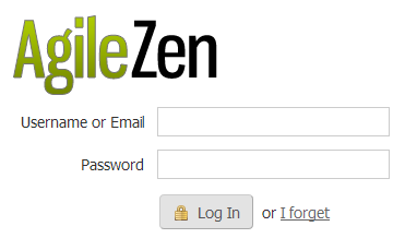
Please do make the cancel option a link rather than a button. It makes it so incredibly simple to see which button I should click. Look at this AgileZen login, it's obvious which option is the default:

enter image description here

2
  • 10
    Another thing that helps this design is not naming the buttons "OK" and "Cancel", but actually naming them after the actions they represent.
    – crazy2be
    Commented Sep 8, 2011 at 16:24
  • Good example Bernhard. It's similar to Wordpress and the "Publish" and "Move to Trash" button formatting.
    – rlsaj
    Commented Sep 8, 2011 at 22:32
8

I will go a bit against the stream so far and argue that it depends on context. When the majority of users will want to click OK (and don't mean you wanting them to click OK!), then it's fine to make Cancel a link. But if both OK and Cancel represent equally probable paths, then make Cancel a button. Gestalt Laws: things that look similar are perceived as belonging together, having the same importance/concept/whatever. By this reasoning, when faced with equally probable paths, users will look for things that "belong together". If you make "Cancel" a link, it will look like an exceptional case and add a layer of complexity for the user, who expects a similar-looking object but finds none.

For more on button vs. link, Jakob Nielsen has this to say: http://www.useit.com/alertbox/command-links.html

3

I would suggest that if you can make the cancel a link, then do so. The problem with primary and secondary buttons is that this is another style of link to understand - assuming, as I gather, that you do not have secondary buttons elsewhere. Links are already given connections that people know how to hande, and so require less cognitive load than a new button.

If you have a different style of button, then people have to see this and interpret what it means, and interpret why it is different. That is better to be avoided ( Steve Krug - Don't Make Me Think! )

2
  • Interesting thought. I would have judged both buttons and links as sufficiently self-disclosing clickable items, but now you have me second-guessing. Mixing buttons and links does prompt a question of 'why are these different', and it's worth considering if the audience is less experienced with web apps. Commented Sep 8, 2011 at 16:07
  • I assumed your "secondary button" would be looking slightly different, and so would be the only thing that looked like that on the site. THis would mean it is a new style, needing new cognitive work to understnad what it means. Commented Sep 8, 2011 at 18:24
2

As has already been said, use a link for the cancel button. However don't use "Ok" for the other action. Make it more descriptive and apply to the question you are asking.

For example:

Would you like to save this file? Save | Cancel

Are you sure that you don't want to save? Don't save | Cancel

Making the buttons themselves clear makes it faster for people to scan and easier to use.

4
  • The double negative on the second one makes me cringe. Please don't write dialogs like that.
    – Aaronaught
    Commented Sep 8, 2011 at 23:19
  • How is that a double negative? A double negative would be something like "Are you sure that you don't want to not save?"
    – JohnGB
    Commented Sep 10, 2011 at 16:25
  • 2
    When you "cancel" a prompt that says "are you sure you don't want to save?" then what happens? Does it save? Or does it do nothing? You shouldn't have a prompt warning you that something isn't going to happen. If you absolutely must make "not saving" the primary action, then phrase it as a positive action such as "discard changes" or "exit without saving", and change the "cancel" text to more clearly indicate what will happen ("keep working" or "don't exit").
    – Aaronaught
    Commented Sep 10, 2011 at 17:00
  • Fair point, however the point of this answer is what is on the buttons. I've seen many dialogues like that and the point is that making the buttons themselves clear makes for better UX. Making the question clear is another aspect which also demands attention.
    – JohnGB
    Commented Sep 11, 2011 at 16:17
1

It also matters if you're talking about a touch or mouse-driven device. Buttons are slightly easier to use on touch devices. On a website, a word link works just fine and certainly can support the lower profile of the secondary option.

If you choose buttons for either type of device, color variations can support the click to use the most desired option. As I recently learned from a UX study on a mobile device, MAC users tend to expect the OK button (or desired path where applicable) to be the one at the right and PC users expect it to be at the left.

In general, making sure you're asking the right question in the first place is a big help to solving issues. Then having relative/descriptive buttons really ups the success rate.

All that said, I'm for using text links for secondary options.

0

The object you use to represent the "Cancel" (whether it is a button or a link) is a development consideration and partially irrelevant. Buttons can be made to look like links and vice versa. But I may be over-analysing your question - I know what you're getting at.

When looking at this, I find that ensuring there is an obvious visual difference between the primary and secondary actions is the key. Emphasising your primary action is obviously your priority. In the largest application I've ever worked on, my secondary actions are all buttons but are of a less intrusive style than my primary ones.

Your Answer

By clicking “Post Your Answer”, you agree to our terms of service and acknowledge you have read our privacy policy.

Not the answer you're looking for? Browse other questions tagged or ask your own question.