0

Say I want to show all of A's friends in the following form.But what to do when there're a lot of friends of A?And what's the name of this kind of graph? enter image description here
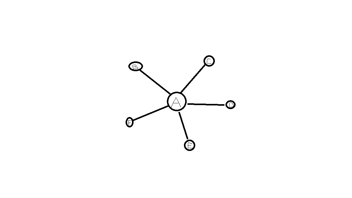
Edit: For clarification, I want to represent a friend list in a graph as shown in the image and want to know if that's possible when the number of friends is large. I ask for the name of this kind of graph so that I can do a more specific google search. I'm also curious about which graph suits best if the above is not possible.

9
  • why do you make a graph for representing this? Commented May 22, 2017 at 10:34
  • 1
    @DimitraMiha Because boss likes this! Just for curiosity, what's best suited for this then?
    – jddxf
    Commented May 22, 2017 at 12:23
  • What benefit does the boss think this infographic will have?
    – user67467
    Commented May 22, 2017 at 12:36
  • Mmm... Is this a UX question or a definition question? What're you trying to achieve here? What's the problem you're trying to solve?
    – UXerUIer
    Commented May 22, 2017 at 12:56
  • @theonlygusti Actually I don't know. Someone told me this is a must because boss likes this and I forgot to ask why as I was busy then. Maybe he didn't know either. But in my opinion if the number of friends is small this representation is better than a list.
    – jddxf
    Commented May 22, 2017 at 13:57

5 Answers 5

2

It is simply called a graph

https://en.wikipedia.org/wiki/Graph_(discrete_mathematics)

In graph theory, a graph is a structure amounting to a set of objects in which some pairs of the objects are in some sense "related".

Typically, a graph is depicted in diagrammatic form as a set of dots for the vertices, joined by lines or curves for the edges.

More specifically you are looking for a social network graph https://en.wikipedia.org/wiki/Social_network

2
  • I think a social network graph is different from this one as the former contains relationships between persons but the latter only contains who're friends of one person.
    – jddxf
    Commented May 22, 2017 at 13:51
  • 1
    It is still a social network graph just one as you say that only contains people who're friends with one person
    – Joe
    Commented May 22, 2017 at 15:16
1

You could call this type of infographic a network.

There is no way to get around the fact that it will quickly become busy and dense with a lot of friends, you would have to use another visualisation tool.

Ask your boss what they wanted to gain from this visualisation, and also ask them more generally why they feel they need one in the first place.

See if any other infographic would suffice.

2
  • "you would have to use another visualisation tool" / "See if any other infographic would suffice" - do you have any sugegstions?
    – Mawg
    Commented Jan 24, 2021 at 21:34
  • @MawgsaysreinstateMonica ask the boss why they want this graph. Then give them a better solution than the unscalable one the boss proposed. Obviously the better solution ("another visualisation tool"/"other infographic" as you quote me) depends on what the boss wants out of all of this.
    – user67467
    Commented Jan 24, 2021 at 22:33
1

You can use a process called Clustering. Here is an example used on Google Maps

Basically elements are clustered depending on the current zoom level. When user zooms on a specific cluster, that same cluster gets divided in other lower level group.

Now, this only makes sense if A's friends can be grouped on categories like: location, age, gender, hobbies, etc... which I don't know if they are.

1

We ended up with a solution like this.

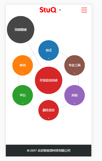
When the number of items is small, we show all of them. enter image description here

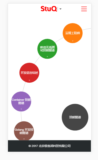
When the number of items is large, we just show part of them and we scroll or touch the screen to see the others. enter image description here

Even in this way, we can place only a limited number of items on the circle. But since only part of the circle is visible on the screen, we can replace the data when they are about to be visible if necessary.

For example, we have 100 items, and we place 20 of them on a circle, and only 5 of them are visible on the screen. At first we have items [1...20] on the circle and items [1...5] are visible. After we rotate 90deg, items [6...10] are visible. If we rotate 180deg again, items [16...20] are visible. Now we must replace items [1...15] to items [21...35] so that when we continue rotating we can see the right data.

1
  • Please accept your own answer. Doing so will help others who read this question in future, by clearly indicating which solution you cose.
    – Mawg
    Commented Jan 24, 2021 at 21:33
0

And what's the name of this kind of graph?

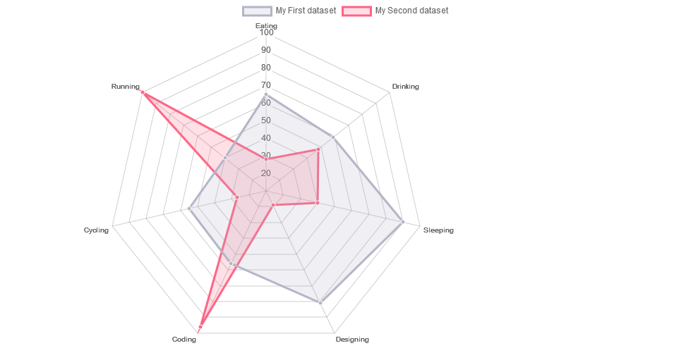
These types of charts are caller RADAR CHARTS

enter image description here

Say I want to show all of A's friends in the following form.But what to do when there're a lot of friends of A?

THe only possible way is to do grouping or categorizing and you can either use a badge or follow the above example.


If you need any help regarding implementation you can look into

http://www.chartjs.org/docs/#radar-chart
1
  • 1
    From what you refer to, "a radar chart is a way of showing multiple data points and the variation between them". But I don't need to show the variation here.
    – jddxf
    Commented May 22, 2017 at 12:26

Your Answer

By clicking “Post Your Answer”, you agree to our terms of service and acknowledge you have read our privacy policy.

Not the answer you're looking for? Browse other questions tagged or ask your own question.