5

I'm designing the control panel of a booking app. Guests will be able to enter some reservations, that the host will have to confirm or reject. A reservation can be in one of these stages:

  • Pending
  • Confirmed or Rejected
  • Deleted

When the host confirms or reject a reservation request, an email is automatically sent to the guest.

[edit:] A Pending reservation can be Confirmed, Rejected or Deleted; a Confirmed or Rejected one can only be Deleted.

I'm wondering if is it better to implement the UI of the form for the status change of the current reservation:

  1. As a single select (or a series of radio buttons) that allows the host to select a different status for the current reservation

  2. As a series of buttons that trigger a status change (like "Confirm reservation request" or "Reject reservation request")

2 UI alternatives demo

Consider that this User Interface will be placed on the reservation's details page.

The first solution allows to highlight the current status, display all the possible status a reservation can be and reduces accidental mistakes because it involves 2 clicks. The second solution highlights the fact that the host is triggering a really meaningful action, to which are bound several collateral effects.

I'd personally choose the first solution because it fits in the most common approach of changing the status of a generic thing, but I recognise that it is flawed because it doesn't highlight the fact that saving a new status for a reservation request is a very important action in this domain.

8
  • Can a reservation go from any state back to any other? For example from Confirmed/Rejected back to Pending, or Confirmed to Rejected, or Deleted to Pending?
    – Alvaro
    Commented May 21, 2017 at 21:58
  • Good point: a Pending reservation can be Confirmed, Rejected or Deleted. A Confirmed or Rejected reservation can only be deleted.
    – Stefano
    Commented May 21, 2017 at 23:03
  • @TripeHound I'm sorry, there was a mistake on the text you quoted: the guest can only insert a reservation request, he cannot change its status. The host will be able to confirm / reject / delete the reservation request. I edited the question and corrected the mistake. Thank for spotting it. The host can cancel a confirmed reservation since guests may ask him to cancel their reservation.
    – Stefano
    Commented Aug 23, 2017 at 10:16
  • No problem. I'll delete the comment.
    – TripeHound
    Commented Aug 23, 2017 at 10:18
  • FWIW looks like AirBnB uses buttons
    – DasBeasto
    Commented Aug 23, 2017 at 15:57

5 Answers 5

7
+50

Assuming that the reservation status always starts with being "Pending" - and is not a factor of user action, there are two distinct categories of system/user actions.

  • First category has both confirmation and rejection. Changes reservation state and generates notification,
  • Second category is deletion. Here I assume, only change in reservation state is there and no user notification.

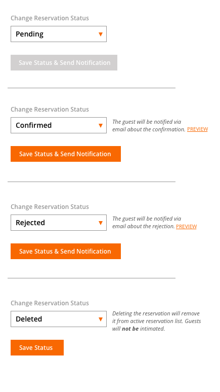
Considering the above, and with an intent to arm the host with sufficient information about what is the result of the state changes, here is a design suggestion -

1) Status change choice intimates the user about the system action, both about what new state and the associated secondary action.

2) It also, in case of Deletion informs that there will be NO secondary action. Making him more confident about his decision.

3) Additionally, it could be great to have the user see a preview of the email message that goes out, and optionally edit the same if needed. Again, more control leading to more confidence.

4) As a quick suggestion, you could think of terming "Delete" as "Archive Reservation" or something. That itself would make a lot more sense about its action. Again, that's strictly based on my assumption of the delete action.

enter image description here

3
  • Thanks for your suggestion. So do you think that it would be more user friendly letting the user select the new status, rather then letting him click a button to trigger a status change? For sure, with the <select /> approach (solution #1), it would be easier to lay out a smart suggestion about what will happen due to the status change.
    – Stefano
    Commented May 22, 2017 at 20:56
  • 2
    Yes. Having a button trigger a status change might not be suitable according to me in this case for 2 reasons. First, its an important product action and should demand more attention (vs a click) and since there are parallel actions that happen, the user could potentially be given the right to control/edit them. The issue, as I see with a confirmation dialog handling such situations is it increasing cognitive load. Say, if I know that the email will be sent (expert user), then why should I always go pass the confirmation dialog? Its more of a system controlling things vs the user in control.
    – Amit Jain
    Commented May 23, 2017 at 3:18
  • 1
    I agree, this solutions helps both new users and expert users. New users are comforted by the additional status information, while expert users can safely ignore it. It also keeps the user in charge of the whole process and prevents accidental clicking. A deleting action should preferably not be accidentally clickable if there is a point of no return, especially if it's right next to a desired action. The stomach drop sensation will go through the roof! Commented Aug 23, 2017 at 10:34
1

Here changing the status is very crucial activity. Using button for such changes is not a suggested option as using a button only implies a user action with just boolean results(changing state to right or wrong , true or false) in general cases.

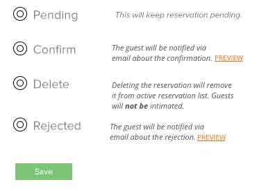
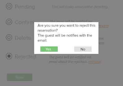
Here we need to make a system action, so radio buttons are best suited. Additionally, you can show a description of the effect each option will make on the system simultaneously, this cannot be done in dropdown. Then you can add a modal view for confirming the action, this will act as a precautionary step before confirming the action preventing accidental mistakes, as it will grab users attention and make him realise that this action is very important.

Dropdown is not so suited as there may be new users at the host end. They may have to select every option and see what exactly each option does, increasing their efforts. There is also a chance that an option is selected and confirmed accidentally. This can be prevented with modal window, but showing modal window after confirming the action after selecting an option from dropdown does not go properly with the flow.

So radio buttons is best suited option amongst all of the three. Check example image below.

enter image description here

enter image description here

Check link for additional description: https://www.formassembly.com/blog/drop-down-list/

1
  • I agree that showing at once all the options (with the help text for each one) is great for new users. But I fear that this won't be so well suited for expert users, since they won't need to scroll all the help text every time they have to confirm a reservation.
    – Stefano
    Commented Aug 29, 2017 at 12:46
1

Assumptions:

  • This is a multi-device experience
  • “Delete" and “Reject” can be used when a guest requests a cancellation
  • There is no difference besides the email notification between "Reject" and "Delete"

Suggestion / Recommendation

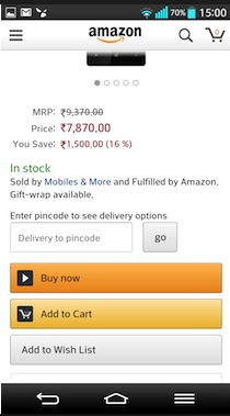
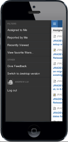
It is common to have nice large buttons as actions in the mobile experience. See JIRA & Amazon examples below. Nothing UX states a drop down is better than a Button for action and vice versa. What you need to be aware of is to ensure a CTA (Call to Action) is well understood, easy to find and simple to interact with.

Amazon Exampe JIRA Example

The buttons seem like the best and simplest solution (assuming they are not competing with anything around them). Assuming the reservation page is simple content (text and perhaps an image). Buttons offer enough of differentiating factor to serve as a CTA.

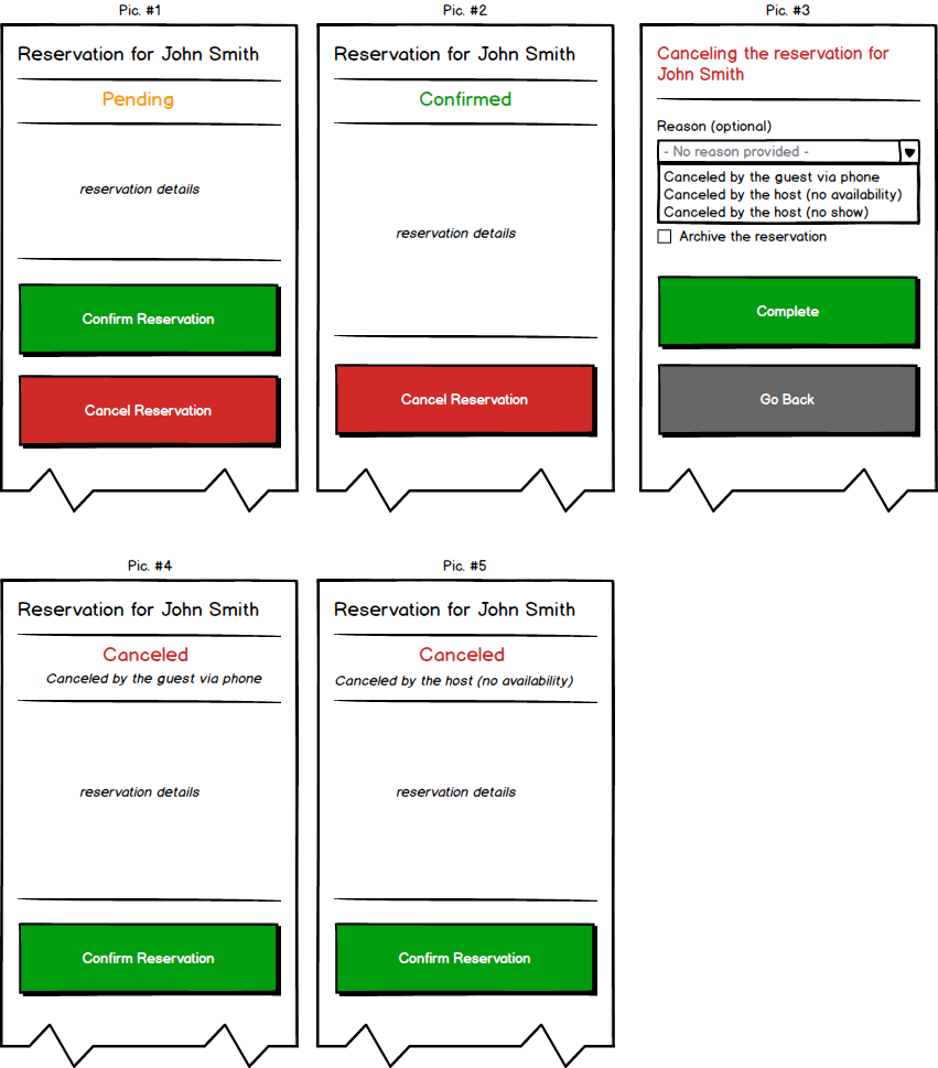
The series of pictures below, Pic 1 - 5 show an example of the mobile experience.

  • Pic. 1: is an example when looking at the reservation in Pending state. I assume the host need to see reservation details before they can decide on the action.
  • Pic. 2: is an example of the Confirmed reservation. If a guest changes their mind, the reservation can still be canceled.
  • Pic. 3: is an example when a host clicks to cancel the reservation. Additional dialog is displayed where a host can pick various reasons (which will help you differentiate between different cancellation reasons and remove the need to have “delete” and “reject” buttons, per my understanding of the flow)
  • Pic. 4: is an example of the reservation when it was canceled by the guest via phone. You can see a reason displayed under the status message.
  • Pic. 5: is an example where the reservation was canceled by the host.

NOTE: I believe the application will still need “Confirm” action when the reservation is canceled. A guest may change their mind and call back in after they canceled. A reservation could be “rejected” by accident OR I assume another cancellation can open up a seat for someone else.

New UX

Summary:

If you are unsure which route to pick, you can always do a usability study to see what your customers prefer (given how the rest of the experience looks like). The proposal above is purely based on the assumption that you need a multi-device experience, such experience often suggests a responsive design and a mobile first approach in most of the use cases.

“As soon a the action takes place, let the user know that the action has started and show its progress. This is especially important for actions that are executed asynchronously in the background and need some time. When the action has finished, let the user know the result. Then the feedback cycle is complete.”

From the article: https://blog.mwaysolutions.com/2015/11/20/give-the-user-feedback-for-a-better-ux/

0

I think a status gives information inside the system, while a button triggers actions (could be inside and outside). If the host changed the status of a reservation it could imply a change inside the system only, while triggering an action with a button would change its status and perform other possible actions like sending an email.

In your second solution you could make use of a confirmation dialog for each of the actions as they are bound to several collateral effects. So that would make it two clicks as well.

0

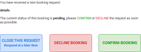
I think this could be simplified as the state is pending, until the user takes action, therefore the DDL or list becomes superfluous, furthermore, giving the user clear response question and button text will assist the decision process.

Confirm or Decline

2
  • I can see this would be great shown on the notification email sent to the host, in order to make him confirm or decline the incoming request.
    – Stefano
    Commented Aug 23, 2017 at 15:31
  • For sure or on screen, if they have an area to view each request, obviously the styling is basic at the moment. Commented Aug 23, 2017 at 15:56

Your Answer

By clicking “Post Your Answer”, you agree to our terms of service and acknowledge you have read our privacy policy.

Not the answer you're looking for? Browse other questions tagged or ask your own question.